Film-Tech Cinema Systems
Film-Tech Forum ARCHIVE


my profile | my password | search | faq & rules | forum home
  next oldest topic   next newest topic
» Film-Tech Forum ARCHIVE   » Community   » Film-Yak   » CBS Eye Logo Turns 60 (Page 2)

 
This topic comprises 2 pages: 1  2 
 
Author Topic: CBS Eye Logo Turns 60
Bobby Henderson
"Ask me about Trajan."

Posts: 10973
From: Lawton, OK, USA
Registered: Apr 2001


 - posted 10-24-2011 02:32 PM      Profile for Bobby Henderson   Email Bobby Henderson   Send New Private Message       Edit/Delete Post 
While the CBS eye logo is very simple (as in "they paid someone for that design!?" simple) it is an important example of the sweeping change that took hold in graphic design during the 1950's.

The "International Typographic Movement," often called the "Swiss Movement" gave birth to things like the Helvetica type family and lots of bold, minimalist design. It shoved aside the previous trend of hand lettered scripts, twinkling stars & arrows and illustrations riffing off Norman Rockwell. That very dated looking "retro" style has tried to re-emerge from time to time, but only does so out of schtick. In reducing designs down to their most minimal, fundamental level the Swiss movement succeeded in creating arguably timeless designs.

For better or worse, large corporations embraced this graphic design movement over the next 20 years. They shed brand marks that either looked dated, too complicated or even too illustrational to be clean, timeless and truly corporate looking. William Golden's CBS Eye logo design is one of the examples that has endured for decades.

Paul Rand and Saul Bass deserve mention in this topic because the two were among the heaviest hitters in creating minimalist brand marks. Paul Rand created the logos for IBM, ABC, Westinghouse and UPS. Saul Bass designed the old Bell Telephone AT&T logo as well as the newer "death star" logo. He made logos for the United Way, Girl Scouts, Minolta, Warner Bros. (1970's version), United Airlines and many more.

I don't like the current brand mark CBS is using. Obviously they still use the eye logo. But they have some clunky looking techie lettering set next to it. When William Golden originally designed the logo he set the "CBS" letters in the Didot typeface. That combination works. The new one doesn't.

 |  IP: Logged

Joe Redifer
You need a beating today

Posts: 12859
From: Denver, Colorado
Registered: May 99


 - posted 10-24-2011 04:18 PM      Profile for Joe Redifer   Author's Homepage   Email Joe Redifer   Send New Private Message       Edit/Delete Post 
quote: Frank
 -
Those are the rings of Saturn? Have they even seen Saturn? Maybe that's what the rings would look like as the entire planet was spiraling to it's doom.

Oh wait I see it now. One of the "rings" I see is the actual planet, though transparent. God damn it.

 |  IP: Logged

Mike Blakesley
Film God

Posts: 12767
From: Forsyth, Montana
Registered: Jun 99


 - posted 10-24-2011 05:45 PM      Profile for Mike Blakesley   Author's Homepage   Email Mike Blakesley   Send New Private Message       Edit/Delete Post 
Well don't feel bad, Joe & Frank. I'm in the auto parts business and have seen that logo for years and never got that until just now. I just never thought about what it might 'really' be.

I am now wondering if there's some strange meaning to the stupid-looking Toyota logo, or if Chevy's bowtie design means something extra.

 |  IP: Logged

Joe Redifer
You need a beating today

Posts: 12859
From: Denver, Colorado
Registered: May 99


 - posted 10-24-2011 05:50 PM      Profile for Joe Redifer   Author's Homepage   Email Joe Redifer   Send New Private Message       Edit/Delete Post 
Just how many jobs do you have, Mike? Music, movies and autos?

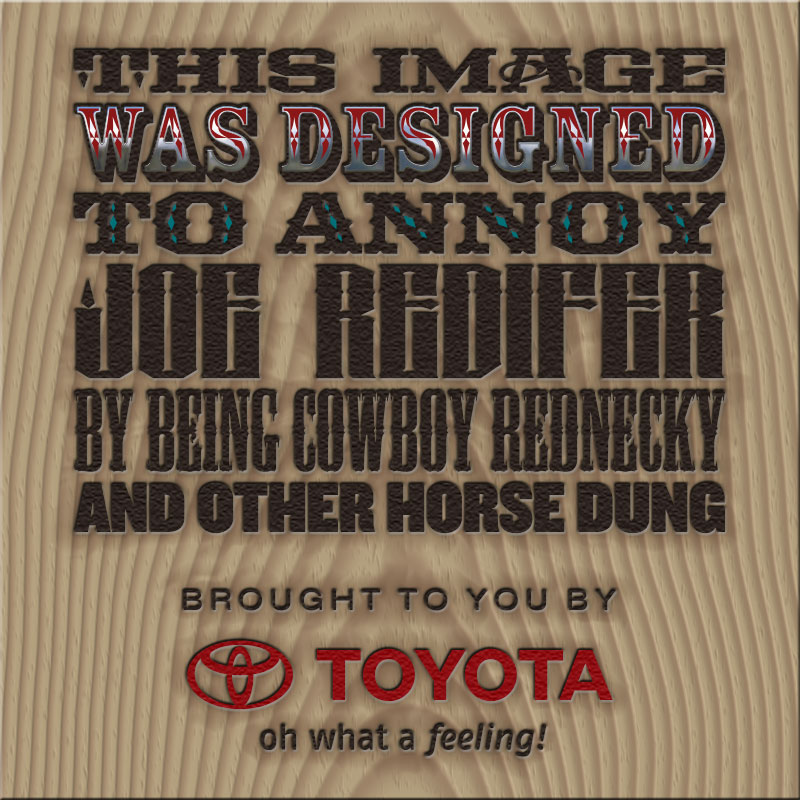
The Toyota logo is apparently just 3 ovals, but I always thought it looked like a bull (long face with bull horns). I dislike anything western or cowboy-ish (other than a few good western movies) so the logo looks like trash to me. My guess is they switched to that logo to make their trucks look more manly and certainly more "redneck-y".

 |  IP: Logged

Mike Blakesley
Film God

Posts: 12767
From: Forsyth, Montana
Registered: Jun 99


 - posted 10-24-2011 06:17 PM      Profile for Mike Blakesley   Author's Homepage   Email Mike Blakesley   Send New Private Message       Edit/Delete Post 
quote: Joe Redifer
Just how many jobs do you have, Mike? Music, movies and autos?
Just 2 actually. Music and auto parts are in the same building. (Car parts -> Car audio -> CDs and such)

 |  IP: Logged

John Wilson
Film God

Posts: 5438
From: Sydney, Australia.
Registered: Dec 1999


 - posted 10-25-2011 04:38 AM      Profile for John Wilson   Email John Wilson   Send New Private Message       Edit/Delete Post 
quote: Joe Redifer
Just how many jobs do you have, Mike? Music, movies and autos?
Oh, and he's the Mayor.

 |  IP: Logged

Mike Blakesley
Film God

Posts: 12767
From: Forsyth, Montana
Registered: Jun 99


 - posted 10-25-2011 10:20 AM      Profile for Mike Blakesley   Author's Homepage   Email Mike Blakesley   Send New Private Message       Edit/Delete Post 
No, thank God...you couldn't give me that job!

 |  IP: Logged

Bobby Henderson
"Ask me about Trajan."

Posts: 10973
From: Lawton, OK, USA
Registered: Apr 2001


 - posted 10-25-2011 06:20 PM      Profile for Bobby Henderson   Email Bobby Henderson   Send New Private Message       Edit/Delete Post 
quote: Joe Redifer
The Toyota logo is apparently just 3 ovals, but I always thought it looked like a bull (long face with bull horns). I dislike anything western or cowboy-ish (other than a few good western movies) so the logo looks like trash to me.
Couldn't pass up the opportunity:

 -

 |  IP: Logged

Mike Blakesley
Film God

Posts: 12767
From: Forsyth, Montana
Registered: Jun 99


 - posted 10-25-2011 07:01 PM      Profile for Mike Blakesley   Author's Homepage   Email Mike Blakesley   Send New Private Message       Edit/Delete Post 
That's probably the coolest font Joe's name has ever been rendered in.

 |  IP: Logged

Randy Stankey
Film God

Posts: 6539
From: Erie, Pennsylvania
Registered: Jun 99


 - posted 10-25-2011 07:36 PM      Profile for Randy Stankey   Email Randy Stankey   Send New Private Message       Edit/Delete Post 
What? No Trajan?

 |  IP: Logged

Joe Redifer
You need a beating today

Posts: 12859
From: Denver, Colorado
Registered: May 99


 - posted 10-25-2011 08:42 PM      Profile for Joe Redifer   Author's Homepage   Email Joe Redifer   Send New Private Message       Edit/Delete Post 
Well that definitely does the trick! I like how the J in my name has a candle flame on it. Also, the board is a nice touch [Smile]

 |  IP: Logged

Bobby Henderson
"Ask me about Trajan."

Posts: 10973
From: Lawton, OK, USA
Registered: Apr 2001


 - posted 10-25-2011 08:49 PM      Profile for Bobby Henderson   Email Bobby Henderson   Send New Private Message       Edit/Delete Post 
quote: Randy Stankey
What? No Trajan?
While Trajan has been used for the poster art on westerns like Open Range, it has been used on far too many other movie posters and movie title sequences to be considered a western genre typeface.

And I also know you're joking. Ha. Ha.

FWIW, the fifth line of copy was set in Mesquite. That's the typeface used on the original poster artwork for Tombstone. Also, every one of those typefaces (and more western theme typefaces) were used in the end titles of Rango.

 |  IP: Logged


All times are Central (GMT -6:00)
This topic comprises 2 pages: 1  2 
 
   Close Topic    Move Topic    Delete Topic    next oldest topic   next newest topic
 - Printer-friendly view of this topic
Hop To:


Powered by Infopop Corporation
UBB.classicTM 6.3.1.2

The Film-Tech Forums are designed for various members related to the cinema industry to express their opinions, viewpoints and testimonials on various products, services and events based upon speculation, personal knowledge and factual information through use, therefore all views represented here allow no liability upon the publishers of this web site and the owners of said views assume no liability for any ill will resulting from these postings. The posts made here are for educational as well as entertainment purposes and as such anyone viewing this portion of the website must accept these views as statements of the author of that opinion and agrees to release the authors from any and all liability.

© 1999-2020 Film-Tech Cinema Systems, LLC. All rights reserved.