
I found it quite curious that he would all of the sudden choose to shoot this movie in 2.39 and I was just wondering if anyone had any information on this.
Glenn
Be thankful that Spielberg has chosen 2.39. There is no law saying that a director must pick an aspect ratio and shoot it forever. His next film will probably be 1.37.
Steve has always been paranoid about how his movies look on video, but he has always wanted the highest quality possible in the theaters. My guess is he finally realized that shooting in Super 35 gives him the best of both worlds (at a slight compromise of each). It gives him the security of knowing he can reframe each shot on the video transfer by showing more picture area at the top and bottom of each shot AND it gives him the larger aperture that scope provides (sharper and brighter picture) in the theater.
While I would rather see good old fashioned anamorphic photography, I will always take Super 35 over conventional flat ANY DAY! With today's filmstocks and cameras, Super 35 can look damned good. (The 70mm print of Titanic I ran looked sharper than any previous 35mm anamorphic blowup I have ever seen.) The real problem seems to be the guys at the labs screwing it all up printing too fast.
Don't know if it was scope or flat.
Some have suggested that this choice may have been influenced by Tom Cruise.
I was told that Disney did not endorse the scope format because of the wildly varying quality of anamorphic theatre lenses.
I must say, I've got wildly varying scope lenses. Some of them make the picture look smeared. I am trying to replace them now because more and more movies are being released in the scope format. Nearly every movie we are running right now is scope.
Super 35 can be "Film Done Right":
http://www.theasc.com/magazine/dec97/titanic/pgs35/pg1.htm
http://www.cameraguild.com/interviews/chat_carpenter/carpenter_titanic.htm
When using Super 35, the image can be composed for 2.39:1 "scope" theatrical release, but additional height of the frame "protected" so the video release can have a less severe "letterbox".
------------------
John P. Pytlak, Senior Technical Specialist
Worldwide Technical Services, Entertainment Imaging
Research Labs, Building 69, Room 7525A
Rochester, New York, 14650-1922 USA
Tel: +1 585 477 5325 Cell: +1 585 781 4036 Fax: +1 585 722 7243
e-mail: john.pytlak@kodak.com
Web site: http://www.kodak.com/go/motion

"Duel" was probably shot in 1.33 since it was made for TV. Correct? The opening credits in Encore's transfer were surrounded by a black border on all 4 sides so nothing would be cut off by TV overscan, but it was still a 1.33 (or so) frame.
"Minority Report" got 4 stars from Ebert. I can hardly wait to see it...
------------------
"One man can make a difference."
------------------
John P. Pytlak, Senior Technical Specialist
Worldwide Technical Services, Entertainment Imaging
Research Labs, Building 69, Room 7525A
Rochester, New York, 14650-1922 USA
Tel: +1 585 477 5325 Cell: +1 585 781 4036 Fax: +1 585 722 7243
e-mail: john.pytlak@kodak.com
Web site: http://www.kodak.com/go/motion
More about the fact that release prints of Minority Report are Scope rather than flat.
quote:
The only non-Lucas related scope movies Steven has made are Close Encounters, Jaws, Hook and maybe that first one [The Sugarland Express]
Also "1941." Plus, as writer and/or producer, Spielberg has been involved with many scope releases, including "Poltergeist," "The Goonies," "Joe Versus The Volcano," "Twister," "The Mask Of Zorro," "Ace Eli And The Rodger Of The Skies," and others.
quote:
2.39 first came into use on The Cell two years ago.
Huh? 2.39:1 has been the standard scope projection ratio for the past thirty years! (Maybe John Pytlak can post a reference to the SMPTE standards here.) Most people, however, either (A) don't know that the standard is actually 2.39:1 (rather than 2.35:1) or (B) they simply use the more common term of "2.35:1." Others prefer refering to scope with the figure of 2.40:1, which is subjectively correct as well, but is simply a rounded figure.
quote:
When using Super 35, the image can be composed for 2.39:1 "scope" theatrical release, but additional height of the frame "protected" so the video release can have a less severe "letterbox".
True, though very few video transfers (on DVD anyway) are available this way to the public. Most are presented in the original composition ratio of 2.39:1 (or something close to that). Some of the handful of Super 35-originated films shown theatrically in scope that are available on laserdisc and/or DVD in other widescreen ratios (typically 1.78:1, 1.85:1 or 2.00:1) include "Top Gun," "Judgment Night," "The General," "Silverado" (first pressing only), "The Governess," "Set It Off," "Star Trek VI: The Undiscovered Country," and "Ferris Bueller's Day Off" (LD only; DVD is in scope ratio), among others. A larger number of Super 35 films have appeared on TV (HBO in particular) broadcast in different widescreen ratios than the theatrical prints.
quote:
Spielberg originally intended Empire of the Sun to be projected at 1.66. I don't know how many US theaters actually did though.
References to 1.85:1 have appeared in interview pieces with cinematographer Allen Daviau, ASC in American Cinematographer and (a future issue of) Widescreen Review. According to Mr. Daviau, the film was composed for 1.85:1 and meant to be projected in that ratio. Of course, this wouldn't have prevented any theater from actually projecting it at 1.66:1; the imagery was there to do so. The film was shot with a 1.66:1 hard matte.
The DVD is framed at 1.78:1. The laserdisc versions were framed around 1.66:1, which is what I believe has led many to believe the film was meant to be projected at 1.66:1.
Michael, 2.39:1 is not the 2.35:1 spec, just misstated. These are two different specifications, the 2.35 being the older one, dating back to the revised CinemaScope specification in the 1950s (the original scope spec being 2.55). The 2.39 spec was designed recently to prevent negative splice flashes from being projected and to conform to how most theatres have been cutting plates to prevent this distraction themselves. However not hard matting 2.39 can lead to new questions about how a print is intended to be projected. Not all current scope releases hard matted to 2.39, but leave the frame wide open. I suppose this might be to avoid exposing frame lines in theatres which are still projecting right out to full height.
2.4 is the 2.39 spec misstated, although I don't know why in the world of technical specifications where everything is based on correct numbers, someone decides to call relatively new specification by the wrong number. Is it easier to say "for-ty" than "thir-ty-nine" (you save one syllable)? It is bad enough that techies still refer to the Academy ratio as 1.33 when that is the spec for silent film; when sound was added it was changed to 1.37 -- two different specs. It's a small thing, but just goes to show how easily things can get messed up by inexactitude (yes, I made the word up).
In the re-release SW trilogy and Ep 1, which I ran recently, some had the frame hard matted at 2.39 while one did not. So it may be more of an arbitrary decision on the part of the lab rather than a conscious decision by the filmmaker.
And never EVER trust DVD or Laserdisc jacket material for correct information about what went on in theatres with respect to aspect ratios, especially older titles. The liner notes are written by video people, usually about films made before they were even born, and they are notorious for saying that the video release is "the way the film was intended to be seen." It is nothing but a marketing line; if the video folks were so intent on faithfulness to the film presentation, then they wouldn't be so fast to throw in half the junk that was originally left on the editing floor -- all those "additional scenes not shown in theatres." Usually there's a reason the director cuts scenes from a film....because, hello, they weren't intended to be there!
Frank
"Huh? 2.39:1 has been the standard scope projection ratio for the past thirty years! (Maybe John Pytlak can post a reference to the SMPTE standards here.) Most people, however, either (A) don't know that the standard is actually 2.39:1 (rather than 2.35:1) or (B) they simply use the more common term of "2.35:1." Others prefer refering to scope with the figure of 2.40:1, which is subjectively correct as well, but is simply a rounded figure."
A few years ago, I researched the history of the "scope" standards, which is now posted on Marty Hart's "American Widescreen Museum" website:
http://www.widescreenmuseum.com/widescreen/apertures.htm
From 1957 through today, there have been a number of small changes to the anamorphic projector aperture recommended standards. John P. Pytlak of Eastman Kodak dug through countless back issues of the SMPTE Journal in order to provide the following chronology of the changes to the standards:
The March 1957 SMPTE Journal has PH22.104-1957, the standard for 2.55:1 anamorphic (no optical track), with an aperture size of 0.912 X 0.715 inches. Notice of withdrawal of this standard was in the January 1964 Journal.
The December 1957 SMPTE Journal has PH22.106-1957 for 2.35:1 anamorphic, with an aperture of 0.839 X 0.715 inches. It was unchanged in the September 1964 Journal. The November 1965 SMPTE Journal published PH22.106-1965 still with the 0.839 X 0.715 aperture size.
In the September 1970 SMPTE Journal, a new draft of PH22.106 was proposed, with an aperture size of 0.838 X 0.700 inches, to minimize the flashes at splices. This was republished as standard PH22.106-1971 in the October 1971 issue.
In the June 1976 SMPTE Journal, the two (flat and scope) projectable image area standards (PH22.58 and PH22.106) were consolidated into one standard and renamed PH22.195. The publication of PH22.195-1984 in the October 1984 Journal still had the scope area as 0.700 X 0.838 inches.
The June 1992 SMPTE Journal published a proposed revision, with a scope area of 0.690 X 0.825 inches. In August 1993, the standard was published as SMPTE 195-1993, with the current area of 0.690 X 0.825 inches. So August 1993 is when the two formats became the same width of 0.825 inches.
------------------
John P. Pytlak, Senior Technical Specialist
Worldwide Technical Services, Entertainment Imaging
Research Labs, Building 69, Room 7525A
Rochester, New York, 14650-1922 USA
Tel: +1 585 477 5325 Cell: +1 585 781 4036 Fax: +1 585 722 7243
e-mail: john.pytlak@kodak.com
Web site: http://www.kodak.com/go/motion
Oddly enough, there's a shot on the laserdisc where you can see the boom microphone quite clearly in the bottom of the screen. It's around the time of the costume party (early in the film) and after the boy goes to get his glider and stumbles upon a group of soldiers. As the boy and two men are walking away, there's the fuzzy, gray microphone cover, plain as day. I don't think they wanted that to be seen in theatres and I'm disappointed that it's on the laserdisc and/or that the laserdisc was not 1.85. Also early in the film (but in a different scene) there's an odd dissolve right in the middle of a shot. It's really weird and I don't know if it was that way in the theatrical release or it's unique to the laserdisc. I always admired that film because, on the technical side, I consider it one of the most flawless movies ever made. So it's sad to start seeing errors on the disc.
quote:
Not all current scope releases hard matted to 2.39, but leave the frame wide open.
Are SCOPE releases ever hard matted (letter-boxed, not door-boxed) on the 35mm print material? I don't see the reason. It is not like there is anything left to hide.
------------------
John P. Pytlak, Senior Technical Specialist
Worldwide Technical Services, Entertainment Imaging
Research Labs, Building 69, Room 7525A
Rochester, New York, 14650-1922 USA
Tel: +1 585 477 5325 Cell: +1 585 781 4036 Fax: +1 585 722 7243
e-mail: john.pytlak@kodak.com
Web site: http://www.kodak.com/go/motion
quote:
Release prints made from duplicate negatives can have excellent quality. For "Film Done Right", the proper procedure is to contact print the short pitch original negative (BH-1866 perfs) onto a long pitch master positive (DH-1870 perfs). Then use a (slower) pin-registered step printer to make the short pitch duplicate negatives (BH-1866 perfs). The sound negative is recorded directly onto short pitch sound recording film (KS-1866 perfs). Then contact release prints are made onto long pitch print film (KS-1870 perfs). This method minimizes any slippage in the printers to give the optimum steadiness and sharpness, even with high speed release printing.
John, are optical printers inherently pin-registered devices? I'm thinking that if this is the case, then this would remove one of the variables for 'film done wrong' at the lab stage (with super 35). Yet, I have seen that super-35 print quality can vary substantially. Would most of the loss in sharpness from one procedure to another come down to incorrect pitch choices at each printing stage?
As an example, I projected two prints of 'The Beach' (super 35) prior to its release - one print of the movie was 20 minutes longer and sharpness and colour were outstanding - even long shots were extremely crisp and fine-detailed. The next print came from a different lab, and it was extremely grainy even on a modest-sized screen. Sharpness and detail were lacking in absolute terms, but *especially* in comparison to what I knew was possible from the source material - it was like watching a different movie. What went wrong? I assume that the duplicate negative of the inferior print was already flawed, meaning that the fault was either with the IP or the optical-squeeze step used to create the DN. I'm therefore wondering where can such discrepancies occur and what can be done to prevent them?
quote:
Are SCOPE releases ever hard matted (letter-boxed, not door-boxed) on the 35mm print material? I don't see the reason. It is not like there is anything left to hide.
What would the hard matting be anyway? The difference between 2.35 and 2.39
I really hate how most Super 35 movies look. I suppose that there are valid reasons for using the format. It seems ideal for someone like John Frankenheimer, who likes to have really deep focus and wide aspect ratios. But I don't understand people like James Cameron who think it's great for when the film is released on video. Why bother? Anamorphic films look so much better for so many reasons. And now, especially with DVD, it doesn't seem like a good compromise at all.
That's the way it's done here. Curious: is the filing of aperture plates standard procedure?
Given that lenses are made in specific focal length increments (generally 5mm, sometimes 2.5mm) it is unlikely that one will be able to precisely size and mask the image over different formats with whatever screen dimension is being held constant (preferably a constant height) and the proper amount of spill onto the masking without some small adjustment of the aperture.
And that's just regarding overall image size. Correction is also required for keystoning of the image when there is down-tilt or up-tilt (the keystoning of the image will still be there but will be less noticable when the sides are kept straight. Ditto for projection onto curved screens. A small percentage loss of image at the edges for this purpose is built into the industry standard specs (SMPTE etc).
>What would the hard matting be anyway? The difference between 2.35 and 2.39<
Exactly. The 2.39 frameline is a bit thicker than what you usually see on scope prints and if your optical system is projecting EXACTLY 2.35, then a print that IS hard matted to 2.39, will project frame lines, albeit slight, on the top and bottom of the screen.
As Steve points out, this difference will not usually be correctable by changing the prime lens. With lenses manufactured for the most part in 5mm increments, the next FL step would be to much to make that slight correction. The easy way around this problem would be to replace the prime lens with the new Schneider variable FL prime which is adjustable to about 7% of the mean focal length. That would allow you to make the slight adjustment that would be needed to eliminate the visible frame lines of a hard matted 2.39 print. This is an expensive proposition, however, especially for a non-profit like us.
We will probably wind up doing the simplest option, and that is dropping the top mask to compensate -- a lot cheaper than buying two new lenses. Dropping the mask, however, will mean cropping our 1.37 a bit, but it actually will help our 1.85 since that was a tad overcut (maybe like 1.83 or something). It would be really nice if ALL lenses had that 7% variable option.
Frank
PS -- Has anyone ever considered mechanizing that laborious plate filing job? While filing plates for 4 formats and two projectors, I had plenty of time to think of ways to make this job easier. I pictured rigging the file to a reciprocal saw using the saw blade clamp to hold the file; then I'd put the saw on a jig to keep it immobile. It just might work and believe me, the next time I have to file a complete set, I will give this a try.
The avoidance of optical abberations from 'scope compression lenses is just one thing. I think the tyranny of home video's need for "full frame" is the top reason to use Super35 far above all other reasons.
...Then there must be a conspiracy to conceal this top priority from the readers of American Cinematographer. I don't wish to be contrary, but switching from spherical to anamorphic isn't quite as easy as changing lenses on a 35mm still camera. And shooting in 65mm introduces even more problems with depth of field issues. I have to face the fact that much of the know-how which was used to shoot the 65mm masterpieces of the 1960s has been lost. I think Far and Away is a prime example of what happens when an over-confident cinematographer decided it would be easy to switch to 65mm and get great results. I doubt there are very many cinematographers working today who'd like to make such a high-profile stumble... especially when the industry (on both the production and exhibition side) believes that 35mm is good enough.
As for Cameron's reasoning, I had not heard that he does not like the artifacts created by anamorphic lenses. This is a good reason for him not to use them. But at the same time, I think he's nuts. What I love more than anything else about anamorphic lenses are all of the little imperfections. This is why I'd prefer them over one of the larger formats. I grew up with movies like ALIEN and DIE HARD, so to me, those imperfections are just a part of movies. I think they're beautiful. But that's just my opinion, and, unlike Mr. Cameron, I haven't directed four or five of the best pictures ever made, so I'll shut up now.
quote:
Whenever you have lens flares in anamorphic, you get these straight lines all the way across the frame. Some people like those, but I think they're ridiculous and don't correspond to anything in the way the human eye sees things. People associate that effect with 'big movies,' but that's just because for a long time big movies were all shot in anamorphic. So some people think a picture has that 'big movie' look because the headlights on a car create these white lines that go from one edge of the frame to the other. That doesn't correspond to anything I see in my daily life ... Super 35 just lacks certain anamorphic artifacts that I think are detriments, and I much prefer that look.
I am very close to perfecting a secret invention (patent pending) that easily installs in the front dash; it senses those super bright "designer" headlights while they are still miles away and aims a cryaton particle beam at them, creating a sympathetic vibration of the filaments which causes them to EXPLODE before they get anywhere near my car. The deluxe model will also immediately jam any "On-Star" transmitter should it be used to call for help.
Oh, and excuse me, James (King-of-the-World) Cameron, are you saying that spherical lenses have no flare? How about those shots made with a spherical lens where a bright light will produce a line-up of dots that radiate progressively outward from the light source, and if the light source moves, the line of dots swings around the radius -- do we see THAT in real life? Some of these artifacts are a given in cinematography. Years ago such shots might have been re-done; in recent years this kind of artifact is more and more tolerated. It's really a matter of taste and what bothers or doesn't bother the director and/or cinematographer. If Mr. Cameron is annoyed by the flare caused by anamorphic lenses as opposed to the flare caused by spherical lenses, you really can't argue with him; but as far as the audience is concerned, if polled, they probably would say that anyone arguing about which is the better kind of flare, needs to change their medication or just say no to drugs all together.
Frank
I've never seen the anamorphic flare occur anywhere else in real life.
Besides, a lot of scope projection lenses suck. I'm running test loops in all of my projectors to determine which (if any) of the scope lenses are still any good. So far...I'd say they all need to be replaced for one reason or another. Mainly it's a focus problem.
Thanks. I will try that today and let you know if it helps...these were used lenses when I got them, so it was easy to assume that they weren't aging gracefully.
"• Focusing Anamorphics-Tips for achieving a better focus on scope films."
------------------
John P. Pytlak, Senior Technical Specialist
Worldwide Technical Services, Entertainment Imaging
Research Labs, Building 69, Room 7525A
Rochester, New York, 14650-1922 USA
Tel: +1 585 477 5325 Cell: +1 585 781 4036 Fax: +1 585 722 7243
e-mail: john.pytlak@kodak.com
Web site: http://www.kodak.com/go/motion
To answer an earlier question, yes, optical printers are usually pin-registered. (Some continuous optical reduction printers have been used in the past, primarily for printing 16mm to Super 8). By "forcing" pin-registration to be used for making the duplicate negatives, Super 35 can result in better steadiness.
------------------
John P. Pytlak, Senior Technical Specialist
Worldwide Technical Services, Entertainment Imaging
Research Labs, Building 69, Room 7525A
Rochester, New York, 14650-1922 USA
Tel: +1 585 477 5325 Cell: +1 585 781 4036 Fax: +1 585 722 7243
e-mail: john.pytlak@kodak.com
Web site: http://www.kodak.com/go/motion
Do we see these abberations in real life? Well, put it this way - do we see aliens in real life? Cowboys? Robots from the future on motorcycles, being chased by large trucks through the LA drainage system? Monsters from the bottom of the ocean? The only thing I've seen in real life that resembles a 'big picture' is 9/11.
We're not going to the pictures to see real life. If we wanted that, we could sit in the park. Anyhow, each to their own. I just happen to like the 'feel' of anamorphic.
 , so 35mm 2.39:1 transfered to video "looks" often sharper (but less with less depth!!) than Panavision.
The last two can be used to artistic effect, and it's great when they seem to fit in. However, there are many cases when they are merely annoying, simply because they're not real life. Anamorphic IMAX, for instance, just wouldn't make sense. Special effects (prior to the CGI era) would've been a lot harder if they'd shot in Technirama instead of VistaVision. Anamorphic effects would have seriously screwed up the lighting.
Do we see some fantastic images in movies? Sure. But do you also enthusiastically accept fake-looking CGI imaging because it has "character?" Most of us would prefer that it look believable, even if it's a scene that we'd never see in real life.
Interestingly enough, some of the CGI in Minority Report was mistakenly rendered with anamorphic lens effects. The scene on the highway, for instance, showed some anamorphic flare (watch for ovals). Poor communication with the effects house, I suppose?
I'm sure that it is very annoying to work with anamorphic lenses, and there are certainly some problems with them. But I'd still rather have shallow focus and lens flares than excessive grain.
I agree that the larger image area of the 35mm anamorphic frame makes the most efficient use of the camera negative image area. The area that ends up on the screen is 0.825 x 0.690 inches. With Super 35, the area that ends up on the screen is 0.945 x 0.394 inches, or about 65% of the anamorphic area. And "size does matter".
But for Super 35, using slower films, avoiding underexposure, and care in printing can all be used to reduce the graininess, with many examples of "Super 35 Done Right".
------------------
John P. Pytlak, Senior Technical Specialist
Worldwide Technical Services, Entertainment Imaging
Research Labs, Building 69, Room 7525A
Rochester, New York, 14650-1922 USA
Tel: +1 585 477 5325 Cell: +1 585 781 4036 Fax: +1 585 722 7243
e-mail: john.pytlak@kodak.com
Web site: http://www.kodak.com/go/motion
John, what's a recent example of "Super 35 done right"? Can this vary from print to print of a single movie? I'm just wondering, because I saw a print of WINDTALKERS at school a couple of months ago, and it looked substantially better than the one which is at my theater right now. Of course, we're showing it on a much larger screen, but the difference seemed to be pretty big.
By the way Steve, (and this completely off-topic, I'm sorry) but I've been fortunate enough to see a couple movies in your theater and I was really impressed. It has this atmosphere of, like, a total love for movies. It's really cool. Thanks for the experience.
(Ditto that feeling about distant, out-of-focus points of light, but either circle (or oval)-of-confusion is acceptable.)(topic) Super 35 done right - Is "Titanic" recent enough? Was it considered to be grainy?
(topic) Graininess in "Minority Report" - until Spielberg says differently, I believe that was his vision. I don't like graininess normally, but for this picture I think it worked, as did his Black & White vision for "Schindler's List".
Can you think of anything more recent than TITANIC? I didn't have a very good eye for things like this at that point. Could you give an example of something from, say, the past 2 years? If not, then doesn't that say something about the quality of Super 35 in general? Also, how much of "Super 35 done right" falls on the filmmaker's shoulders as opposed to other factors, like the lab, money, etc.? From that Cameron interview, it seemed like he had a bit more control over the process than most people, but he was also taking greater care to ensure that it would turn out OK. Thanks.
You're missing my point, as detailed below.
"Brian, there is such a thing as going too far in anamorphic advocacy."
Perhaps, but I wasn't advocating anything.
"It's not great because it has less depth-of-field, uneven focus shifting, and unusual lens flare effects."
Those very traits may be what gives anamorphic its character.
"But do you also enthusiastically accept fake-looking CGI imaging because it has "character?" "
Yes! Many have commented that the original Star Wars films looked a lot better with their fallible models than the new 'perfect' looking films. What about Knight Rider? I loved the cheesy models - CGI in a new Knight Rider just would look too plastic for me. Your inspirations are determined by your experience. If the best movie you ever saw had fake-looking CGI, you may just look upon this fake-looking CGI as nostalgic, and very comfortable, depending, of course, upon the context of the material you're viewing. Indeed, I don't want to see anamorphic abberations in IMAX Lions of the Serengeti, or bad, fake-looking CGI in Lethal Weapon!
"Most of us would prefer that it look believable, even if it's a scene that we'd never see in real life."
Sure. But I'm not advocating anything, and therefore not speaking for "most of us."
The point is that I grew to love anamorphic 35mm, and all that represents it, warts and all.
The Fox snipe has no matted line but the Dreamworks does, as an example.
BTW, both my Fox snipe AND my Dreamworks snipe look like the neg. has been water damaged. You'd think a director of Spielberg's quality would never allow a negative out of his control with those sort of obvious faults.
Just goes to show, eh?
------------------
Too much of the rest of the film is given over to a romance between Padme and Anakin in which they're incapable of uttering anything other than the most basic and weary romantic cliches, while regarding each other as if love was something to be endured rather than cherished. There is not a romantic word they exchange that has not long since been reduced to cliche.
No, wait: Anakin tells Padme at one point: "I don't like the sand. It's coarse and rough and irritating--not like you. You're soft and smooth." I hadn't heard that before.
- Roger Ebert reviewing Episode 2. :)
quote:
BTW, both my Fox snipe AND my Dreamworks snipe look like the neg. has been water damaged. You'd think a director of Spielberg's quality would never allow a negative out of his control with those sort of obvious faults.
John, are you talking about the snipes looking like they are submerged underwater? I'm not sure what the symbolism was supposed to be about that. Were these snipes to be like the pre-cogs in the film? I personally thought that the snipes didn't work. Why mess with those great looking Fox and Dreamworks logos?
AFAIK, a majority of "scope" features today are shot in "Super 35". Here is what a quick search of the imdb yielded:
http://us.imdb.com/SearchTechnical?PCS%3ASuper+35
http://us.imdb.com/SearchTechnical?for=PCS%3ASuper+35&skip=200
Some pretty good (as well as bad) looking pictures on that long list. For example, both "American Beauty" and "Titanic" won Academy Awards for Best Cinematography.
------------------
John P. Pytlak, Senior Technical Specialist
Worldwide Technical Services, Entertainment Imaging
Research Labs, Building 69, Room 7525A
Rochester, New York, 14650-1922 USA
Tel: +1 585 477 5325 Cell: +1 585 781 4036 Fax: +1 585 722 7243
e-mail: john.pytlak@kodak.com
Web site: http://www.kodak.com/go/motion
As for AMERICAN BEAUTY, This was the first time that I remember noticing the excessive graininess of Super 35. Actually, I also remember reading an interview with Conrad Hall somewhere where he talked about how he did something like underexpose the film a bit in order to intentionally get a grainy look, but forgot about how much grain was naturally in the Super 35 process, and wished that he would have given the film a bit more exposure.
By the way, did you notice how many movies on that list were not actually shot in Super 35? Gotta love the imdb 
"Awarded to Michael Broesamle, Uwe Braehler, Volker Massmann and Wolfgang Steinebach of Philips Digital Video Systems and Arthur J. Cosgrove, Andrew F. Kurtz, Roger T. Lees and Leslie G. Moore of Eastman Kodak for the design and manufacture of the industry-standard high-definition digital telecine.
The Spirit DataCine Film Scanner is a joint development between Philips Digital Video Systems and Eastman Kodak. The combination of the Advanced Imaging Head from Eastman, and the precision transport mechanisms and high-speed digital signal processing developed by Philips, has resulted in a new benchmark for high-quality film transfers in both standard-definition and high-definition video standards and high-speed data scanning."
______________________________________________________________________
A "grainy" look can be an artistic choice --- using very high speed stocks and underexposure are "tools" to achieve that "look". But Super 35 can be very sharp and fine grained too.
------------------
John P. Pytlak, Senior Technical Specialist
Worldwide Technical Services, Entertainment Imaging
Research Labs, Building 69, Room 7525A
Rochester, New York, 14650-1922 USA
Tel: +1 585 477 5325 Cell: +1 585 781 4036 Fax: +1 585 722 7243
e-mail: john.pytlak@kodak.com
Web site: http://www.kodak.com/go/motion
Most of the work I do is behind-the-scenes on made-for-TV poductions. However, this Spring I worked on a theatrical feature film... a big-budget science fiction movie from a major Hollywood studio. (!) The format was 2.39:1 using Panavision anamorphic lenses. The viewfinders had framing lines for 2.39 only... no hint of any other aspect ratio during production. I never heard the director say a word about video transfer issues. He never watched anything but the wide, "letterbox" image on his video assist monitors. In fact, they did a lot of shots where you'd see, for example, four guys standing shoulder-to-shoulder filling the whole frame. (!)
quote:
Mitchell,
I totally agree with everything you said about MINORITY REPORT.
Can you think of anything more recent than TITANIC? I didn't have a very good eye for things like this at that point. Could you give an example of something from, say, the past 2 years? If not, then doesn't that say something about the quality of Super 35 in general? Also, how much of "Super 35 done right" falls on the filmmaker's shoulders as opposed to other factors, like the lab, money, etc.? From that Cameron interview, it seemed like he had a bit more control over the process than most people, but he was also taking greater care to ensure that it would turn out OK. Thanks.
Super 35 films:
Harry Potter
Lord of The Rings
Panic Room
The Musketeer
THE LORD OF THE RINGS, which looked awful, grainy as hell ( especially the outdoor greeny scenes, with that city in the moutains and of course the beginning )
BLADE is also superb, I always thought it was shot in Panavision but it's not
HEAT was shot in Panavision and looks a bit too grainy...
PEARL HARBOR and CAPTAIN CORELLI'S MANDOLIN both shot in Panavision and look gorgeous.
------------------
John P. Pytlak, Senior Technical Specialist
Worldwide Technical Services, Entertainment Imaging
Research Labs, Building 69, Room 7525A
Rochester, New York, 14650-1922 USA
Tel: +1 585 477 5325 Cell: +1 585 781 4036 Fax: +1 585 722 7243
e-mail: john.pytlak@kodak.com
Web site: http://www.kodak.com/go/motion
Charlie's Angels
Ocean's Eleven (Las Vegas dark)
In The Bedroom
Proof Of Life
Others have been made, but due to CGI or what I consider may have been the director's vision (e.g., "Minority Report"), they have not been named for comparison.
Any comment?
You're right, CHARLIE'S ANGELS did look good. Interestingly, it had the same D.P. as TITANIC, Russell Carpenter. IN THE BEDROOM looked OK too. But OCEAN'S ELEVEN was super grainy. I was just watching the DVD, and you can even see the grain on there.
So, assuming the filmmaker's not James Cameron, how much control do they have over the quality of Super 35? Is it just about getting a good negative, or do they need to hold the lab's hand through the process, or is it just a case of trial and error, and studios not willing to pay for something that's good when they already have something that's OK?
It is MOSTLY about "getting a good negative". Compared to fast camera negative films, the Kodak intermediate and print stocks used by the lab have very fine grain:
http://www.kodak.com/US/en/motion/products/lab/5242.shtml
http://www.kodak.com/global/images/en/motion/products/lab/f002_1140ac2.gif
http://www.kodak.com/US/en/motion/products/lab/2383.shtml
http://www.kodak.com/US/plugins/acrobat/en/motion/products/curves/2383Diff.pdf
------------------
John P. Pytlak, Senior Technical Specialist
Worldwide Technical Services, Entertainment Imaging
Research Labs, Building 69, Room 7525A
Rochester, New York, 14650-1922 USA
Tel: +1 585 477 5325 Cell: +1 585 781 4036 Fax: +1 585 722 7243
e-mail: john.pytlak@kodak.com
Web site: http://www.kodak.com/go/motion
quote:
What exactly is the aspect ratio of a full 35mm frame without a soundtrack? I've been told that it's 1.67:1. Is that true?
The answer to your question is 1.33:1 (.980 x .735" = 1.33:1).
Steve
------------------
"Old projectionists never die, they just changeover!"
quote:
The answer to your question is 1.33:1 (.980 x .735" = 1.33:1).
Mike Schindler then asked:
quote:
OK. That makes sense. But it brings up two more questions. What is the aspect ratio of a full 35mm film frame with a soundtrack? And where does the whole 1.37:1 thing come in?
I don't have any actual numbers for 35mm with optical soundtrack. I don't think there is a projection spec on this because nothing is meant to be shown that way, though the figure would be fractionally larger than the anamorphic projection aperture, which is .825 x .690" (1.20:1). Actually, some films were shown in the range of 1.15:1 - 1.20:1 in the late 1920s and early 1930s in between the introduction of sound and the establishment of the Academy format.
The 1.37:1 Academy ratio falls *within* the anamorphic spec. Same width and slightly less height (.825 x 600").
I think many people mistakenly think the frame *with* the optical soundtrack is 1.33:1/1.37:1, which may be what led you to believe the full aperture was in a wider ratio (1.67:1 was the figure I think you noted).
Where did you get your full frame spec?
Steve
------------------
"Old projectionists never die, they just changeover!"
quote:
Michael,Where did you get your full frame spec?
The "Film and Camera Formats" section of the Panavision catalog. Other specs have been referenced from the BKSTS series of wall charts.
Steve, why do you ask? Do you have a different figure?
--jhawk
However, I'm still interested in what else can go right/wrong. In an example I cited earlier, I saw two prints of 'The Beach' (ergo, same camera negative) and one of them was of the 'I can't believe it's not 70MM' variety (well, not quite, but you know what I mean), whereas the other one was 'Is this 16MM or just grainy, soft 35MM?', and that's not an exaggeration.
So what could have contributed to this?
Style A is 0.864 x 0.63 inches (21.95 x 16.00 mm) (Non-Anamorphic)
Style B is 0.864 x 0.732 inches (21.95 x 18.59 mm) (Anamorphic)
Style C is 0.981 x 0.735 inches (24.92 x 18.67 mm) ("Special Processes", including Super-35)
Standard SMPTE 195 specifies the current projectable image areas for 35mm prints. The 1.37:1 aspect ratio (0.825 x 0.602 inches) traces its origin to the "Academy" aspect ratio of 0.825 x 0.600 inches (e.g., old ASA Standard Z 52.37).
------------------
John P. Pytlak, Senior Technical Specialist
Worldwide Technical Services, Entertainment Imaging
Research Labs, Building 69, Room 7525A
Rochester, New York, 14650-1922 USA
Tel: +1 585 477 5325 Cell: +1 585 781 4036 Fax: +1 585 722 7243
e-mail: john.pytlak@kodak.com
Web site: http://www.kodak.com/go/motion
I have run Super 35 workprints in approx. 2.2 : 1. Absolutely not my idea but that of another tech who took 1.85 plates and widened them to cover the Super 35 full silent width. The idea was to continue to fill the height of the screen (given common height projection) while still using the same lens as for 1.85. I kinda liked the 2.2 thing as a sort of guilty pleasure. Just set framing so the headroom aligns with their chart and you get a bit of excess picture at the bottom which rarely matters. Wrong...very wrong. But with the sharp image of a workprint off the camera negative and the 2.2 : 1 ratio you could easily imagine you're watching 70mm.
And 0.738 - 0.688 = 0.050 inches, or half the nominal width of the analog soundtrack, the reason for the shift in centerline.
------------------
John P. Pytlak, Senior Technical Specialist
Worldwide Technical Services, Entertainment Imaging
Research Labs, Building 69, Room 7525A
Rochester, New York, 14650-1922 USA
Tel: +1 585 477 5325 Cell: +1 585 781 4036 Fax: +1 585 722 7243
e-mail: john.pytlak@kodak.com
Web site: http://www.kodak.com/go/motion
quote:
I found it quite curious that [Spielberg] would all of the sudden choose to shoot [MINORITY REPORT] in 2.39 and I was just wondering if anyone had any information on this.
There is a feature article on the photography of MINORITY REPORT in the July issue of American Cinematographer. While the article does not go into specific detail on *why* the 2.39:1 ratio was selected, there were a couple passages that may be of interest and are related to the selection of film format.
"MINORITY REPORT also marked Spielberg's first foray into Super 35 filmmaking. [DP Janusz] Kaminski chose Panavision Super 35 cameras and Primo lenses, because he knew the Primos' sharpness would help maintain the quality of the image during the optical blowup to an anamorphic print. 'I always use filters and Dior nets, which automatically remove a certain sharpness,' he notes. ' When I saw the blowup test for MINORITY REPORT, the movie benefitted from [Super 35] because the highlights got slightly brighter, the shadows got slightly harder and the colors got slightly more pastel-ish."
Another factor in the selection of Super 35 (over anamorphic) may have been related to the selection of wide angle lenses for the majority of the production. Of course, they could've used the *same* wide angle lenses in the 1.85:1 spherical format, but I'm guessing that the 2.39:1 wide screen ratio was selected first, then the origination process was selected to accommodate achieving that ratio.
"Steven likes the actors to be as close to the camera as possible, so we're most often shooting with a 17mm, 21mm or 27mm," [Kaminski] says. "He's very much an old-fashioned filmmaker in terms of how he tells his stories; that seems like a very tricky statement because his movies are so technologically advanced, but when you see a special effect in Steven's movies, you can experience it in a wide shot, He likes to see action play in one continuous shot rather than being interrupted by an editor's cut, and that's very old-fashioned. We staged a lot of scenes in wide shots that have a lot of things happening within the frame. Of course, there is plenty of quick cutting in the film because there are extensive action sequences, but many scenes are about people and emotions, and we often let the emotions play in a single wide shot."
Curiously, it's the only one of the 9 film stocks in the ad that mentions Super 35. Yet it's a fast film; I was under the impression that all the issues with grain in Super 35 meant that you wanted to use slower stocks, not faster ones. So, John, why is Kodak promoting Super 35 with Vision 800T?
--jhawk
Sure, VISION 200T will have finer grain. But if the situation demands, the 5289 can yield remarkable images for being such a fast film.
------------------
John P. Pytlak, Senior Technical Specialist
Worldwide Technical Services, Entertainment Imaging
Research Labs, Building 69, Room 7525A
Rochester, New York, 14650-1922 USA
Tel: +1 585 477 5325 Cell: +1 585 781 4036 Fax: +1 585 722 7243
e-mail: john.pytlak@kodak.com
Web site: http://www.kodak.com/go/motion
I guess I find myself wondering what sort of negative film tends to be used on the Super 35 films that we do see as looking grainy. Thanks for the snappy response., btw.
--jhawk
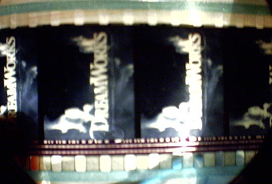
As you can see, it is up in the frame...it seems that the bottom of the 'printed' frameline sits on the actual frameline and thus gives the illusion you need to frame down. But don't or you will ACTUALLY be out of frame.
Is every print like this?
John
------------------
Too much of the rest of the film is given over to a romance between Padme and Anakin in which they're incapable of uttering anything other than the most basic and weary romantic cliches, while regarding each other as if love was something to be endured rather than cherished. There is not a romantic word they exchange that has not long since been reduced to cliche.
No, wait: Anakin tells Padme at one point: "I don't like the sand. It's coarse and rough and irritating--not like you. You're soft and smooth." I hadn't heard that before.
- Roger Ebert reviewing Episode 2.
Having looked at MANY movies in my career, my own feeling is that underexposure is the most frequent culprit in "grainy" pictures. An underexposed negative will print with low density shadow areas ("smoky blacks"), so the fast negative grains that capture shadow detail will be printed light enough to be easily seen on the print. A "richer" exposure pushes the image further up the negative's characteristic curve, onto the finer grained emulsion components, and even the grainer fast components are printed to a "rich" solid black that minimizes the grain.
If I had a limited amount of light, I would choose to use a film that was a stop faster, rather than be forced to underexpose by one stop.
I do not dispute that all things being equal, the larger image area of 2.39:1 anamorphic will yield lower graininess than 2.39:1 Super 35. But the excellent sharpness and low graininess of the KODAK VISION family of films allows Super 35 "Done Right" to look very good:
http://www.kodak.com/US/en/motion/products/negative/
------------------
John P. Pytlak, Senior Technical Specialist
Worldwide Technical Services, Entertainment Imaging
Research Labs, Building 69, Room 7525A
Rochester, New York, 14650-1922 USA
Tel: +1 585 477 5325 Cell: +1 585 781 4036 Fax: +1 585 722 7243
e-mail: john.pytlak@kodak.com
Web site: http://www.kodak.com/go/motion
That Dreamworks title is either a CGI or optical element. Someone erred on the vertical positioning when it was made. It would affect ALL prints.
------------------
John P. Pytlak, Senior Technical Specialist
Worldwide Technical Services, Entertainment Imaging
Research Labs, Building 69, Room 7525A
Rochester, New York, 14650-1922 USA
Tel: +1 585 477 5325 Cell: +1 585 781 4036 Fax: +1 585 722 7243
e-mail: john.pytlak@kodak.com
Web site: http://www.kodak.com/go/motion
If Super-35 can be 'done right', why isn't it? Why did every print I've seen using it have to be grainy?
Could be many reasons:
They wanted a grainy/"gritty" look
They couldn't get enough light to avoid underexposure
They preferred the "look" or flexibility of a faster film stock
A proprietary (non-standard) "silver retention" or "bleach bypass" process was used
It can be "done right":
http://www.theasc.com/magazine/dec97/titanic/pgs35/pg1.htm
http://www.cameraguild.com/interviews/chat_carpenter/carpenter_titanic.htm
http://www.cinesite.com/core/press/articles/1998/01_00_98-titanic.html
http://www.cinesite.com/core/press/articles/1998/02_00_98-digital_revolutn.html
------------------
John P. Pytlak, Senior Technical Specialist
Worldwide Technical Services, Entertainment Imaging
Research Labs, Building 69, Room 7525A
Rochester, New York, 14650-1922 USA
Tel: +1 585 477 5325 Cell: +1 585 781 4036 Fax: +1 585 722 7243
e-mail: john.pytlak@kodak.com
Web site: http://www.kodak.com/go/motion
From memory, yes.
"On the feature We Were Soldiers, the negative was "overscanned" at 4K, and the resulting data was then down-sampled to 2K, yielding a crisper image than a straight 2K scan, but making it possible to work more quickly and efficiently. Seasoned film timer Mike Stanwick, on loan from Deluxe, was brought in to help with the digital timing. Efilm's proprietary timing and conforming software is resolution-independent, and allows 2K and 4K scans to be mixed in the same reel, a feature that's useful for things like resizes and push-ins. In an effort to eliminate lab timing entirely, Efilm's Arrilaser film recorders are recalibrated constantly to compensate for chemistry fluctuations and the high definition video projector used in timing has settings that closely emulate each film emulsion used. According to Efilm's president, Joe Matza, We Were Soldiers is the first film to have been fully mastered at true 2K resolution, timed entirely on a computer and released with no lab timing. Editor William Hoy was very satisfied with the process and indicated that digital intermediate gave the team creative possibilities that they couldn't have had otherwise."
------------------
John P. Pytlak, Senior Technical Specialist
Worldwide Technical Services, Entertainment Imaging
Research Labs, Building 69, Room 7525A
Rochester, New York, 14650-1922 USA
Tel: +1 585 477 5325 Cell: +1 585 781 4036 Fax: +1 585 722 7243
e-mail: john.pytlak@kodak.com
Web site: http://www.kodak.com/go/motion
Links to information about "Digital Intermediate" and digital timing:
http://www.kodak.com/US/en/motion/support/dlad/
http://www.kodak.com/US/en/motion/digital/color.shtml
http://www.kodak.com/US/en/motion/digital/mastering.shtml
Digital Intermediates
http://www.kodak.com/country/US/en/motion/students/onCampus/oct2001/dfm.shtml
------------------
John P. Pytlak, Senior Technical Specialist
Worldwide Technical Services, Entertainment Imaging
Research Labs, Building 69, Room 7525A
Rochester, New York, 14650-1922 USA
Tel: +1 585 477 5325 Cell: +1 585 781 4036 Fax: +1 585 722 7243
e-mail: john.pytlak@kodak.com
Web site: http://www.kodak.com/go/motion
Frank

