This is topic Film Trademarks in forum The Afterlife at Film-Tech Forum ARCHIVE.
To visit this topic, use this URL:
https://ft-forum.com/ft/cgi-bin/ubb/ultimatebb.cgi?ubb=get_topic;f=12;t=000583
Posted by Monte L Fullmer (Member # 2797) on 06-17-2007, 05:09 PM:
Since the discussion with trademarks in the "Ratatouille" topic in the "Features info and trailer attachment" forum, I though we'd better take this topic over here to continue and to follow forum rules in that previous forum pertaining on chit-chatting to be continued to a new area.
One person mentions of the new Disney trademark (which I think is the best thing that has came out of the "House of Mouse" since they redid the "Buena Vista" trademark when Disney quit going through RKO for their features..(and the RKO trademark is shown in the comedy "Are We Done Yet") and began "BV" release with their first CinemaScope feature "20000 Leagues Under the Sea"
One person said about the Pixar trademark..and said that the Universal trademark was tops.
How many of us remember the numerous trademarks that UNI went through..with the airplane circling around the globe (the B/W days..), then the Universal International trademark, how the 'saturn' rings came into focus and surrounded the globe for the Universal trademark of the 60's and 70's, and the current one we have now (which was derived from the opening sequence of WaterWorld..*gasp*).
Now, we shift over to Columbia Pictures - the famous statue of Columbia and it's variations during the B/W era. Plus, Columbia had their sense of humor as well with the 1963 film of "A Man Called Flinstone" with a cartoon descript of the trademark with Wilma posing as Columbia..
Paramount had their mountain, but the two best trademarks from Paramount came from: when they would present "VistaVision" afterwards with the mountain in the background, and the highly detailed artwork of the mountain with red hues for the opening trademark of "the Ten Commandments" (and how many of us remember the little cross symbols that were flashed in the upper right hand corner after each changeover of those 12 reels of film to remind of us of how the widescreen image is supposed to be centered on the screen...) - from "A Paramount Picture" to "Gulf+Western", "Paramount Communications Company", then the present "A Viacom Company"
MGM had Leo .. what can we say. Just that Leo didn't move and roar on the front of "BEN-HUR" and he was completely left out at the beginning of "2001:a Space Odyssey" in choice of a simple drawn circular form in black with a blue background. MGM had their small changes as well with their merger with UA and the gold MGM banner was changed to add in the UA merger in that banner that surrounded LEO. Now, it's back to normal, but one can tell that the trademark is rather a tired one - one can see the graininess of using old negatives...
Warner Bros known for their shield. Yet, in 1966 they dropped the shield for the "W7" since of the merging with "Seven Arts". Then the short lived "A Kinney Company" soon afterwards. Later on in the mid 70's, they went artistic with the simple "W" being of a part of Warner Communications Company. Finally, the shield returns.
..but nothing compares to the superb classic FOX logo with Lionel Newman's "Fox Fanfare" composition hearlding which would begin before the fade-in of the trademark.
Then as the fanfare contiues after the opening segment, the second section of the fanfare would begin with the added script in gold letters on a dark blue sky background:
20th Century-Fox
presents
a
CinemaScope
Film
The fanfare wasn't included on the first two FOX CinemaScope films - being of "the Robe" and "Demetrius and the Gladiators", since Newman had to come up with the second movement of his fanfare to present CinemaScope with the trademark..
Then, a rare addition to the CinemaScope trademark was added for the 55mm process:
20th Century-Fox
presents
a
CinemaScope
Film
in
CinemaScope55
(for the King and I, and Carousel)
It was disappointing when FOX started to use Panavision lenses for their cameras that the "CinemaScope" section of the trademark was taken out.
Yet it was a massive improvement for FOX to switch over to those lenses from using those B&L's that they were using from the inception of anamorphic photography..being that "CinemaScope" is their trademark name.
-Monte
Posted by Mike Blakesley (Member # 26) on 06-17-2007, 07:58 PM:
It is nice to see Disney using a "flag" that befits their legacy. The old blue/white one was really cheap looking.
Remember how Paramount trailers used to open with the logo on screen, and a cool drum/hi hat riff?
PS: I would vote for putting this in the "Yak" forum.
Posted by Gerard S. Cohen (Member # 994) on 06-17-2007, 07:59 PM:
Monte:
Your description of the trademark logos unreels like a compilation of them--I coukld almost see them again in my mind's eye. Have you--or anyone else--compiled them into a digital video that we can view or even download? [And don't forget those from the newsreels: the Pathe rooster crow, the "Eyes and Ears of the World" and the (RKO ?)radio tower broadcasting lightning, et al...]
Posted by Ron Curran (Member # 3631) on 06-17-2007, 10:00 PM:
We in the business practically had multiple orgasms when we showed Down With Love in 2003. An average movie but it revived the fifties Fox trademark with the original Cinemascope extension.
The current Columbia and Warners openers are cool.
Posted by Mike Blakesley (Member # 26) on 06-18-2007, 12:05 AM:
Agreed there.
The only one that's really dull right now is New Line.
Paramount's flying stars are cool, and Universal's is nice. Fox is the all time classic, I hope they never substantially change it.
I was very glad to see Columbia go back to the pure "lady" after their brief foray in the '70s into that dumb half-circle starburst thing.
Mention should also go to Pixar with their Luxo Jr. logo. Very cool especially the faint "click" sound at the end of the movie when he turns his light off.
Posted by Anslem Rayburn (Member # 1267) on 06-18-2007, 12:31 AM:
quote: Gerard S. Cohen
Have you--or anyone else--compiled them into a digital video that we can view or even download?
While not exhaustive by any stretch of the imagination, here's a clip of some changes :
Link
Posted by Ron Curran (Member # 3631) on 06-18-2007, 03:09 AM:
Thanks Anslem.
Hey Mike and Monte, do you remember the beaut Columbia gun-totin' lady on the front of Cat Ballou?
Posted by Christian Appelt (Member # 1067) on 06-18-2007, 08:39 AM:
quote: Monte L Fullmer
MGM had Leo .. what can we say. Just that Leo didn't move and roar on the front of "BEN-HUR" and he was completely left out at the beginning of "2001:a Space Odyssey" in choice of a simple drawn circular form in black with a blue background.
There was another non-standard Leo in front of NORTH BY NORTHWEST, IIRC it was redesigned to fit the Saul Bass main title design.
I recall two versions of a "MGM cartoon" logo, one with Leo dissolving to Tom the Cat meowing and one without the original lion. Still got a laugh when I saw MGMG cartoon in a theatre two years ago!
Posted by Richard P. May (Member # 3598) on 06-18-2007, 11:29 AM:
Monte,
A nice reminicence of the various logos. In your summary of the Universal series, you left out the mirrored globe with the plexiglass UNIVERSAL rotating around it. This was between the period of the airplane and Universal-International.
RPM
Posted by Monte L Fullmer (Member # 2797) on 06-18-2007, 12:50 PM:
yea, whoops forgot about that earlier UNI "plexiglass" trademark. thx for the update on that one.
Yes, and did forget about the "Cat Ballou trademark , and that horrible mid 70's "sunburst" trademark for Columbia that was mentioned.
Yes, the Chuck Jones MGM trademark for "Tom and Jerry" ..
Posted by Bobby Henderson (Member # 840) on 06-18-2007, 01:39 PM:
I guess I should have a little more enthusiasm than I do for the motion graphics "logos" major movie studios have on the front of their features these days. Many of the new branding schemes look great. But then I have a sort of "so what" feeling about them at the same time.
The problem is the technical challenges on creating those motion graphics designs are relatively minor. Sure, some are still costly to make, requiring hundreds or even thousands of man hours to model and animate. The best ones take some beefy render farms to produce. But there's hardly any visual idea that is just plain impossible to produce like it might have been a couple decades ago.
Many of these new motion graphics intros are produced using off the shelf software like Autodesk Maya, Studio 3D Max and Adobe After Effects. Some may use more expensive solutions like Autodesk's suite of high end systems it acquired from Discreet (Flame, Flint, Inferno, etc.). The process is simple enough that even some smaller indie companies and other production companies are developing impressive looking motion graphics branding of their own.
In decades past it was a pretty big challenge to come up with a film distributor brand motion graphic that looked visually impressive and tasteful at the same time. In the 1980's and into the early 1990's we would see a lot of smaller studios lay on the cheesy disco starburst effects and other laughable crap like that.
The late 1960's and 1970's had a decent amount of experimentation with minimalistic graphics. The un-animated MGM lion graphic from 2001: A Space Odyssey was visually stark, but functioned more like a pure logo. Many people use the word "logo" far too loosely, applying it to complex (and often cluttered) graphic designs and even illustrations. Studios like Paramount, Warner Bros and others did similar experiments. Mere remnants of those experiments only survive now on movie poster one sheets where the studios still try to have their brands live up to the true definition of a logo.
Posted by Louis Bornwasser (Member # 3063) on 06-19-2007, 12:45 PM:
I have a pristine 70mm Fox open; Judging by the size of the fingerprints in the flocking, I would estimate the "painting" to be about 24 x 36". The "animated" searchlights were painted on celluloid or plexi and moved; you can see the edges. Louis
Posted by Michael Coate (Member # 757) on 06-22-2007, 05:04 AM:
The 20th Century Fox logos (clips, snipes, whatever you wish to call them) have always been my favorite, especially those featuring the “CinemaScope Extension.” One exception: I dislike the use of the full fanfare when used on contemporary non-scope films, where I find its use inappropriate and running counter to the original concept of the “Extension” music.
I especially enjoy seeing some type of gag or stylization incorporated into a studio logo. (For humorous examples, see Fox’s “The Cannonball Run” or MGM’s “Strange Brew.” Or for visually interesting examples, see Paramount’s “Indiana Jones” movies where the animated logo mountain dissolves into a photographed opening-shot mountain or Universal’s “E.T.” where the logo was played in reverse.)
This month, by the way, marks the 40th anniversary of the retirement of the “Fox Fanfare with CinemaScope Extension” with the release, in the United States at least, of the final official CinemaScope production: “Caprice”*.
Fox would bring the full fanfare out of retirement in 1994, although it did occasionally make an appearance inbetween ’67 and ’94, most notably on “Star Wars” and “Die Hard.”
[*Sources vary on whether the final official CinemaScope film was “Caprice” or if it was “In Like Flint.” I’ve seen references to “Flint” being the last, but I think there may be some question over which one commenced principal photography first vs. the one that was last to be released.]
Posted by Bobby Henderson (Member # 840) on 06-22-2007, 10:49 AM:
Currently just about any 20th Century Fox release that uses the Fox Fanfare music uses the full "CinemaScope Extension" segment as well, regardless of aspect ratio used.
This situation has been in place due to the design of Fox' current motion graphic branding scheme. The extra music is needed for the time it takes for the animation to fly from the top of the 20th Century Fox logo and sweep around the front of it until stopping in the familiar camera angle. That "logo" has been in place since 1994, first introduced with True Lies. Speed was the last movie to use the older logo that had been in use for quite a long time.
The "CinemaScope Extension" of the Fox Fanfare is even played on most Fox Searchlight releases.
Since the current Fox motion graphic is CGI-based, it's been relatively simple to customize it. X-Men altered it. The Star Wars special editions and prequels had stationary versions of it, ahead of the Lucasfilm Ltd. brand mark shown during the "CinemaScope Extension" music. Moulin Rouge framed the logo animation with curtains and the silhouette of an orchestra conductor (which stayed in the frame for the opening titles).
In the 1980s, the Fox logo was altered in weird ways on some 70mm prints. The 70mm print I saw of The Abyss had the Fox logo badly cropped. You could see the "20th" part of it, but much of the lower part of it was clipped. The 70mm print I saw of Die Hard featured a Fox logo horizontally stretched. It was as if they placed a 1.33:1 Fox logo on the front of the anamorphic shot material before printing it to 70mm.
These days it seems like studio logos are altered and stylized in various ways more often than they have been in the past. CGI makes the process much easier. An effects studio can use the original 3D modeling and animation files and do a lot of different things with them.
Warner Bros' logo has been altered somewhat frequently over the last decade. The Matrix is probably one of the best known alterations (turning the WB and Village Roadshow logos green and lacing them with video scan lines). Constantine had the WB logo crumbling away in hellish wind. Didn't the WB logo on Twister emerge out of some story clouds? Million Dollar Baby had a stationary WB logo over a black background.
Some movies have done simple tricks to alter studio logos. Gladiator simply desaturated and tinted the Universal Studios and Dreamworks SKG motion graphics.
Posted by David Stambaugh (Member # 1102) on 06-22-2007, 11:39 AM:
One of the coolest things about seeing Star Wars in 70mm was that awesome Fox Fanfare with the Cinemascope Extension for LucasFilm. With the silence during "A long time ago in a galaxy far, far away..." followed by the John Williams' opening music and the Star Wars title & prologue sequence, it all fit perfectly and added to the feeling that the movie was something special. ![[thumbsup]](graemlins/thumbsup.gif)
I always wondered what the deal was with the Fox logo in front of "Die Hard". Didn't that flat-logo-projected-in-scope error even carry over to home video releases? Anyway "Die Hard" is another contemporary example where the Fox Fanfare fit the movie perfectly.
Posted by Bobby Henderson (Member # 840) on 06-22-2007, 01:32 PM:
quote: David Stambaugh
Didn't that flat-logo-projected-in-scope error even carry over to home video releases?
I don't think so. Each DVD release has had the 1980's era 20th Century Fox logo properly composed for a 'scope frame. I'm not sure if the stretched logo error carried over to any of the laser disc releases.
quote: David Stambaugh
Anyway "Die Hard" is another contemporary example where the Fox Fanfare fit the movie perfectly.
IMHO, that is the very best rendition of Fox Fanfare I've heard on any Fox release. It's just damned ballsy as hell. I remember even being a little startled by it the first time I saw Die Hard in 70mm. The drums thump really hard and the pacing of the music has a certain snap to it that is lacking in a lot of the other customized arrangements of the iconic tune.
I think movies like Predator and Speed used the same recording, but the audio was mixed just a little different. The music's mix on the opening of Die Hard had more slam.
Posted by Steve Guttag (Member # 268) on 06-22-2007, 01:53 PM:
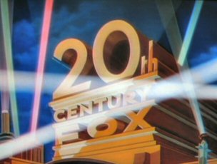
There are many more varients to the openings that listed here but the major changes have been picked off. Like for Fox...keep an eye on the "20" in it and watch the "0" change in shape over the years...it is like they couldn't decide what it should look like until it was bobbed down a bit to its present and consistant form.
The horrible Columbia thing from the 70s (starburst) with the unfocusable letters (on the negatives!)...I remember talking with a guy doing telecine work telling me it was a blur for them too.
The "simple" W for Warners was affectionately known as the "saugage links." I tend to like the older version of the intros best.
Certainly Fox, with the full fanfare is very impressive...I like Leo roaring more than him missing/stationary. I want to say there were some MGM/UA features that had such a intro that they tried to have neither the traditional UA (transamerica) nor the Leo MGM and had what looked like plain jane text with the slash and all. MGM/UA...
I also like the Tri-Star intro with the charging Unicorn...nice music too.
Universal played with their intro too much for me though each time it was easily identified as Universal.
Now who can't look up in the sky and see the stars that form Orion and not expect them to start to swirl to form the "O" in Orion?
Steve
Posted by Scott Norwood (Member # 30) on 06-22-2007, 03:12 PM:
I like the current 20th Century Fox and Warner logos, but both of them really should be re-done at a higher resolution, since the current versions have digital "jaggies" that are way too obvious.
Is anyone else annoyed when video versions of films have different logos than the theatrical versions? One example that comes to mind is the current DVD of "Trainspotting"--the 35mm prints have the "flying-M" Miramax logo, whereas the DVD has the current "city" logo. Minor, but annoying nonetheless. There are plenty of other examples as well.
Posted by Bobby Henderson (Member # 840) on 06-22-2007, 04:36 PM:
Columbia Pictures' branding scheme was sort of hit and miss during the 1970's and 1980's. The starburst thing by itself (which faded into the minimalistic logo thingie) didn't work all that great. OTOH, I liked how the colored starburst was incorporated into the lady's torch, as seen in the opening of Ghostbusters. The torch would intensify in brightness to show that rainbow colored starburst. The lettering on the image had some problems. The rounded and heavy weight ITC Souvenir type with all its shiny embellishment certainly made it a bit difficult to read.
I kind of liked the treatment of Warner Bros' old "sausage links" logo where the camera would zoom through the "W" a couple of times.
Those minimalistic and hard edged graphic logos were all the rage in the 1960's and 1970's. It seemed like most movie studios and TV networks had to develop one. I think the CBS "Eye" logo (first developed in the 1950's) and other icons like the one for IBM were pretty influential. That trend certainly led to the stark graphical logo for MGM on the front of 2001: A Space Odyssey. Warner's sausage link "W" was one of the more successful marks. I remember seeing it on lots of movies and music recordings when I was a kid. Paramount Pictures came up with a decent hard edged logo of their mountain brand during that period.
Paramount is one of those studios that didn't change its opening logo very often. The current CGI flying stars intro has been around for a few years now. I can't remember which movie ushered in that one. I'm pretty sure Top Gun debuted the first flying stars Paramount logo. Previous to that, the traditional mountain painting was used in various configurations, with some transitioning to the hard graphic logo.
quote: Steve Guttag
Universal played with their intro too much for me though each time it was easily identified as Universal.
I don't think Universal has changed its logo more than twice in the last 30 years. The "Saturn rings" logo spanned much of the 1970s and 1980s. Back to the Future: Part II unveiled the version that was used for much of the 1990s. The current Universal motion graphic was introduced with The Lost World: Jurassic Park.
Prior to those three versions, Universal has had a lot of different intro graphics.
Regarding the Tri-Star logo, I liked the music for that motion graphic. But I thought the visuals of the wings coming out of the horse looked pretty fake. The final "print version" logo with the winged horse over the triangle was a nice image.
The thing with Tri-Star also reminds me of Carolco's logo (both were sometimes seen together). Carolco's logo would start out pretty cool looking but after all the dazzling light effects play out and the logo finishes zooming out it just ends up looking fake for some reason. I think it's because the logo was in true 3D perspective at first and then it is collapsed into something with a flat isometric block shadow. It feels like it's breaking a visual rule in its process.
quote: Steve Guttag
Now who can't look up in the sky and see the stars that form Orion and not expect them to start to swirl to form the "O" in Orion?
I was used to identifying Woody Allen movies and such with the Orion logo. After seeing Robocop I always tend to think of that movie whenever seeing those stars swirl around the "O".
quote: Scott Norwood
Is anyone else annoyed when video versions of films have different logos than the theatrical versions? One example that comes to mind is the current DVD of "Trainspotting"--the 35mm prints have the "flying-M" Miramax logo, whereas the DVD has the current "city" logo. Minor, but annoying nonetheless. There are plenty of other examples as well.
In the case of Miramax, their previous logo was so cheesy looking I could forgive them applying the much better looking "city" version to any catalog DVD releases. But from a purist's perspective, I agree any movie re-issue on DVD or in theaters should use the studio graphic from that era.
Posted by Michael Coate (Member # 757) on 06-22-2007, 06:34 PM:
quote: Bobby Henderson
I'm pretty sure Top Gun debuted the first flying stars Paramount logo.
Theatrically, it was introduced with "The Golden Child" (December 1986). The original video versions of "Top Gun," however, did have the logo you're thinking of because those versions were released after the new logo had been introduced.
quote: Bobby Henderson
Back to the Future: Part II unveiled the version that was used for much of the 1990s.
My recollection is that it was "Part III" rather than "Part II" that introduced the '90s version of the Universal logo.
quote: Scott Norwood
Is anyone else annoyed when video versions of films have different logos than the theatrical versions?
Yes, very much so! One of the reasons I don't care for the logo changes is that when the studios dick around with the logos they sometimes (inadvertently?) alter content such as music that may have appeared over the original logo. The original video versions of "Top Gun," for instance, had music removed during the "new" logo, and then when the first post-logo credit comes up the music just "pops on" at full volume. Dumbasses!
Posted by Damien Taylor (Member # 4255) on 06-22-2007, 09:54 PM:
The Back To The Future III DVD, and possibly theatrical release (I didn't go as I was 5) Had that great Universal 75th anniversary montage. I believe Ghostbusters II had a similar one for Columbia. How did they achieve the effect of the lens glare on the circa 1940 Columbia intro? See "His Girl Friday" for example. WB celebrated their 75th with Bugs added to the opening.
Two very nice transfers from universal were on the DVD release of: Dracula's Daughter (1936) which had the circumnavigating plane tag. and,
Son Of Dracula (1943) had the shiny metal earth and spinning glass stars tag.
The Frankenstein release contained the same in varying degrees of blurriness.
UHF also contained that great Orion opening.
Posted by Monte L Fullmer (Member # 2797) on 06-22-2007, 11:09 PM:
quote: Michael Coate
Theatrically, it was introduced with "The Golden Child" (December 1986).
...and beginning of Paramount's 75th anniversary which the "75th" was centered under the "Paramount" script - and was in a more colorful and higher contrast logo, but still with Gulf+Western at the time.
..then, the "90th" anniv logo came in below the "Paramount" script in 2002...
My biggest memory with the Orion trademark (through Warner Bros) was the 1980 John Boorman film "Excalibur" - being that the opening music was from one of Wagner's orchestral pieces from one of his operas..
Then another Orion memory was the 8 academy award winning classic movie in 1984, being that of "Amadeus". with the opening of when Salieri screaming out the words "Mozart" while in the asylum and the opening bars of Mozart's Symphony no. 25 in G minor.
Then, of the British "Top Rank Organization" trademark with the bodybuilder swinging the hammer onto the large gong.
Avco Embassy (when Avco Financial Services bought Embassy Pictures - studio of "the Graduate" fame - which looked good in scope and IB technicolor..) and created the multi colored slanted "A" that would meld those colors into white.
Every time I happen to see the UA trademark with the Transamerica Corporation "T", I think of "Yellow Submarine" and "Fiddler on the Roof" - and to think "Heaven's Gate" destroyed that union...
Posted by Christian Appelt (Member # 1067) on 06-23-2007, 10:57 AM:
Many DVD releases of old movies bear a number of new trademarks.
I do not recall titles, but some MGM black & white films had BOTH the usual grainy Leo in color AND a new CGI United Artists logo.
After the end credits, they added another "excitingly animated" MGM lion to advertise mgm.com - if you fell asleep during the main feature, the cheap "whoosh" sound at ear-splitting volume will either wake you up or give you a heart attack.
BTW, someone must have complained about the CGI UA logo in colour because they changed it to b&w in later DVD releases...
Posted by Bobby Henderson (Member # 840) on 06-23-2007, 11:11 AM:
I liked the United Artists logo which was used on releases like Goldeneye in 1995. Wasn't that the first movie in which it appeared? It looked kind of cool and the music accompanying it was pretty decent as well, at least it worked well with the James Bond thing.
quote: Monte L Fullmer
Every time I happen to see the UA trademark with the Transamerica Corporation "T", I think of "Yellow Submarine" and "Fiddler on the Roof" - and to think "Heaven's Gate" destroyed that union...
I always think of animated Pink Panther cartoons when seeing that mark.
Regarding the MGM logo and its roaring Leo the Lion character, I kind of think of that studio logo as being the "Coca-Cola" of movie studio logos. Cumulative history noted, especially during Hollywood's "golden age," this is the most emblematic icon of Hollywood -even more so than 20th Century Fox' icon.
And that's why I think Sony/MGM is sort of stuck with that logo's current arrangement. Even if they put together some flashy new animated motion graphic with the ribbon flying into the frame or some animated montage of lions or something, all the elements would have to line up into the old logo's arrangement at the end, with Leo roaring inside of that ribbon frame.
It will be interesting to see what happens with MGM's motion graphic branding in the next few years with new James Bond movies and such. I think there's a decent chance Sony will risk playing around with it, but they won't have very much flexibility in how they do it.
Posted by Monte L Fullmer (Member # 2797) on 06-23-2007, 04:23 PM:
quote: Bobby Henderson
I always think of animated Pink Panther cartoons when seeing that mark.
Yes, Bobby I fully agree, and we can also add "the Ant and the Aardvark" in this as well - the many times I ran these two UA cartoons prior to feature beginnings at the Drive-In I used to work at for quite the time ...
Posted by Damien Taylor (Member # 4255) on 06-24-2007, 08:11 AM:
I hate hate hate that cheap looking "glare wipe" mid 90's thing UA had, it was pure rubbish. The only movie I remember having it offhand was Hackers.
Posted by David Stambaugh (Member # 1102) on 06-24-2007, 11:15 AM:
There's an interesting history of the Paramount "Magestic Mountain" logo here.
Posted by Frank Angel (Member # 248) on 07-05-2007, 09:17 AM:
Anyone know if the stylized MGM lion designed for 2001 was ever used again on any other MGM release? I heard someplace along the way that it was designed specifically for that film and remained unique to it.
Posted by Bruce McGee (Member # 131) on 07-05-2007, 01:44 PM:
I liked the Columbia logo on 1959's, THE MOUSE THAT ROARED with Peter Sellers.
Torch lady looks down at her feet, sees a mouse, and runs away leaving the torch light and its power cord hanging.
I'm glad Columbia had a sense of humor with the use of their logo.
Posted by Jesse Skeen (Member # 586) on 07-05-2007, 03:02 PM:
The lion design used on "2001" was also on MGM Records releases, and I think on some of the first MGM/CBS Home Video releases on the tape labels.
Posted by Michael Coate (Member # 757) on 07-05-2007, 04:30 PM:
quote: Bobby Henderson
The 70mm print I saw of Die Hard featured a Fox logo horizontally stretched.
This wasn't confined to the 70mm prints; the 35s had it too.
quote: David Stambaugh
I always wondered what the deal was with the Fox logo in front of "Die Hard". Didn't that flat-logo-projected-in-scope error even carry over to home video releases?
quote: Bobby Henderson
I don't think so. Each DVD release has had the 1980's era 20th Century Fox logo properly composed for a 'scope frame. I'm not sure if the stretched logo error carried over to any of the laser disc releases.
I imagine the stretched Fox logo was a simple mistake of the lab cutting into the negative a flat version of the logo rather than a scope one, and then having a lack of time or a cost-factor preventing a correction. But…when I saw the stretched logo reappear two years later on "Die Hard 2" I had to wonder if it wasn't deliberate.
Anyway, I think the first laserdisc edition did retain the stretched logo. To verify, I recently dug into my laserdisc collection (yep, I kept 'em), but the disc I found for "Die Hard" was the 1995 Dolby Digital remastered edition which featured a corrected Fox logo. (As with a lot of remastered releases, I ditched earlier versions upon acquiring a new-and-improved version.)
quote: Bobby Henderson
Since the current Fox motion graphic is CGI-based, it's been relatively simple to customize it. X-Men altered it. The Star Wars special editions and prequels had stationary versions of it, ahead of the Lucasfilm Ltd. brand mark shown during the "CinemaScope Extension" music.
A stationary version (to accommodate the removal of the CinemaScope Extension music) is what I think should be used on contemporary "flat" releases.
quote: Bobby Henderson
In the 1980s, the Fox logo was altered in weird ways on some 70mm prints. The 70mm print I saw of The Abyss had the Fox logo badly cropped. You could see the "20th" part of it, but much of the lower part of it was clipped.
The off-center cropping in this instance may have been due to the film being shot in Super-35 using a topline composition method. Since "The Abyss" was only Fox's second Super-35 production and was produced fairly close to the introduction of the format, a customized topline Super-35 version of the studio logo probably had not yet been produced.
Posted by Bernard Tonks (Member # 809) on 07-05-2007, 06:37 PM:
Before CinemaScope in the 4x3 screen days. I could never understand why the B+W Fox trade mark also had the searchlights over the front, but on Technicolor films they were only behind the trade mark. Always spoilt it for me! ![[Frown]](frown.gif)
I hate the ridiculous sound delay on the Fox Searchlight Pictures overlong trade mark. ![[sleep]](graemlins/sleep.gif)
![[puke]](graemlins/puke.gif)
Ran most of the Paramount VistaVision pictures. I remember the framing cues well which were printed on 12 frames. Could never understand why they had to print them on every incoming reel though, surely just on the first 2 reels would have sufficed.
Also used to like the Repuplic Pictures trade mark, but cannot remember the sound track. Anyone remember?
Posted by Tim Reed (Member # 137) on 07-05-2007, 08:54 PM:
The front-crossed searchlights reappeared in the mid-60s... on pictures like "Fantastic Voyage" and "Batman". quote: Steve Guttag
watch the "0" change in shape over the years...it is like they couldn't decide what it should look like
I just figured they didn't get the perspective quite right. 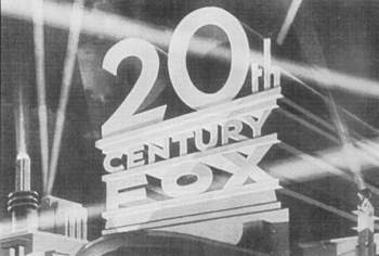
I've always preferred that original first logo. For some reason, it just looks grand to me. In black and white with the searchlights all around, and the odd-shaped "0" it has a surreal appearance that I dig. ![[Wink]](wink.gif) On the track, the drums are prominent throughout the entire piece (as they were on the non-scope versions until the mid-70s), and they're really hammering it out. The arrangement sounds bigger.
On the track, the drums are prominent throughout the entire piece (as they were on the non-scope versions until the mid-70s), and they're really hammering it out. The arrangement sounds bigger.
Posted by Frank Angel (Member # 248) on 07-23-2007, 03:45 AM:
quote: Tim Reed
The arrangement sounds bigger.
Bigger optical recording IM distortion as well -- what does that sound like, maybe 10% It's enough to make you grind your teeth.
Posted by Bernard Tonks (Member # 809) on 07-23-2007, 08:35 AM:
The front crossing searchlights on Technicolor films seemed to appear by the early 1950's going by "Destination Gobi" (1953)
screened on FilmFour TV recently.
http://us.imdb.com/title/tt0045682/
Posted by Damien Taylor (Member # 4255) on 07-23-2007, 10:58 AM:
quote: Steve Guttag
watch the "0" change in shape over the years...it is like they couldn't decide what it should look like
This one just looks really wrong, like 0's about to roll off.
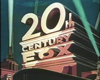
Edit: TV Movie Incident on a Dark Street (1973)
Posted by Tim Reed (Member # 137) on 08-01-2007, 12:50 AM:
quote: Frank Angel
It's enough to make you grind your teeth.
Wasn't talkin' about that. It's obviously a very old recording. I'm referring to the musical arrangement. Humm... I've been down this road before in another thread. The way the instruments are playing this version of the theme, particularly the drums pounding throughout the entire piece, give it a bigger presence than in later arrangements, IMHO. It sounds larger, mightier.
Am I the only one who hears this? ![[Confused]](confused.gif)
Posted by Damien Taylor (Member # 4255) on 08-01-2007, 03:36 AM:
Those poor drums kinda got washed out by the rest of the instruments as time went on. When the fanfare was re-recorded, the decision was probably made to pull them down in the mix. As some said, it could also be due to more archaic sound equalization bringing them out more.
Take a look at M*A*S*H. By 1970 the drums were being mixed to sound like they were being played in a pipe but the rest of the band were right in your face.
Edit: This was the DVD, so it could be a plastering of a later fanfare.
Posted by Claude S. Ayakawa (Member # 1401) on 08-02-2007, 01:22 AM:
I always liked the logo Universal used when the studio was known as Universal-International. I seem to recall the studio used the UI logi during the fifties and reverted back to 'Universal' in the early sixties. What was the purpose of adding 'International " to their logo?
-Claude
Posted by Bernard Tonks (Member # 809) on 08-02-2007, 07:34 AM:
Claude,
International Pictures merged with Universal Pictures. HISTORY LINK
There have been several mergers over the years, too many to mention now. An interesting one is that Gaumont British Pictures was distributed in the UK by General Film Distributors (later Rank), but in the USA distribution was by Gaumont British Film Distributors of America.
Powered by Infopop Corporation
UBB.classicTM
6.3.1.2