This is topic test charts in forum Digital Cinema Forum at Film-Tech Forum ARCHIVE.
To visit this topic, use this URL:
https://ft-forum.com/ft/cgi-bin/ubb/ultimatebb.cgi?ubb=get_topic;f=16;t=003092
Posted by Carsten Kurz (Member # 5396) on 08-10-2017, 11:06 AM:
I heard ISDCF was planning to release some universal test charts, also as a help to adopt to new aspect ratios.
Now, maybe that's an interesting discussion - What makes a good test chart? Of course there are different uses for test charts, and it's probably wise to not mix too many functions into a single chart.
What are your suggestions for the different types of applications?
- Carsten
Posted by Chris Markiewicz (Member # 1415) on 08-10-2017, 05:48 PM:
I liked the Dunkirk 2.20 chart; it was really easy to zoom out to the edge lines. The focus grids were also easy to use. Perhaps a series of stills, one for each possible aspect ratio, clearly labeled?
Posted by Leo Enticknap (Member # 534) on 08-11-2017, 08:17 AM:
Actually, some test charts to aid the creation of screen and lens files for old aspect ratios would have been very useful in my previous job: in particular 1.19, 1.33, 1.37, 1.66, 2.55 and 2.79. Only really relevant to arthouse venues with adjustable masking at least on two sides, but it would have been to me.
The things I need a test chart to do are:
- Verify that color reproduction is correct (e.g. that it's not doing Rec709 when I need it to do DCI XYZ)
- Verify color convergence
- Verify evenness of focus across the projected image (Scheimpflug)
- Ideally, verify evenness of illumination across the frame; though a white test pattern will always be the best way to do this.
- Show any keystoning clearly, to enable me to fix it or mask it.
- Show me if the projected image is even horizontally or not
- Show me any cropping in the projected image
I have not yet come across any chart that puts all of those into a single image: it would be great if someone could come up with one that does.
Posted by Carsten Kurz (Member # 5396) on 08-11-2017, 09:48 AM:
I think it is not a good idea to put all of that into a single image. You could, though make a DCP that cycles through different test charts.
- Carsten
Posted by Carsten Kurz (Member # 5396) on 08-12-2017, 08:34 AM:
I guess focus test charts/targets need to be in full level green. You don' want to mix convergence issues with focus, and green is the color our eyes are most sensitive.
Other than that, test charts should always be full container. For masking/lens files, I prefer to have the background outside of the intended frame in a bright color as well, so I immediately see my masking efforts. Masking on a black background and waiting until your mask touches the framelines is stupid.
To adjust to your physical masking, and it order to still see the 'outside' on that masking, I guess white is preferable.
As for setting up a new format, e.g. for 2.0:1 or 2.2:1, frame lines, bright outside, and focus marks plus a text indicating the aspect ratio should be all that is needed, as a new lens setting should always also need a focus check.
I guess it would also be nice to have pixel scales on every side, so you can see how much of the intended format is actually being cropped away, and wether the cropping is symmetrical.
- Carsten
Posted by Bill Brandenstein (Member # 7758) on 08-12-2017, 09:21 AM:
This sounds like something that could be put together in Photoshop, then converted into DCPs. 3 for each aspect ratio? Near-white with coarse black grid (brightness), green with detailed annotated grid (converging, masking, cropping), color test. I don't have enough knowledge and experience to do this straightaway, but I've created and used test patterns for years in other contexts and having "go-to" files has been great.
Posted by Carsten Kurz (Member # 5396) on 08-12-2017, 05:31 PM:
The process is clear, no problem to do it in photoshop and convert to DCP. The question is, what makes a good test chart?
- Carsten
Posted by Steve Guttag (Member # 268) on 08-13-2017, 07:13 AM:
I, like I presume many others, carry a collection of test charts with me (PNG and TGA) with just a few converted to DCP. Since I work just about exclusively with DLP machines, I can use the projector patterns most everywhere and for setting screen files, they are perfectly accurate. I haven't found anyone to have an exclusivity on ideal test patterns though I've gone to the Barco patterns most. I like their "Framing_Uncorrected" for most things. It has a lot of useful information in a single chart. You get Flat and Scope ratios that are color coded, focus, convergence, focus uniformity, color presence, grey scale uniformity...etc. all in a single chart.
Barco also "wins" for me on their "Focus Green" pattern for getting focus uniformity. There are a lot of patterns, in the green color only, where you want them. So you can check/set Scheimpflug/bore-site/uniformity pretty well.
For Real-D XL, I like NEC's 8-bit cross pattern. It lets one see not only the center but how well you have the two outputs converged over the entire screen since it is a full grid. For setting DCP ratios it is frustrating and it does have a 16x9 rectangle in there but I still just use it for Real-D XL.
For other ratios, I've had some "help from my friends" to generate test patterns. One of them is comprehensive in that most of the ratios from 1.33 on out are on it but in order to make it not "busy" it may be a bit too simplistic. It alternates white and black for the ratios so you can see when you are getting to the next ratio/where the edge is of yoru current ratio and then corner arrows in unique colors. I have also had custom charts made for 2.0 and 2.1 for back in the Tomorrowland/Jurassic World era plus I have sites that regularly show 2.2 movies due to their "classic" nature. The 2.2 pattern has the ratio for Flat, Scope and Full containers.
Christie has their "Framing2" pattern that has many of the "film" ratios on it and is available in PNG (2K and 4K) as well as TGA for series 1.
If you use anamorphic lenses, as I do, Christie's standard target pattern can be handy as it has a 1.25 squeezed oval on it that should be ROUND when you are done.
I agree with Carsten about having a light area outside of the ratio to know when you are approaching though I don't think it needs to be white. In a multi-ratio pattern, the light area could be distracting or lower the effectiveness of other ratios on the pattern.
One technique I've taken to is to create screen files of all of the ratios I use. Creating screen files are easy and anyone can do it on any DLP projector (and the work in any DLP projector including going from series 1 to series 2). So, if I'm going to create a 2.2 lens file for a site, I'll loading in my 2.2 screen file, put a full white pattern up and zoom the lens until it fills the screen appropriately, check focus/zoom until both agree and then save the screen file under a new name and "mask" as appropriate. It takes almost no time and you know you are not cropping any more than needed since you started with the full frame for the ratio. You also minimize your time adjusting the screen file since you are only taking away those bits that overhang your screen/masking system.
Posted by Leo Enticknap (Member # 534) on 08-13-2017, 11:10 PM:
Agreed that the Barco built-in test patterns are especially good - much more so than the NEC ones.
However, when measuring screen brightness, I would always treat a peak white DCP as more reliable than a projector-generated test pattern coming directly from the ICP. About a year ago, I had a studio tech come to check us before an important screening. I had previously measured the brightness after tweaking the triaxial lamp alignment using the projector's inbuilt white test pattern (this was an NEC 3240), and got 14ft-l, plus or minus 0.2 or so, everywhere on the screen. The studio tech then came, and insisted on using an FS Peak White DCP to take his readings, which came out at between 11.5 and 12.
Neither he nor I had any idea why the difference was so big, but he pointed out that if the white test pattern is coming from the DCP server, then what you're measuring is following the exact same signal path as what you're showing to an audience, whereas a test pattern generated in the ICP is not. He wanted to check the colors using red, green, blue and white DCPs after shooting them, too, although for that there was hardly any difference.
Posted by Jeremie Dunand (Member # 9938) on 08-14-2017, 06:55 AM:
In France, we have the CST (Commission Supérieure Technique De L'Image Et Du Son, in english : Superior Technical Commission for Image and Sound), which provides free charts for: framing (2K and 4K), subtitles, 3D, sound ... As well as colorimetry , Luminance and contrast. These charts are available for free on the CST website since early 2015.
Webpage for download : http://www.cst.fr/produits-et-services/mires-numeriques/
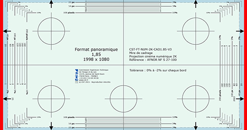
Even if they have French text on them they are quite usable all over the world.
Hope that can help some of you. ![[Wink]](wink.gif)
Posted by Steve Guttag (Member # 268) on 08-14-2017, 07:08 AM:
While I agree that using a DCP should be the final test/measurement with respect to color/brightness (it is in the spec, actually) because it does test the FULL signal path, if one verifies that they are also reading the proper color, then the differences will be VERY small.
Most people, when they read their brightness don't verify that the correct TCGD (color verification) is selected before making that measurement and that will give a skewed (brighter) reading. You definitely cannot choose the uncorrected white "pattern." You have to use RGB full white with the right TCGD to have an accurate reading. Some projectors make taking these readings difficult too. I suggest using the DLP program if using projector test patterns so you know what you are putting up on screen.
NEC needs a substantial amount of color correction. Their "native" color is VERY blue. This adds into why they are typically 20% less light efficient than their other DLP competitors.
On 3D, you are almost always best served by using a DCP of your colors. You have a very poor sense of what processing is going on and if the 3D apparatus is syncing to an internal pattern. I had one chain accuse a site I set up of having wildly off color/light balance on a Real-D system. I have no doubt they were using a projector pattern when they made their readings and the meter was telling them, probably accurately, what it was seeing. Furthermore, I always have the 3D glasses with me when taking 3D light readings so I have a better chance of making sure the proper calibrations are happening for the meter to read. It should be VERY hard to get Real-D (or other polarizing system) to have wildly differing eye luminance levels nor should it drastically shift the color.
Posted by Ian Freer (Member # 1940) on 08-14-2017, 04:52 PM:
quote:
...using an FS Peak White DCP ... came out at between 11.5 and 12.
I have noticed the same thing with NEC projectors when comparing the projectors internal white pattern against the Dolby supplied Peak White FS pattern. From memory it's consistent though, not just a one-off occurrence.
Powered by Infopop Corporation
UBB.classicTM
6.3.1.2