This is topic Lobby Decor in a new Regal in forum Ground Level at Film-Tech Forum ARCHIVE.
To visit this topic, use this URL:
https://ft-forum.com/ft/cgi-bin/ubb/ultimatebb.cgi?ubb=get_topic;f=5;t=001818
Posted by David Stambaugh (Member # 1102) on 12-30-2006, 07:08 PM:
EDIT: I changed the title of the thread because the lobby turned out looking pretty good to me (read further in the thread). ![[Razz]](tongue.gif)
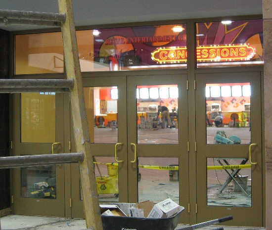
I was at Valley River Mall here in Eugene today. Walked over to where the new 15-plex is going up. You can see the lobby and concessions area through the construction viewing windows. Lots of reds, orange, yellow, creme colors, very warm, looks ok. So far so good.
But then there's the massive wall above the concessions stand. In giant letters, randomly placed several times, is the text "REGAL ENTERTAINMENT GROUP". WTF? They might as well put their stock symbol "RGC" up there too along with a ticker showing the current share price. Maybe a big giant painting of Philip Anschutz.
[ 02-20-2007, 03:54 PM: Message edited by: David Stambaugh ]
Posted by Adam Martin (Member # 641) on 12-30-2006, 07:39 PM:
You mean something like this?
Alhambra Renaissance 14
This theater was one of those that Edwards started building right before the takeover by REG, so the outside is all Edwards-y and the inside is all Regal-y.
Posted by David Stambaugh (Member # 1102) on 12-30-2006, 07:51 PM:
Goddam, that's ugly! Admittedly this new build isn't finished and there's nothing up there but this text right now, probably gets some more graphics, but still. At least Cinemark 17 here has a nice Hollywood-theme mural and not just a big ugly "Cinemark" logo. It's about entertaining the customer, not promoting the company.
Posted by Jeff Arellano (Member # 3249) on 12-30-2006, 08:27 PM:
Yes, the Alhambra Regal is damn ugly inside.
I really can't wait to see how Anschultz designs the interior of the flagship of Regal....the LA Live theatre scheduled for next year (even though they are still working on the parking structure underground).
Posted by Monte L Fullmer (Member # 2797) on 12-31-2006, 02:57 AM:
Nope, that's all of the good ol' "classic" EDW's looks inside at the Alhambra 14 - the carpet pattern and the usage of marble floors are the same as the two EDW 14 units that are here in Idaho but with a slightly different floor layout-with the same high lobby ceiling.
Yet, hallway to the entrances for the smaller auditoriums on each side is basically the same with the two big houses directly behind the snakbar.
Just the usage of "Stadium Theatres" on the front of the Alhambra building looks like a font that REG uses.
You're gonna have to leave Anchutz out of the design thing - he's just the main investor of those three companies that he took control of and he placed REGAL in charge of these three companies in their operations.
-Monte
Posted by Mike Olpin (Member # 1115) on 12-31-2006, 04:32 AM:
The basic architecture of Alhambra is Edwards, however the touches are Regal. For instance, the large space occupied by the logo was most likely intended for one of the Edwards murals. Edwards wouldn't have painted anywhere in the lobby that shade of yellow either.
As far as REG's newest builds, I think that they've shown a significant improvement over the design of many of their late 90s locations.
Posted by Charles Greenlee (Member # 3856) on 12-31-2006, 05:33 AM:
Yeah, our interior is pretty ugly. Add to it we're over 20 years old, so the painted cinder block has a nice caked effect. Remember public schools, where the brick didn't have any texture anymore, just shiny white paint? Kinda like that, though not as bad, yet. The color scheme is what gets me. I'll see if I can arrange some pics. We are a REG. Was Litchfield, then simply Regal, now Regal Entertainment Group.
I don't think I'm supposed to take and post pics of my own theatre, not sure. Else fails, I'm sure I have a friend willing to post them. ![[Big Grin]](biggrin.gif)
Posted by John Alan Petrey (Member # 3906) on 12-31-2006, 11:08 AM:
![[fu]](graemlins/fu.gif)
Posted by Charles Greenlee (Member # 3856) on 12-31-2006, 12:14 PM:
Well that was uncalled for. I wonder if your figer may be injured, and you're trying to show me the injury. But most likely it is more childish games. Anyhoo, back to the subject at hand. Our interior color scheme is like something I'd do on a roller coaster on RCT. I always paint them all putrid, I think somehow it adds to the puke fator of the ride.
Posted by Robert Minichino (Member # 3495) on 12-31-2006, 01:42 PM:
Hey John, out of now 15 posts, how many are of you waving that thing around? You keep doing that and it's going to get snapped off. ![[Smile]](smile.gif)
Posted by Bill Enos (Member # 440) on 12-31-2006, 06:01 PM:
The Alhambra 14 is gorgeous compared to Regal's Virginia Center complex in Richmond, Va. Low ceilings, lots of almost institutional greens, like going into a cave. Clean and never had an issue there though.
Posted by Cory Isemann (Member # 2517) on 01-02-2007, 01:34 PM:
quote: Bill Enos
like going into a cave
Yes, Bill is right on there. I have actually gone and replaced all of the hallway ceiling lights with fluorescent bulbs, seems to have made a difference, makes the hallways a little brighter. We got new carpet and newer seats in the older part of the building.
Our building is an older design that I wish they'd do a little more to update just for appearance's sake. The Kiln Creek Stadium 20 in Norfolk (VA) is a perfect example. Renovations completed recently included a new concession stand, new carpet and seats throughout the building, a party room, and new wallpaper. Looks really spiffy.
Posted by Eric Hooper (Member # 1730) on 01-03-2007, 10:31 PM:
REG sucks.
Posted by Charles Greenlee (Member # 3856) on 01-04-2007, 02:32 AM:
quote: Eric Hooper
REG sucks.
Yeah, I'm sure they're not the finest, but I've worked for worse, far worse. ![[Cool]](cool.gif)
Posted by Eric Hooper (Member # 1730) on 01-05-2007, 07:11 PM:
I was more talkin' from a patron's POV...
Posted by Monte L Fullmer (Member # 2797) on 01-05-2007, 08:25 PM:
..is Charles trying to make his REG one of the better REG's in the circuit?
Should make him District Booth Certifier then - and he can earn some extra fat on the side of every booth person that he certifies each through all four levels.
Posted by Charles Greenlee (Member # 3856) on 01-07-2007, 04:05 AM:
quote: Monte L Fullmer
..is Charles trying to make his REG one of the better REG's in the circuit?
I wish. I'm afraid that's alot more than I can chew. I'll stick to making sure the presentation is the best I can make it. Not much I can do about everything else, such as lobby decor, except annoy the GM till she does something, if she can.
Posted by David Stambaugh (Member # 1102) on 01-14-2007, 06:45 PM:
I had a look at this again today. I gotta admit it looks a LOT better now. The "Regal Entertainment Group" text is almost in the background, surrounded by patterns of very bold colors (I sound like an interior decorator) and a large orange/red neon "Concessions" sign. It's movie-theatre garish but it looks ok. Looks nothing at all like the Alhambra Renaissance 14.
Posted by David Stambaugh (Member # 1102) on 01-28-2007, 08:23 PM:
Here's a crappy snapshot of how the lobby sorta looks:
Posted by Jesse Skeen (Member # 586) on 01-29-2007, 04:44 PM:
They oughta sell ad space on some of those walls ![[Wink]](wink.gif)
Posted by Darryl Spicer (Member # 711) on 01-29-2007, 09:33 PM:
Why do you need a big sign that says concessions on it. I mean come on people should know that is the concession stand. All that does is create something that can breakdown and look like shit when it is not working properly.
Posted by David Stambaugh (Member # 1102) on 01-29-2007, 09:59 PM:
I wonder why they didn't go with "Snacks" or "Snack Bar" or something.
Posted by Mike Blakesley (Member # 26) on 01-29-2007, 10:01 PM:
quote: Darryl Spicer
Why do you need a big sign that says concessions on it. I mean come on people should know that is the concession stand.
I wondered the same thing.
Posted by Bobby Henderson (Member # 840) on 01-29-2007, 10:19 PM:
Ewww. That "concessions" wall design looks pretty harsh, even toxic. It doesn't make me think "movies." I'm thinking of something more like "can I order a chicken fried steak with my popcorn?" It definitely gives off a Cracker Barrel Restaurant kind of vibe, but in a more cheesy way.
Posted by Mike Blakesley (Member # 26) on 01-30-2007, 01:07 AM:
quote: Bobby Henderson
That "concessions" wall design looks pretty harsh, even toxic.
It'll "date" fast, for sure, if it isn't "dated" already.
I have always thought that Cretors' one dumb feature on their popcorn machines was the big sign saying POPCORN. Duh; you can see it, smell it, and hear it being popped, so why not just put a cool looking red top on the machine like Manley used to do?
quote: David Stambaugh
I wonder why they didn't go with "Snacks" or "Snack Bar" or something.
The way things are these days, I'm surprised it doesn't say CONCESSION'S.
Posted by David Stambaugh (Member # 1102) on 01-30-2007, 09:26 AM:
quote: Mike Blakesley
The way things are these days, I'm surprised it doesn't say CONCESSION'S.
lol. Very true, unfortunately.
Posted by Bobby Henderson (Member # 840) on 01-30-2007, 12:29 PM:
Something like "concession's" would very likely appear if every sign company caved to deliberate grammatical errors when requested. Some people actual do ask to have apostrophes and other crap stuck in where it doesn't belong just to be different. Usually it takes someone with a little backbone to tell the customer how stupid it will look to most people. Granted, you have to phrase the comments carefully, but out of professional responsibility the customer really needs to know the truth.
Posted by Charles Greenlee (Member # 3856) on 02-07-2007, 11:32 PM:
quote: Eric Hooper
I was more talkin' from a patron's POV...
Yeah,there's only so much the lower managment can do. We try our best here, and do get compliments, but I know there's room for improvment. Like I said, even from a patron's standpoint, there are worse, and probably better. Poeple compliment us on our service far more than "Your theatre across town", the 10-plex, which is by far newer. So I can take pride that even if the company sucks, at least we aren't the worst of the worst, not that the 10 is the worst.
Posted by David Stambaugh (Member # 1102) on 02-18-2007, 07:46 PM:
Here's another poor-quality snapshot of the finished lobby:
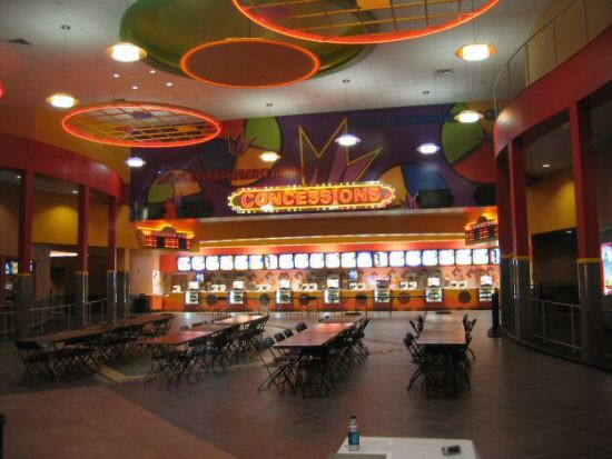
Presumably the folding tables & chairs are for interviewing new staff or training or something.
I'll submit a few more pics of the interior mall marquee and the exterior to CinemaTour.
Posted by Andrew McCrea (Member # 674) on 02-18-2007, 10:15 PM:
It already looks dated.
Posted by David Stambaugh (Member # 1102) on 02-19-2007, 10:29 AM:
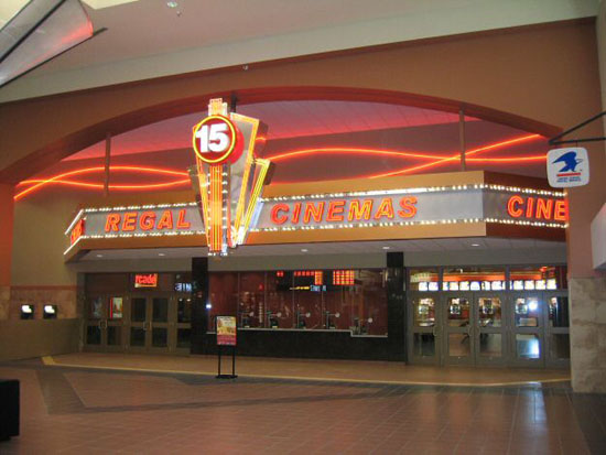
It looks better in person than in the snapshot. It's movie-theatre garish but it kind of works I guess. The facade/marquee facing the interior mall has lots of bright neon and flashing lights, makes everything else in that mall look very drab in comparison.
Posted by Louis Bornwasser (Member # 3063) on 02-19-2007, 11:38 AM:
July 27, 1999
Posted by Scott Jentsch (Member # 1681) on 02-19-2007, 03:21 PM:
quote: David Stambaugh
I'll submit a few more pics of the interior mall marquee and the exterior to CinemaTour.
David,
If you're willing, I'd like copies of some of your photos to add to our Photo Gallery for that theater (we have none at this point). Feel free to send them to my E-Mail address in the "Mail" link. Let me know how you would like to be credited, as I give credit where credit is due for people who submit photos.
Thanks!
Scott
Posted by David Stambaugh (Member # 1102) on 02-19-2007, 04:52 PM:
Scott - Done!
Posted by Stephen LaPadula (Member # 3050) on 02-20-2007, 02:48 PM:
Question, why are so many people on this forum blasting Regal for their unique design? There are countless threads on this site that scrutinize big chains for building 'cookie cutter' theatres. god forbid someone does something different, someone spends time and money to give a building a unique look. AMC builds theatre with murals of dead actors, Lowes builds with the famous quotes those dead actors said, and Cinemark, the worst of all, has black and white checkered tiles on every visible surface, so nauseating Helen Keller would have a seizer!
I applaud Regal for *trying* to be different....No one is ever pleased.....
Posted by David Stambaugh (Member # 1102) on 02-20-2007, 03:50 PM:
I actually think the lobby design turned out pretty cool. Maybe I'll change the title of the thread now.
Here's how it looks inside the mall (some of the neon wasn't installed when the pic was taken).
Posted by Brad Miller (Member # 2) on 02-20-2007, 08:44 PM:
I've got to side with Stephen, and that picture David posted above looks pretty nice. These companies that go out there and don't just use the same set of blueprints over and over should be applauded. ![[thumbsup]](graemlins/thumbsup.gif)
Plus, what's REALLY important is how well the auditoriums are designed and the presentation. Big freakin deal if the lobby doesn't blow me away. If I have to spend more than 5-10 minutes in there the managers aren't doing their job right, but I'll spend 2 hours in that auditorium.
Posted by Darryl Spicer (Member # 711) on 02-20-2007, 09:13 PM:
quote: Stephen LaPadula
Cinemark, the worst of all, has black and white checkered tiles on every visible surface
Not anymore....Cinemark new builds are very nice inside and easy on the eyes.
Posted by David Stambaugh (Member # 1102) on 02-20-2007, 10:13 PM:
Maybe someone from Regal will see this and let me take some pics of the booth and auditoriums. Just click on my mail link.
Cinemark 17 in Springfield (built in 1999) looks pretty classy. Really nothing at all like the Movies 12 they built here around 1990. Except for the purple seats. They need to spruce it up though, it's starting to look a little worn around the edges.
Posted by Sam Graham (Member # 2889) on 02-20-2007, 10:40 PM:
Am I the only one looking at the mall entrance picture and wondering why Regal would have its own post office?
Posted by Adam Martin (Member # 641) on 02-20-2007, 11:30 PM:
Maybe they're planning on getting a lot of complaint letters. ![[Devil]](graemlins/devil.gif)
Posted by Monte L Fullmer (Member # 2797) on 02-21-2007, 12:21 AM:
When they open up this 15plex, what's going to happen with CinemaWorld 8 when REG leaves it.... bust it down for another Wally's World SuperStore?
Posted by David Stambaugh (Member # 1102) on 02-21-2007, 09:36 AM:
Cinema World 8 will be shut down. Regal may have given some thought to making it a dollar house, but it's probably too big (that's my theory -- 2 400+ seat houses). The building has had a "For Lease" sign on it now for a while, apparently no takers. I expect it will be demolished and replaced with something else. Too bad because it was a pretty good place to see a movie most of the time.
There's a USPS kiosk over to the right in that picture.
Posted by Charles Greenlee (Member # 3856) on 02-24-2007, 11:24 PM:
Our REG theatre is painted some gaudy colors, looks like they had a contract to get it painted by the easter bunny. But I will agree, better than another "clone" or "cookie cutter". Still, I'd like to see a themed multiplex. Like maybe with an Egyptian motif, or something interesting.
Posted by Bobby Henderson (Member # 840) on 02-25-2007, 11:10 AM:
quote: Stephen LaPadula
Question, why are so many people on this forum blasting Regal for their unique design?
Ugly design is ugly design, even if one claims it is "unique." I think that "concessions" sign has a pretty toxic color scheme. The box office sign David later posted looks much better. However, the use of bold weights of Helvetica seem like an odd choice for movie theater type. I would have tried using something with at least a little more visual flair. San-serif faces like Frutiger, Gill Sans or Gotham would have looked better.
Helvetica is used, past the point of over-use, in neon filled channel letter signs for its even stroke widths and lack of serifs. Helvetica style channel letters are much easier to build. When I must design a channel letter sign using Helvetica, I try to use condensed or extended weights of Helvetica-Neue if I have the freedom to do so.
Posted by Monte L Fullmer (Member # 2797) on 02-25-2007, 05:34 PM:
quote: David Stambaugh
to making it a dollar house, but it's probably too big (that's my theory -- 2 400+ seat houses).
..yet, you'd think that an 8plex with those two large houses would benefit from the growth of attendance and snakbar sales if that place did go a 2 buck discount palace - to help offset the higher expenses that is present at the 15plex. - let alone the profits made in the boxoffice with far less film percentages to pay for at the first week and continual slight reduction of precentages as the film stays on...
-Monte
Powered by Infopop Corporation
UBB.classicTM
6.3.1.2