This is topic New website from a template - good idea? in forum Ground Level at Film-Tech Forum ARCHIVE.
To visit this topic, use this URL:
https://ft-forum.com/ft/cgi-bin/ubb/ultimatebb.cgi?ubb=get_topic;f=5;t=002966
Posted by Mike Blakesley (Member # 26) on 02-11-2016, 02:10 AM:
I've been feeling for about 5 years (at least) that our website needs a major upgrade, but we don't have the budget to hire a designer to build it from the ground up. It doesn't need to do e-commerce (we have an RTS portal for that).
I built our current site from scratch using Microsoft FrontPage. A couple of years ago, I purchased Adobe DreamWeaver with the intention of migrating over to that and building a new site, but I got pretty confused rapidly. So I backtracked and upgraded FrontPage to Microsoft ExpressionWeb, which is a little closer to my skill level, but haven't really had the time to start from scratch like I wanted to -- and I feel like something home-built will still turn out to be no better than we have now.
I found this site that offers website templates, from which I found this:
Sample website
... for $69.00. It's a DreamWeaver template.
So my question for you all is, does anyone have experience with using one of these things? Is it a huge nightmare to learn enough DreamWeaver to modify it? Or would I be completely in over my head?
I have a basic understanding of HTML but have never done my own coding. I don't know much about CSS or the languages and etc. that have come along in recent years.
I guess my real question is, should I take the plunge on this or should I bite the bullet and hire a pro?
At least if I take the plunge I'm only out the $69.00. But any advice or thoughts would be appreciated.
Posted by Kenneth Wuepper (Member # 1174) on 02-11-2016, 08:12 AM:
Hello Mike,
You could have more fun than at the casino for that $70.00.
Here is what our page looks like.
http://templetheatre.com/
It is maintained by our staff and although it loads pretty slowly it is not unlike your sample.
KEN
Posted by Rick Raskin (Member # 1561) on 02-11-2016, 10:45 AM:
Microsoft ExpressionWeb V4 is free. I've been using FrontPage for many years and just downloaded the free V4. You may want to give it a shot before paying $69.00.
Posted by Scott Norwood (Member # 30) on 02-11-2016, 12:54 PM:
Have you looked at Wordpress? That is what most non-web-developer types are using now. It is pretty easy to work with, especially if your hosting provider can give you a "canned" installation of it that is ready to go.
Assuming that your web site's primary function is to provide a place to post your showtimes, prices, directions, and maybe some pictures of your theatre, it should be pretty simple to set up and maintain.
There are plenty of themes, templates, and plugins available for free or at low cost.
Posted by Randy Stankey (Member # 64) on 02-11-2016, 02:08 PM:
If all you want is a "This is who we are and here is what we do" kind of website, templates are fine. A lot of templates like Wordpress or Joomla offer updateable content so you can do things like post events or movie schedules and stuff.
If you want a more customized website with personalized logos and stuff, you'll need to design your own or have somebody do it for you.
There's nothing wrong with templates. They just look "template-y."
But if you don't mind the template look, go for it. ![[Smile]](smile.gif)
Posted by Justin Hamaker (Member # 2165) on 02-11-2016, 04:31 PM:
Mike, have you considered going to the local high school and hiring a student. I'm sure there are at least a few kids in your community who could knock something out for relatively little cost, and you keep your money local.
Posted by Bobby Henderson (Member # 840) on 02-12-2016, 12:11 PM:
I really hate what has become of web sites lately. Any sense of proper graphic design is just plain dead with these things. Mobile is all to blame for it.
The need for making web pages "responsive" to fit a whole bunch of different devices is the problem. Phones, tablets, notebooks and regular desktop PCs all have displays that vary extremely in size, resolution, aspect ratio and screen orientation (vertical or horizontal). This is essentially a far worse and far more complicated geometry problem than what video authors faced trying to fit a CinemaScope movie into an old 4:3 TV set.
Basically modern "responsive" web pages can't have any sense of composition at all anymore because no fucking frame can be clearly defined. This shit stinks itself over into photography, illustration and graphic design. If you properly compose your image the "responsive" image frames might change their shape and crop your image in all sorts of stupid, unpredictable ways. Photos end up needing a lot more dead space around the subject and the subject needs to be centered in the frame. Rule of thirds? Golden Spiral? Kiss my ass.
And then there's all the coding. What a mess that has become.
Steve Jobs and co. successfully killed Flash, but replaced it with an even bigger mess, HTML5. Browser makers have adopted it in wildly inconsistent ways. HTML5 offers no performance benefits over Flash when using the same kinds of vector animations in SVG & Canvas objects.
If you want to try to maintain control over the look and composition of your web site, like have it look properly composed on a phone, tablet, PC, etc. You can create separate designs for each and trigger them using break points. BUT, that's a shit-ton of work to do, and you gotta include lots and lots of coding hacks so each tailored layout doesn't fall apart when brought up on older computers whose browsers haven't been updated in years.
A bunch of modern web site functions are heavily tied into JavaScript and JQuery. A web developer who is going to hand code his own web sites has to know those things. He also needs to know AJAX, PHP and a bunch of other shit.
Web design, or rather Web Development has turned into a very user-UNfriendly thing. Mobile complicated the situation even worse. That has forced damned near everyone except for those with lots of time on their hands and computer scientist levels of coding knowledge to just punt and go with the bland template crap.
Wordpress has taken over a huge amount of the web already. Lots of sites are done using Joomla and Drupal too.
I've been messing around with Adobe Muse. It will let you visually design a web site. They just released a new update that incorporates support for responsive layouts. The downside with Muse is the code it generates. There's no rhyme or reason to it, which can turn into a problem for search engine optimization. Muse users have to do a bunch of work within the program to aid SEO.
Posted by Frank Cox (Member # 6258) on 02-12-2016, 03:16 PM:
On the other side of the issue, many (most?) websites really have no need to incorporate dancing fish and teddy bears singing Auld Lang Syne. If I want to see if Joe's Plumbing also services air conditioners I want a nice summary website: 'Joe's Plumbing. Phone Number. Address. We service air conditioners." Dandy. If I have to go through five pages of singing fish to find what I want to know, I'll probably give up before I get there.
It's the same sort of planning that as lots of roadside billboard advertising where a restaurant thinks they have to post their entire menu on the sign. Who's going to read that when they're ripping by at 60mph.
Some people who put their business names on the door of the truck. Dandy, until they use a font that's so fancy you can't read it, or a phone number that's so small you can't see it.
"Prettier" isn't always synonymous with better. I'm a believer in getting the information out there first and foremost. If it's pretty, fine. If it's not, oh well. The information is available.
Posted by Justin Hamaker (Member # 2165) on 02-12-2016, 03:34 PM:
I agree with you Frank. I think there is a reason for EVERY business to have a web site. But for many businesses it doesn't need to be much more than a digital business card, maybe with a simple contact form. In the case of an HVAC or similar business, they could add content such as basic trouble shooting or maintenance tips, but they don't need an elaborate site.
For businesses which have a need for something more elaborate - such as a movie theatre or a company selling products on-line, I prefer simple over flashy. Something where the information is presented in an easy to read and access format. Although Flash and Javascript elements are not necessarily a bad idea, I have seen too many examples where these elements are buggy or slow to load.
As for the complaint about mobile pages, the easiest solution is to have a mobile and desktop page. It only takes a few lines of code to create a page which scales to fit mobile devices. Then it's just a matter of creating a design which scales easily. It's also fairly simple to detect a mobile browser and automatically direct the user to the mobile site.
Posted by Mike Blakesley (Member # 26) on 02-12-2016, 06:35 PM:
So from reading the above (especially Bobby) I'm thinking maybe I should just stick with the status quo. Maybe make some of the existing pages wider - I think we're currently about 950 pixels wide, something like that.
My site has the most pertinent info on the front page (showtimes, contact, upcoming movie info) and if a person wants to dig deeper, there are pages for history, pictures, some statistics, old news articles and such. Of course the front page gets about 98% of the hits, and it's readable on a mobile device, so maybe I'll just leave well enough alone.
Posted by Frank Cox (Member # 6258) on 02-12-2016, 08:02 PM:
You might want to consider getting an app. I wrote an Android app for my theatre a couple of years ago and it has a few hundred users. A lot of people like it because you don't have to go to my website to find out what's playing. Load the app, click "what's playing", and there you go.
There are more hits in my server log on the "regular" what's playing page, but there are several hits every day on the app what's playing page so people are obviously using it. I put a QR code with the google play app url in a frame on the wall in my lobby and see lots of folks taking a picture of it so it does get attention.
Posted by Bobby Henderson (Member # 840) on 02-12-2016, 09:05 PM:
quote: Frank Cox
On the other side of the issue, many (most?) websites really have no need to incorporate dancing fish and teddy bears singing Auld Lang Syne.
That's a dismissive judgment on what graphic design brings to the table in web development. There's a lot more to it than just dancing fish or some other superficial crap. Design is important in visually organizing the information in a more legible and more interesting way. It's isn't just about making things "look pretty." Color scheme, choice of type, use of white space and many other things play a part in what is a delicate balancing act.
The latest standards of CSS3 and HTML5 offer the potential for a web page to look almost as visually sophisticated as any high end magazine layout. There are still some limitations. For one thing it's a real pain to access special characters (such as alternate swashes, small caps, ligatures, etc.) in web fonts derived from pro-level OpenType fonts. Anyway, for all the design capability the latest HTML standards offer the whole responsive thing takes a giant shit on it. Hence all the canned template-driven web sites, most of which tap into the same few web fonts served up by Google.
If a web site looks plain as a bowl of cold oatmeal it will lose repeat visitors. They may choose to get the same information elsewhere, such as on Facebook or in some other walled garden of social media.
quote: Frank Cox
It's the same sort of planning that as lots of roadside billboard advertising where a restaurant thinks they have to post their entire menu on the sign. Who's going to read that when they're ripping by at 60mph.
Every medium in advertising and information display is different. Comparing billboards to web pages is about like comparing apples to car tires. Billboard advertising is primarily about reinforcing brand identity. The best billboard ads do indeed concentrate on legibility and keeping copy down to the bare minimum. Likewise really shitty billboards are put together like a phone book ad. However, the best billboard ads also boast effective graphic design. If they don't show off a visually compelling image car drivers are going to look right past them. Same thing goes for on premise signs. Plain looking signs and billboards are crap. Even worse, a bad design (including stark/plain design) can reflect badly on the business, making them look cheap or unprofessional.
quote: Justin Hamaker
As for the complaint about mobile pages, the easiest solution is to have a mobile and desktop page. It only takes a few lines of code to create a page which scales to fit mobile devices.
It's a little more complicated than that regardless of what tool is used, whether you're hand coding a web site, using a frame work with canned templates (like Wordpress), or more WYSIWYG editing tools like Dreamweaver or Muse. It can get pretty labor intensive if a site's pages have 3 or more break points.
One can't just use one single web page layout and liquid-flow it into every device. Specific choices have to be made on what content to show in each break point layout.
Posted by Sam Graham (Member # 2889) on 02-13-2016, 07:27 AM:
Mike's website, for reference
Our website, for reference
Ours is stupid simple and admittedly dated (mostly due to laziness), but it pulls up fine on every device I've ever tested it on and we've never had a complaint about it. Sure it looks hilarious on a 5k iMac, but it's still functional.
When I do get around to redesigning it, it'll be wider, but not much, and everything will still be fixed width. Our front page has more thought into it than you might imagine to keep things simple and easy to understand what's playing and where...the number one compaint we've had historically was that people confused what was playing at the Cameo vs the Drive-In or the since-closed Twin.
A single screen or small theatre group can still make a nice looking, fun site that people talk about with basic HTML. Creative content is the key. Our Drive-In Rules page gets comliments every weekend during drive-in season.
Posted by Rick Raskin (Member # 1561) on 02-13-2016, 11:39 AM:
Mike: I think your site looks fine and widening it may certainly make it more appealing. One comment though, I think the collage of photos at the top of the page looks a little busy. You may want try removing them and see what you think.
Posted by Justin Hamaker (Member # 2165) on 02-13-2016, 04:09 PM:
This is my theatre's mobile page. It may be fairly utilitarian, but it is very functional. The page grabs the user's screen size and scales accordingly - including the size of the navigation graphics. Lakeport Cinema Mobile Page
I use includes so the parts of the page which do the work are the same on every page. And the content pages use variables to ensure everything is scaled to size. It only takes a few lines of code to accomplish this.
Posted by Lyle Romer (Member # 1266) on 02-13-2016, 05:05 PM:
Bobby,
I agree with your points about how responsive web design kills actual design. On one point:
quote: Bobby Henderson
If you properly compose your image the "responsive" image frames might change their shape and crop your image in all sorts of stupid, unpredictable ways
You can set images to resize and maintain their aspect ratio based on the viewport size. It doesn't help with laying images out with others but it will keep them looking like the original.
Posted by Mike Frese (Member # 4361) on 02-13-2016, 09:18 PM:
Mike,
I think your website is fine. I just have one suggestion and that would be a link to a trailer for the movie when they click on the poster.
quote: Kenneth Wuepper
Here is what our page looks like.
http://templetheatre.com/
It is maintained by our staff and although it loads pretty slowly it is not unlike your sample.
KEN
Your page is way to slow to load.
Posted by Mike Blakesley (Member # 26) on 02-13-2016, 09:38 PM:
quote: Rick Raskin
One comment though, I think the collage of photos at the top of the page looks a little busy.
I tend to agree on that, especially if looking at it on a phone.
quote: Mike Frese
I just have one suggestion and that would be a link to a trailer for the movie when they click on the poster.
I have 2 reasons for not including trailer links:
1. The trailers always have the release dates and we don't always play the movies on those dates;
and more importantly
2. I was finding it difficult to get trailers that didn't have a stupid ad in front, or an unrelated pop-up, or whatever so I gave up. Maybe it's easier to get 'clean' trailers now...?
Posted by Justin Hamaker (Member # 2165) on 02-13-2016, 10:00 PM:
Most of the studios have YouTube channels where they post all of their trailers. I get most of the ones on my web site from there. They usually have a thing on the end of the trailer with links to their various social media sites, but they are usually free from popups and other garbage.
As long as your play date is listed before they even click the trailer, I don't think having a date on the trailer should be an issue.
Posted by Frank Cox (Member # 6258) on 02-13-2016, 10:34 PM:
I think one of the cardinal sins of websites is slow loading. People are used to and want instant results, and if a page takes forever to load they're likely to go away and click on something else.
One of the major things that causes slow loading is websites that will do lookups and download content from dozens or even hundreds of outside websites in the process of getting the information that the user is actually looking for. These outside websites can provide everything from advertising to javascript or ajax frameworks to tracking pixels and you name it. And a lot of those outside sites are so overloaded that they can take a very long time to respond. I don't see why you need to drag in a bunch of cgi executables simply to show potential customers what's playing at your theatre. Locally hosted html works fine for that purpose since that content is (or should be) mostly static content anyway. Customers don't need or want to wait while your script fires off a sql query to a third-party server to get today's movie listings, then queries yet another third-party server to decide how to show the graphic, and then hits google analytics "just because"; all the customer really wants to know is what's playing tonight at 7pm! And if your movies really do change that frequently, just write a program to query the database generate a static webpage when you make a change, and then cache and serve that page to your customers instead of doing a lookup every damn time.
With today's expectations, a super-slow website could actually cost you business.
Posted by Buck Wilson (Member # 5885) on 02-14-2016, 12:00 AM:
Sam, your rules page is indeed great.
But you're missing a period after "...head west until you get here" in response to one of the "conveniently located from..." FAQs
![[Razz]](tongue.gif)
Posted by David Buckley (Member # 2600) on 02-14-2016, 02:14 PM:
quote: Frank Cox
You might want to consider getting an app. I wrote an Android app for my theatre a couple of years ago...
Come on Frank, you can't just leave that there. Tell us more...
Posted by Frank Cox (Member # 6258) on 02-14-2016, 02:42 PM:
![[Confused]](confused.gif)
I don't know what more to say about it. I wrote an app that tells people what's playing at my theatre, mostly as an exercise to learn a bit about Android programming. I posted the app on Google Play, here.
I printed a QR code on paper that contains an automatic redirect from my webpage to the above google play url. (I did it that way so I can see how many people use the QR code as the hits then get logged on my server, and I can also change the destination URL if I ever need to without having to change the QR code. Neither of those things would happen if I set the QR code directly to the google play url.)
I hung the QR code print-out on the wall of my lobby, here:
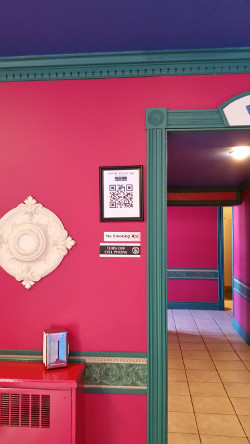
I occasionally see people scanning that QR code with their phones and google developer page tells me that the app is currently installed on a couple of hundred devices, so it turned out to be a worthwhile endeavour.
A friend of mine runs the local cell phone store so he uses my app to demonstrate how to read a QR code and install an app when one of his customers requests it.
Posted by David Buckley (Member # 2600) on 02-14-2016, 02:58 PM:
I'm androidly-challenged, so I cant try it right now, but the screenshots look really good, and the QR code ideas are excellent. What toolset did you use to build the app?
Posted by Frank Cox (Member # 6258) on 02-14-2016, 03:04 PM:
RFO-Basic
You can download my app as an Eclipse project if you like, here.
Posted by Justin Hamaker (Member # 2165) on 02-14-2016, 04:09 PM:
Frank, do you know if this is able to access a MySQL database? I see it supports HTML and javascript, but I don't see any mention of PHP.
Posted by Frank Cox (Member # 6258) on 02-14-2016, 04:27 PM:
By "this" I guess you mean rfo-basic??
If so, then as far as I know the answer is both yes and no. rfo-basic has native support for sqlite databases since that's what is built into Android --the sqlite support library comes preinstalled on every device. I don't think you would be importing a mysql database directly onto the handset or tablet (would you?) so what you're talking about is merely accessing that data from a remote server.
You can easily pull or push it with a request over the network. If it was me, I would probably do something with Perl on the server side if it's easy, or qdecoder if it's complicated (simply because I know a lot more C than Perl so it requires less research to figure out how I'll do it), then just construct queries in the rfo-basic program and blast 'em over the server, the read the results and take action accordingly.
You can actually see a working example of this sort of cgi interaction with a webserver via a perl script in my app. Look at the section for signing up for the mailing list and you'll see a query being constructed to be sent to FormMail.pl on my webserver after the user enters his information.
I'm not sure that I've actually answered the question that you asked, though...
Posted by Marcel Birgelen (Member # 6801) on 02-14-2016, 04:47 PM:
quote: Bobby Henderson
I really hate what has become of web sites lately. Any sense of proper graphic design is just plain dead with these things. Mobile is all to blame for it.
While I'm not the biggest fan of this "responsive design" fad, a website for a movie theater is probably one of the exceptions where "responsive" (or I'd rather call it Device Adaptive) design could actually add something.
People hanging out together deciding what to do tonight will end up checking your site on their mobile phone and most likely not on a notebook or desktop and you don't want to frustrate them with a design that only works by pinch-zooming and panning it all over the place.
Obviously, the best way to roll would be creating a separate page for your mobile device, but then you also have to maintain two different pages.
Posted by Justin Hamaker (Member # 2165) on 02-14-2016, 04:51 PM:
You have answered my question indirectly. It primarily confirms that app development is well beyond my current programming skills. I wouldn't mind taking the time to learn what I needed if I had other purposes, but it seems like a lot for a single application, especially when I have a very functional mobile web site already.
Posted by Frank Cox (Member # 6258) on 02-14-2016, 04:59 PM:
You're over-complicating it if your objective is simply to provide an app that tells people what's playing.
Remember what I said earlier in this thread about creating a static webpage and caching it? Do that for your app. Write a little program using your favourite language that will query your database server and write a html file named something.html. Tell your app to fetch something.html when someone requests the information through the app. Run the program to create the static page every time you update your program listings, or automate it with a cron job and update the static page every day/hour/minute/whatever you want.
Then the app has nothing to do other than fetch a static webpage. Feel free to use mine for a pattern if you want.
Posted by Sam Graham (Member # 2889) on 02-14-2016, 05:12 PM:
quote: Buck Wilson
Sam, your rules page is indeed great.
But you're missing a period after "...head west until you get here" in response to one of the "conveniently located from..." FAQs
Hmm. Thanks. I'll have to fix that.
Posted by Scott Norwood (Member # 30) on 02-14-2016, 05:55 PM:
I fear that people are over-thinking this. Titles, showtimes, prices, directions, and upcoming bookings will probably satisfy upwards of 90% of visitors to a theatre web site. No doubt everyone here (including me) likes to see pictures of the theatre, some notes on its history, etc., but the simple stuff is what matters to the ticket-buying public. Make this information easy to read and fast to load (and don't make people load another page to get any of this information), and customers will be happy.
Posted by Mike Blakesley (Member # 26) on 02-14-2016, 08:56 PM:
quote: Justin Hamaker
As long as your play date is listed before they even click the trailer, I don't think having a date on the trailer should be an issue.
There's the rub though, I don't usually know our playdates unless it's something we're going to play on the break. I'd guess that at least 50% of our bookings are "Monday for Friday."
quote: Scott Norwood
No doubt everyone here (including me) likes to see pictures of the theatre, some notes on its history, etc., but the simple stuff is what matters to the ticket-buying public.
I'm surprised at how many theater pages I've visited have zero pictures of the theater on their site. You don't need to have a whole photo gallery, but give people an idea what your place looks like. It's amazing how many far-flung out-of-towners look at our website and I've had more than one person tell me that they came to a show here because of the pictures on the website.
Posted by Michael Putlack (Member # 6523) on 02-15-2016, 03:32 AM:
I think when it comes down to a website, whether it is for a movie theatre, restaurant, or whatever, that is the first thing a lot of people will see for your business. You have to ask yourself, is this the first impression I want to be making. If it looks like your website was designed in the late '90s, is that the first thing you want your customer to think? Will they also think that you update and maintain your cinema as well as you update and maintain your website?
For everyone on this site that has a strong opinion about movie presentation (common width screens, curtains, make sure lighting cues are correct, etc.), you all should be having a strong opinion about your own websites. You're not just presenting movies, you're presenting yourselves and your businesses, and every step of the way you should make that presentation the best it should be.
Mike, my advice to you would be to use some of that money you were thinking of spending on a nice new curtain, and instead invest it in a new website.
Posted by Scott Jentsch (Member # 1681) on 02-15-2016, 06:27 PM:
Templates are useful when money is tight, but there's no mistaking a template for what it is. Much like two girls at the prom wearing the same dress, you could run into an embarrassing situation where your customers see your same web site design on another theater's web site. Whether that matters to you is your choice.
I'm a big believer that a web site should reflect the character of the organization it represents. The photos on your site show a side of your theater that makes it different than a corporate chain theater, so I think there's a value to them.
That said, someone on a smartphone is more interested in the core details of what's playing and when, how to find the theater, and how to reach someone by phone. The faster and easier that you can provide that information the more successful your web site will be for you. You can still provide the background information, but you should put the showtimes and contact information front and center.
Posted by Melanie Loggins (Member # 6454) on 03-11-2016, 05:25 PM:
We had someone local design our new website. It's just a fancy Wordpress site, and it couldn't be easier to update every week. Our old website could take up to an hour, which is partly because of my crappy html skills and partly because of youtube being weird). You can see it here:The Majestic Theatre
Posted by Justin Hamaker (Member # 2165) on 03-11-2016, 07:08 PM:
Melanie
I'm curious if you've had any push back about not admitting people under 13 to Deadpool, even when your normal policy is no one under 6. Personally I would love to do this, but I fear it would create vulnerability for a lawsuit.
Posted by Melanie Loggins (Member # 6454) on 03-11-2016, 07:34 PM:
Hijacking, but... no! And I was ready for some. In fact, all week people have been thanking/ congratulating me. But then, I live in a very small town.
As for litigation.... The theater's policy is just a policy, based on MPAA recommendations, which are just recommendations. We're free to do whatever we want. When Bully was almost released with an R rating a few years ago, I told people not to worry, that we weren't going to enforce the policy on that one. It's a case-by-case thing, and I don't change policy very often. But in this case, I just figured, it takes a village and if someone was a bad enough parent to let their little one watch Deadpool, they were going to have to do it on their own time.
Posted by Mike Blakesley (Member # 26) on 03-11-2016, 11:12 PM:
We didn't change our "policy" for Deadpool but I did engage in a fairly agressive "anti-advertising" campaign, where I went to great lengths to inform people about the content of the movie. I figured that might also bring some people in who otherwise wouldn't come, so, win-win.
The result was we no "drop offs" of underage kids at all, and we only had ONE family during the whole run of the movie bring sub-10-year-olds to the show. We even tried to talk them out of it at the boxoffice (to no avail). And, like Melanie, I had people thanking me for getting the "word" out about the movie. We still grossed well on it.
Posted by Sam Graham (Member # 2889) on 03-12-2016, 09:39 AM:
quote: Justin Hamaker
I'm curious if you've had any push back about not admitting people under 13 to Deadpool, even when your normal policy is no one under 6. Personally I would love to do this, but I fear it would create vulnerability for a lawsuit.
The Cameo had a strict "16 and over" policy regardless of the feature for decades with some grumbling but no lawsuits. In the last ten years or so, it was relaxed to "under 16 admitted only with adult guardian."
Cinemark's Palace on the Plaza in KC also tried this, at least for awhile. Not sure if they still practice such a policy or not.
Posted by Mark Gulbrandsen (Member # 72) on 03-12-2016, 12:51 PM:
Mike, I wouldn't change too much about your web page. Its like when you go to the food store and they've moved everything around and you have to learn it all over again. You do need to add a page to the Sound system showing the baffle wall and new speakers. when I tell people you have a full baffle wall there they look at me completely baffled!
Also, there is a dead link on that same sound page.
Ken, Your page loaded in about three seconds! That's not slow.
Mark
Posted by Mike Blakesley (Member # 26) on 03-12-2016, 11:58 PM:
quote: Mark Gulbrandsen
You do need to add a page to the Sound system showing the baffle wall and new speakers. when I tell people you have a full baffle wall there they look at me completely baffled!
Also, there is a dead link on that same sound page.
I know, I have a ton of pics of that project plus the video of us taking the screen down.... I need to get on that. Thanks for the heads-up about the link, I'll fix that when I update next. I mainly would like to remodel the picture pages (because the pics are all small so they would load fast back in the pre-high-speed days) and make the pages wider.
Powered by Infopop Corporation
UBB.classicTM
6.3.1.2