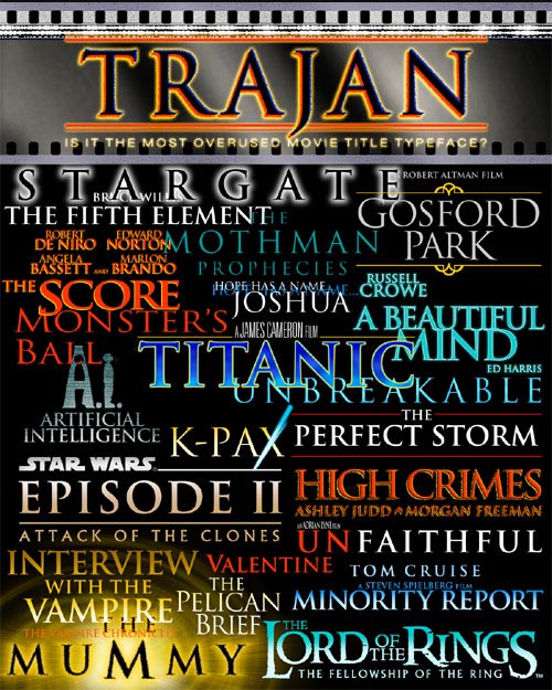
I'm merely posting this image of hit films and fairly new title release names just to show how badly Trajan is being overused. I'm not against it being used for movie title design (or TV design either --please note I did not show the "Six Feet Under" or "Sex and the City" title design). Trajan just has to be spared a little bit. It was good when "Stargate" and "Interview with the Vampire" were the only films using it years ago. Now it seems like there is not a week that goes by where I don't find a new release in the paper where Trajan is used bigger than life for the advertising.
I like when movie titles are made into logos. "Apocalpse Now" has a good title logo. Same for "The Matrix," "Shrek," "Toy Story" and "Tron". At least with these films, you feel like more effort went into coming up with a good title design and having the personality of the film come out with it. I'm not completely against Trajan being used in a film title, but since so many films are using it (across so many different genres) all the face tends to do anymore is say "this film is classy" and little else.
I never realized that all those logos used the same font.
Nice picture! Did you make that, or did you find it on the internet somewhere?
------------------
This one time, at Projection Camp, I stuck a xenon bulb....

------------------
This one time, at Projection Camp, I stuck a xenon bulb....
Divine Secrets of the Ya-Ya Sisterhood
Reign of Fire
Incidentally, that Trajan typeface for Titanic is on the DVD only. The original logo for theatrical/VHS has a "battleship" look to it.
Blood Work
Trapped
Crazy as Hell (opens in NYC this Friday)
Moonlight Mile
Red Dragon
I'll bet Bobby saw xXx -- now THAT is a great logo! 
Take "Planet of the Apes" for instance, as an example of "extra effort." I'm not sure of the details, but Fox' marketing department apparently paid House Industries/Brand Design and the Font Bureau to custom design the Simian Display type family, of which the Planet of the Apes title is based. Visit: http://www.houseind.com, choose the Search By Font Name dialog and scroll down to Simian Fonts to see an example of the family.
Anyone could have developed the Planet of the Apes title in a vector drawing program like Illustrator or Freehand and just left it alone. But that "extra effort" was put into creating a complete typeface family with both text and display families along with special character "ligature" sets. That's pretty cool. Especially when one actually knows the kind of time required for developing a complete typeface. That is no easy thing. You have to draw out all the characters, get them tweaked just right, fool with the letter spacing, make kerning pairs, go back and adjust certain letter glyphs to correct some spacing headaces, and on and on. And you do that for every individual font weight you design. Fox probably paid a lot of money to have the things drawn up. And you get to pay $150 for the fonts if you want them. That helps pay for all that design time.
And just think, Fox could just have easily used Trajan and maybe a lot of people would not have really cared.
However, people have made knock off designs based on the logo. "The Matrix" is another such example. That one is just the Times font being chopped apart and welded in other spots. But a knock off version of that one exists.
Not too many films have their own custom fonts created for them. I'm pretty sure "Fight Club" had its own custom font made for it. I don't know if "Apostrophe" is the original designer of the face, but you can download the font, Fight This, free of charge in Mac or PC format from his site (see package 0014). http://www.apostrophiclab.com/
I do a lot of Corel Draw and Photoshop stuff, but I can't even come close to the look you created in the image in your original post. I would love to sit and watch you create this kind of thing just to pick up some techniques. Now what would be WAY cool is if you could just transfer some of that creative spark over to me!! Technique is one thing, creativity is something else entirely.
With "cheap" or "free" being big influences on the graphics market, it is tough for real graphic designers to sell someone on doing a web site design or print marketing campaign with real graphic design quality. Many businesses think they can do it all in house.
That comes from a basic standpoint that people don't see computer art in the same terms as traditional art. Anyone can buy a new multiprocessor Mac, load it with Photoshop and a slew of other programs. But in the end, they are staring at the same blank canvas as they would if trying to tackle the fine art of oil painting, charcoals or pastels. The design concept one develops in the mind, and the ability to make that concept realized on canvas, paper or in Photoshop is the big difference.
I'm looking at things like 3D animation and digital video oriented graphics as a different field to explore. DV is very excluding from the wannabes for the relatively high hardware/software price for entry. A person has to be pretty serious about what they do to get into that field. You can't "download" a new Panasonic AG-DVX100 3CCD camera off Morpheus (much less all the other gear to go with it).
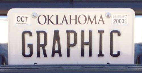
To get back on "Trajan", I'm finding it in more places --like the new personalized license plate that finally came in the mail for my sportside pickup: