This is topic Theatre Marquee fonts in forum Film-Yak at Film-Tech Forum ARCHIVE.


To visit this topic, use this URL:
https://ft-forum.com/ft/cgi-bin/ubb/ultimatebb.cgi?ubb=get_topic;f=8;t=002566

Posted by Evans A Criswell (Member # 381) on 10-02-2003, 04:42 PM:
 
There's a feature I'd like to have in generating my WWW site that I've wanted for a long time. I'd like to be able to take text strings from a file and render them on an image that looks like a theatre marquee sign. Is there a commonly available font that is the same or very similar to the font used on the letters that are stuck onto theatre marquees for the names of the movies being shown? I know that some Regal theatres tend to use a different font than others for this for their marquee letters.

Having this functionality would allow me to change the marquee in the header of my site without having to redo the image and rerasterize it. It would be cool to just change a text file and have the marquee image change when I run the program to regenerate the site.

Does anyone know about the font, or know an easy way to do this from a Perl script or C program? I can generate the image -- I just need the font-related stuff.
 
Posted by Christopher Duvall (Member # 284) on 10-02-2003, 05:36 PM:
 
The font I think you are looking for is called Broadway. I have seen variations of it but here what it looks like...

 -
 
Posted by Daryl C. W. O'Shea (Member # 1303) on 10-02-2003, 06:06 PM:
 
FWIW, I've never seen a marquee font that looks anything like Broadway. [Frown]
 
Posted by Christopher Duvall (Member # 284) on 10-02-2003, 06:28 PM:
 
I have worked in quite a few REGAL sites on the East coast and they use the Broadway style font. However, it is only all caps. The sites here in Vegas use different ones since they were ACT III or UA except for the one I am in. We do not have an outside marquee or roadside.
 
Posted by Evans A Criswell (Member # 381) on 10-02-2003, 08:12 PM:
 
This looks just like what Regal uses. Any ideas about the more traditional ones used for theatre marquees? In any case, is there an easy way to programatically (from, say, Perl or C) pull out bitmaps of the fonts from the TrueType font files (or vector descriptions, or whatever)? I don't know much about how fonts are stored. It's an area in which I've never ventured before.
 
Posted by Joe Redifer (Member # 3) on 10-02-2003, 10:25 PM:
 
Arial is the best font ever created. When I met Bobby Henderson in real life, he went on and on about how great Arial was. He talked of nothing else. I didn't believe him until I saw it and WOW Arial is AWESOME!

Therefore I think all theaters and all outdoor signage of any kind should only use the Arial font. It the font created by God Hisself. [Smile]
 
Posted by Daryl C. W. O'Shea (Member # 1303) on 10-02-2003, 10:36 PM:
 
Evans, you'd probably be happy using Image::Magick.
 
Posted by Evans A Criswell (Member # 381) on 10-02-2003, 11:09 PM:
 
So it supports any TrueType fonts that I have the file for? If that's the case, it'll make things pretty easy. I've used PerlMagick on several occasions to do image manipulation from Perl. That would be fabulous if it's that simple. I'll do some testing tomorrow.

So, the only question remaining is other than Broadway for Regal theatres, what's a font that is like the marquee lettering used by most theatres on their marquees. The marquee image is going to be small and only have room for two or three rows of letters, so I'd prefer a font used on theatre marquees back in the days of single-screen and 2-plex theatres.

I've been using "Impact" from Adobe Photoshop/Illustrator , but I'd like something that looks more like older marquee lettering than that.

I'll not upset Bobby Henderson by using Trajan. [Smile]
 
Posted by Daryl C. W. O'Shea (Member # 1303) on 10-02-2003, 11:49 PM:
 
Try something like this:

$image->Annotate(font=>'/path/to/fonts/broadway.ttf', pointsize=>40, fill=>'black', text=>$text);
 
Posted by Scott Norwood (Member # 30) on 10-03-2003, 04:43 AM:
 
I'll bet that Joe's second favorite font is "Wingdings."
 
Posted by Evans A Criswell (Member # 381) on 10-03-2003, 09:45 AM:
 
Cool! That Annotate call is described on pages 140-141 of my "Programming Web Graphics with Perl and Gnu Software" O'Reilly book! Thanks!

This may be far easier than I ever imagined, especially since the program that generates most of the HTML on my site is already in Perl (1793 lines of it)!
 
Posted by Charles Everett (Member # 889) on 10-03-2003, 11:46 AM:
 
In New Jersey, New York and Pennsylvania, every Regal Cinema that I have been to or driven past uses Broadway as the font for the sign.

Three of these Regals also use Broadway for their marquee letters as well. That typeface makes it difficult to read film titles, especially if you're on a busy road.

Broadway also is the font in use at the Multiplex Cinemas at Town Center Plaza, built by Regal in the late 90's and taken over by National Amusements 1 1/2 years ago. I'm surprised NA hasn't tried to install its own signs and its own lettering yet. Maybe it might have something to do with the local zoning board.
 
Posted by Evans A Criswell (Member # 381) on 10-03-2003, 03:45 PM:
 
I know that the Broadway font isn't the best choice for readability. When I drive in front of a theatre that uses that font, I have to get much closer to the building to read the movie titles. I just looked through a big list of fonts and didn't see anything that looked much like a movie theatre marquee font.

After getting rather disgusted at the difficulty of finding this information, I got an idea -- I did a WWW search on companies that sell replacable letters for marquee signs. It looks like there are Barnes, Broadway, Helvetica, and a compressed Univers font in common usage. I wish I'd thought of doing that yesterday. So I guess that answers my question. Now to start playing with coding that up...

I liek the Barnes style since it has a 3D look. Now to find a ttf file for it or something like it...
 
Posted by Bobby Henderson (Member # 840) on 10-03-2003, 09:38 PM:
 
quote:
I liek the Barnes style since it has a 3D look. Now to find a ttf file for it or something like it...
You're gonna get frustrated trying to find one. Wagner Zip Change and Gemini make the prevailing majority of changeable copy letters for marquees. They have been using the same gothic/sans and "modern" styles for decades. They have made no moves to generate computerized versions of these fonts. Such a move would help sign designers, and actually sell more of Wagner and Gemini's products. Instead, when I design a changeable copy sign for someone, I have to defer to something like Futura Extra Black Condensed to simulate the type.

quote:
I have worked in quite a few REGAL sites on the East coast and they use the Broadway style font.
Are you sure you're seeing Broadway? Cinemark uses a font that has some slight similarities to Broadway for their changeable copy marquee lettering. However the font is more condensed and (thankfully) the thin stems on the letters are substantial enough to read at a significant distance.

Broadway is not designed at all for readability distance. It is designed after type meant for large posters and showcards on easels that people can view up close and for what ever duration they like. Setting type in Broadway for an outdoor sign, particularly one next to a street, is really really stupid. There's lots of other fonts that envoke retro, art deco and art nouveau themes that work much better for distance/quick glance viewing.

quote:
When I met Bobby Henderson in real life, he went on and on about how great Arial was.
What I really said was how Arial was really great at trapping amateur sign designers and making their work look stupid. Customers then bring their money to me! CHA-CHING!

quote:
I'll not upset Bobby Henderson by using Trajan.
Not to worry. Hollywood studios would never allow and Zip Change or Pronto letters to be made with it. The letters would upstage all the Trajan you see on the one-sheets. Can't have that!

[ 10-04-2003, 12:34 PM: Message edited by: Bobby Henderson ]
 
Posted by Joe Redifer (Member # 3) on 10-03-2003, 09:59 PM:
 
Wingdings kicks ass.
 
Posted by Jarred Olsen (Member # 1833) on 10-06-2003, 01:18 AM:
 
Time to bust out with the "Microsoft-bombed-WTC-look-at-NYC-in-Wingdings-now-look-at-it-in-Webdings-obvious-cover-up" card.
 
Posted by System Notices (Member # 2357) on 01-04-2005, 12:35 PM:
 

It has been 456 days since the last post.
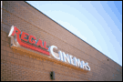

 
Posted by Brandon Willis (Member # 2345) on 01-04-2005, 12:35 PM:
 
Regal didn't change the signage for the theatres they took over from Neighborhood Entertainment in Virginia, back in the mid 90s. Some of these theatres were built by Cineplex Odeon, and when Regal took over they put up "Regal" in their own font and left "Cinemas" in the Cineplex font. Here's an example:

 -
Courtesy of the AOL digital city website.
 
Posted by Bobby Henderson (Member # 840) on 01-04-2005, 06:12 PM:
 
Yep. I've seen the old cannibalize and reuse an existing channel letter sign stunt many times. Who cares if it screws up your business identity to the public? Who needs a consistent brand identity anyway? Gotta cut the cost of that building sign in half regardless of how stupid it winds up looking.
 
Posted by Evans A Criswell (Member # 381) on 01-06-2005, 02:18 PM:
 
Regal is still using the same non-Broadway font on theatres here in Huntsville, I guess because they're still using whatever letters Cobb used before August 1, 1997. The Regal in Decatur, AL used the Broadway style letters on their marquee.
 
Posted by Brandon Willis (Member # 2345) on 01-22-2005, 03:48 PM:
 
Something that I noticed is that most of Regal's theatres they built in the 90s have REGAL going vertically on the marquee tower:

R
E
G
A
L

My theatre, however, is just like all of the other mid 90s Regals except that it has "REGAL" lettered horizontally across the bottom of the tower. It's the only one I've ever seen like that. Every other Regal of the same vintage has the vertical lettering.
 
Posted by Bill Enos (Member # 440) on 01-22-2005, 04:48 PM:
 
Those of you who are so critical have obviously never priced a sign or bought letters.
 
Posted by John Hegel (Member # 628) on 01-22-2005, 05:58 PM:
 
Can any business afford the cost of looking dumb from the road?

You only get one first impression, so I think having a good looking sign is worth any cost.
 
Posted by Ron Yost (Member # 1850) on 01-22-2005, 08:32 PM:
 
Oh come now ... 'identity signage' is a tax write-off. WE pay for it, not them. [Big Grin] [evil]

Ron Yost
 
Posted by Bobby Henderson (Member # 840) on 01-23-2005, 01:29 PM:
 
quote: John Hegel
Can any business afford the cost of looking dumb from the road?
Out of simple logic, one would think this particular question would occur to many business operators around the country, but it usually doesn't. Sure, most people will wear good looking clothes to a job interview or on a date to make a good first impression. The same logic often does not extend to "store front personality." You can find plenty of poorly designed and constructed signs (and often poorly maintained signs) in just about any city, regardless of the type of sign ordinance in place. Ultimately you cannot legislate taste.

Many businesses will spend a lot more money on newspaper ads and TV commercials than they will on store front signs and the overall appearance of their store front. Some large companies understand the value of store front personality and invest well in making sure their business looks attractive and professional from the road. This can be the most visible standards bar between national businesses and those of "small time" caliber.

Properly designed and constructed signs are not cheap. A good set of neon illuminated channel letters will cost thousands of dollars. But the investment in a more professional sign can be greatly offset by the increased customer traffic to the store.


Powered by Infopop Corporation
UBB.classicTM 6.3.1.2