

This is topic What's your favorite movie poster? in forum Film-Yak at Film-Tech Forum ARCHIVE.


To visit this topic, use this URL:
https://ft-forum.com/ft/cgi-bin/ubb/ultimatebb.cgi?ubb=get_topic;f=8;t=004414

Posted by Mathew Molloy (Member # 666) on 12-27-2005, 11:51 PM:
 
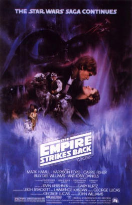
I was just looking at the posters on my walls thinking how the original poster for The Empire Strikes Back is my favorite poster of all time. Something about it just puts me at peace with the world. What's your favorite poster?
 -
 
Posted by Dan Lyons (Member # 1454) on 12-28-2005, 12:12 AM:
 
This is what i have on my wall; Style-B one sheet.
 -
 
Posted by Mike Blakesley (Member # 26) on 12-28-2005, 01:09 AM:
 
I don't have a pic of it, but I would say the favorite poster I own is the "Wizard of Oz" one where the characters are stepping out of the book. It's a reproduction of an old poster produced for one of the reissues. The book cover is in black-and-white and the characters are in color. Very classy looking.
 
Posted by Joe Redifer (Member # 3) on 12-28-2005, 05:51 AM:
 
Here's what's hanging on the wall in my room where my computer is:

 -
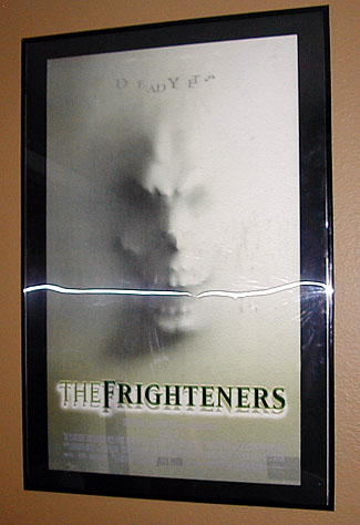
The Frighteners. Probably the coolest poster I have. It is made of plastic and is holographic. When you move the jaw opens/closes and the facial expression changes. Also the words "Deat Yet?" move in and out. Freakin' awesome. I wish I was able to nab the Lost World holographic poster as well, but someone who (wrongfully) thought that they had rights too took it instead. The white horizontal line is caused by the (camera) flash.

 -
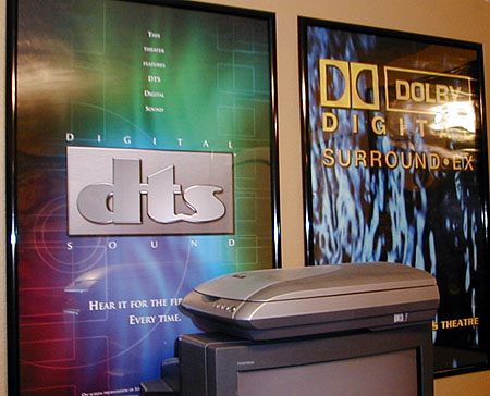
Behind my computer desk are a couple of generic DTS and Dolby Digital EX posters. They looks fairly cool, and they makes me more cools since they are there.

 -
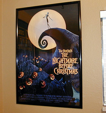
Over in the corner I have a Nightmare Before Christmas. I love the movie and the poster is great as well. Still waiting for a true anamorphic DVD of the movie.

 -
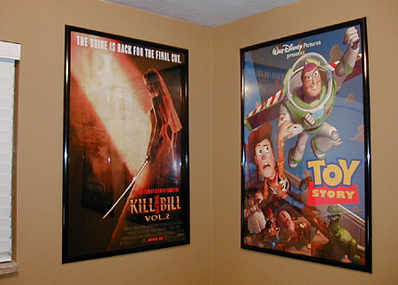
In the other corner I have Kill Bill 2 and Toy Story. In all honesty I prefer Kill Bill 1 (but I love 'em both), but part 2 had the cooler poster. I've had the Toy Story one forever. I heard they later changed Woody's expression into a smile. In Disney's fantasy world, nobody is supposed to "frown" ever for any reason. I know it was changed for the cover of the video and the LaserDisc. I like the expression on the poster the way it is.

 -
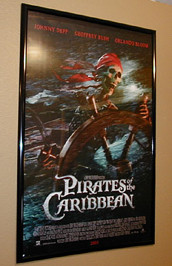
Finally we have Pirates of the Caribbean. While I really enjoy the movie, I have to say that this poster is even better than the movie itself. I didn't like any of the lame-ass posters with headshots of the actors (way too original and creative for me) so I picked the skeleton pirate, which is freakin' awesome! I love skeletons. I hope to be a skeleton someday. Hopefully someone will do some really cool stop-motion animaton with my skeleton. That alone would justify my entire existence.
 
Posted by Rachel Gilardi (Member # 1016) on 12-28-2005, 08:34 PM:
 
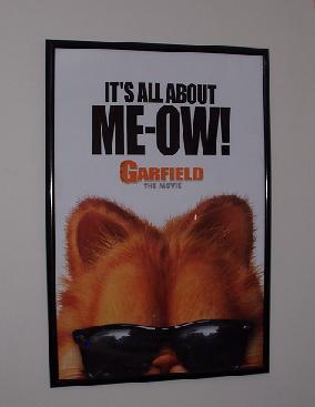
I love the fat cat...

 -
 
Posted by William Hooper (Member # 71) on 12-29-2005, 12:26 AM:
 
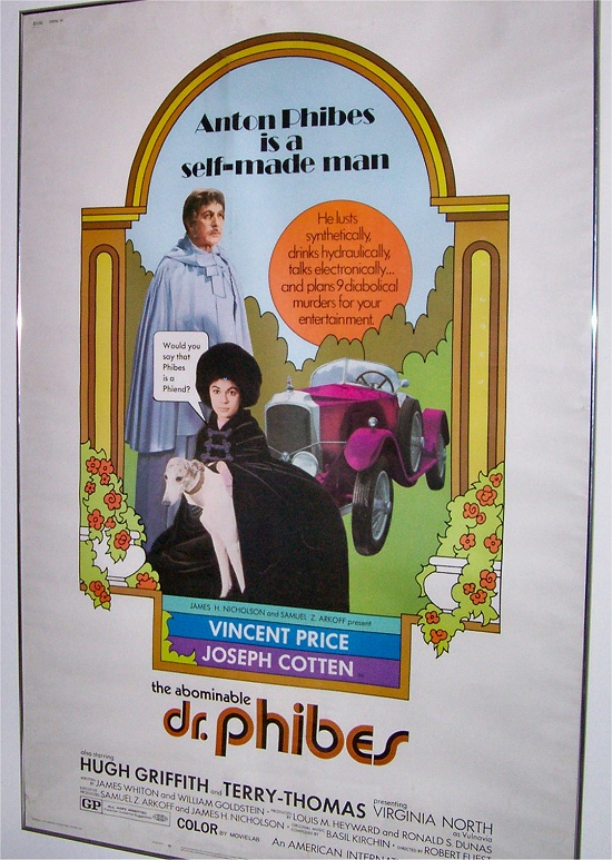
My Phibes 60x40

 -

This is a fortunate topic; I see that the poster is collapsing & wrinkling behind the glass inside the frame. Sheesh, moving that thing to some framing place is going to be a pain...

A theatre nearby had a couple of storerooms paneled in what were the old, hand-painted one-sheet sized signboards for films in the silent & early days. I should have just pried them all off & taken them, like I wanted to. They were beautiful, but I'm pretty sure during the last "renovation" they were demo'd & dumpstered.
 
Posted by Eric Hooper (Member # 1730) on 12-30-2005, 12:58 AM:
 
Gattaca

Lost Highway
 
Posted by Bobby Henderson (Member # 840) on 12-30-2005, 12:16 PM:
 
When people talk about movie poster artists, the names Bob Peak and Drew Struzan get mentioned immediately.

Bob Peak made the poster illustrations for "Camelot," "Superman: The Movie" and "Apocalypse Now" (probably his most famous poster).

Posters by Drew Struzan are easy to spot: great mixed media artwork signed "Drew". The "Back to the Future" poster is where he hit his stride and got prolific like crazy after that.

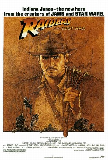
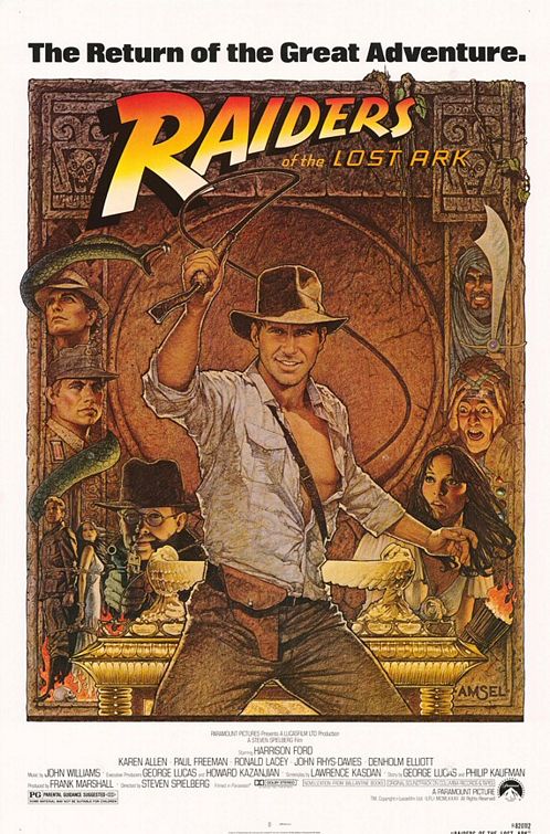
Still, I'm really fond of the work Richard Amsel did on the posters for "Raiders of the Lost Ark." I think his work was an influence on Drew Struzan.

 -

The original release poster.

 -

The more detailed re-release poster.

On to a bit of a rant:

It's kind of funny how this topic was brought up and it will be even more funny to see the results. Some people can argue about whether or not the movie industry is in a slump. One thing is for damned sure: movie poster art today is in a BIG slump.

Most movie posters these days suck brown oily ass. The majority are unremarkable Photoshopped photographs of actors heads. Or you might get a whole body photograph, or maybe a two-shot of two actors or an ensemble. Real illustrations are rare. The best we can seem to get these days is some different graphics -when they're not boring us to death with more Trajan type.

Here's why this is happening. The movie marketing people are designing movies more and more for video stores and home viewing. A complex illustration looks great in a poster case. But it doesn't translate very well when reduced down to the size of a DVD case. So they just stick an actor's surgery altered head on the fucking box. When you walk down the aisle in the video store the product isn't any more visually compelling than a stroll down the breakfast cereal aisle in the grocery store. Same principal at work. But the principal is crap at the movie theater. A big 27" X 41" poster needs more than just a face printed on it. It needs artwork.
 
Posted by Brian Michael Weidemann (Member # 2243) on 12-30-2005, 03:05 PM:
 
Actually, these days, I don't think DVD releases even contain the original movie poster images, as bland as they are. I've noticed more that the faces or bodies are re-arranged. You've got a handful of Photoshop elements that you can drag-and-drop anywhere you like. 20 versions of the poster, one for each character, are a piece of cake, and the DVD box is just a variation, or collage, or whathaveyou. Yes, very uninspired.

I remember the Frighteners poster! Everyone loved that thing and wanted it ... not necessarily because it was a great movie, but because everyone I worked with at the time was a huge Danny Elfman fan and it had his name on it.
 
Posted by Barry Floyd (Member # 385) on 12-30-2005, 03:26 PM:
 
I've got this one hanging on the wall in my booth for screen 1. I tell my wife, "It's there for the kitchen guys"... it's really just for me. Making up prints at midnight on Thursday nights is alot less lonely now.
 -
 
Posted by Jeremy Jorgenson (Member # 2989) on 12-30-2005, 03:34 PM:
 
Does your wife ever read these threads?
 
Posted by Scott Jentsch (Member # 1681) on 12-31-2005, 01:55 PM:
 
The Chronicles of Narnia lenticular is pretty eye-catching
 -

My favorites are:
 -  -  -

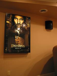
I have the last two, but I'm still looking for a double-sided version of the Fellowship of the Ring poster. The single-sided one just doesn't do the artwork justice.
 
Posted by Jason Black (Member # 684) on 12-31-2005, 02:41 PM:
 
I kinda dig my Ron Howard autographed A Beautiful Mind poster..

Now if I could only get Russel Crowe to sign it.. I'd be in bitness..
 
Posted by David Stambaugh (Member # 1102) on 12-31-2005, 02:56 PM:
 
My favorite movie poster is Sam Graham. [beer]
 
Posted by Robert Harrison (Member # 3202) on 12-31-2005, 04:39 PM:
 
My favorite poster among those in my collection is for a double feature of "Thunderball" and "You Only Live Twice." It combined artwork and stills from the original campaigns with the following wording...

CAN ONE MOTION PICTURE CONTAIN...
ALL THIS EXCITEMENT...
ALL THIS ADVENTURE...
ALL THESE BEAUTIFUL WOMEN!
NO...IT TAKES TWO...
THE TWO BIGGEST BONDS OF ALL!

That was back in the days when Bond posters had fantastic artwork, and not just a photo of the actor playing Bond. Now, unless it's a fantasy without name actors or an animated flick, posters are just mug shots of the damn actors in the film! BORING! The first "Harry Potter" was a pretty good one, but as the series went on and the kids became stars, the campaigns reverted to mug shots.

[ 12-31-2005, 08:09 PM: Message edited by: Robert Harrison ]
 
Posted by Joe Redifer (Member # 3) on 12-31-2005, 06:06 PM:
 
quote: Scott Jentsch
The single-sided one just doesn't do the artwork justice.
Why? Plan on looking at it in reverse?
 
Posted by Scott Norwood (Member # 30) on 12-31-2005, 06:16 PM:
 
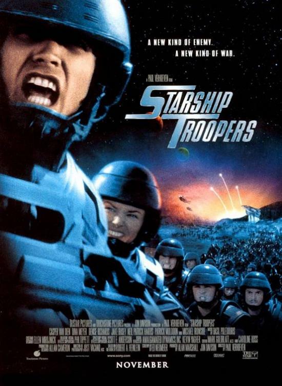
For recent titles, one of my favorites is the US version of the Starship Troopers poster:

 -

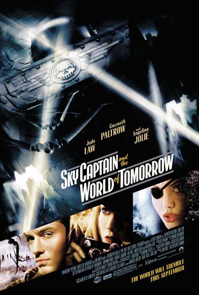
I also liked most of the Sky Captain posters, for example:

 -
 
Posted by Dave Macaulay (Member # 813) on 01-01-2006, 12:56 AM:
 
"Why? Plan on looking at it in reverse?"

Probably the double sided version with the back printed reversed so the colour is more saturated when backlit? I like hanging them wrong side out.
 
Posted by Joe Redifer (Member # 3) on 01-01-2006, 01:43 AM:
 
I agree with that, but if you don't have a lit postercase, I don't think it would make much diffrence, would it?
 
Posted by Wolff King Morrow (Member # 2226) on 01-01-2006, 02:38 AM:
 
The Pirates of the Caribbean 2 poster looks badass as well. I called dibs on it at work.
 
Posted by Jamie Glossop (Member # 2180) on 01-01-2006, 04:26 AM:
 
My 3 Fav films and posters have to be

Azumi

Battle Royal

A Bronx Tale ( I juts love this film! )

I whould upload the pics using a free image host but for some reason the forum wont let me do it which is kind of stupid [Confused]
 
Posted by Hillary Charles (Member # 769) on 01-01-2006, 08:51 AM:
 
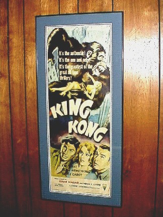
The only poster we have on permanent display (and my absolute favorite) is my prized insert poster from the 1956 reissue of "King Kong":
 -

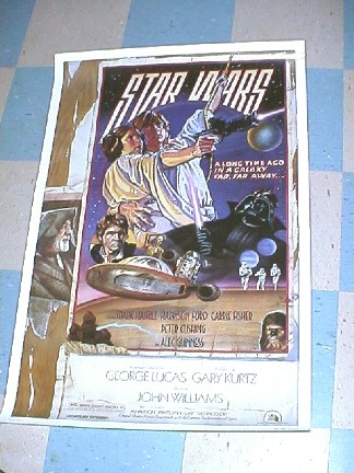
We rotate other posters depending upon what we're showing in the basement cinema (right now, "Witness" is hanging up), but the artwork is often hit or miss. I really do like this "Star Wars" style D poster, with the 1930's style graphics and the remnants of old torn posters seemingly underneath. I remember first seeing it for it's 1980(?) re-release:
 -
 
Posted by Mark Ogden (Member # 43) on 01-01-2006, 06:43 PM:
 
 -

Still my fave all-time poster, good old National Screen #74-294. It's one of the few posters I was allowed to take home with me after the run. I had it dry-mounted and framed, and hung it on a wall in my apartment. Less then a week later, my then-girlfriend refused to spend the night with me 'cause it creeped her out to much. "Either it goes or I go" she said. Wonder what ever became of her . . .
 
Posted by Scott Jentsch (Member # 1681) on 01-02-2006, 10:10 AM:
 
quote: Joe Redifer
I agree with that, but if you don't have a lit postercase, I don't think it would make much diffrence, would it?
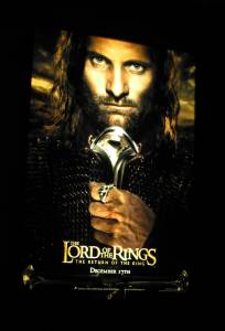
That's what this is for:

 -  -

The backlit case makes me glad I searched out double-sided versions of posters I liked even before I had something that would show them off this well.
 
Posted by Adam Wilbert (Member # 1184) on 01-02-2006, 02:23 PM:
 
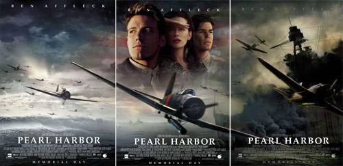
I liked the three one sheets from Pearl Harbor that matched up edge to edge. You don't see that very often, and it looked great in the poster cases:

 -

I could do without the "Ben Affleck Ben Affleck Ben Affleck" across the top though. Another case where the poster and trailer were better than the film.

quote: Jamie Glossop
I whould upload the pics using a free image host but for some reason the forum wont let me do it which is kind of stupid
Thats so the forum can maintain its integrity when your free image server shuts down in a few years (or weeks).
 
Posted by John Hawkinson (Member # 1135) on 01-03-2006, 12:50 AM:
 
Nice triptych, Adam! Fear not, though, as you go from left to right, the Ben Affleck is "fading fast" [Smile] .

--jhawk
 
Posted by Adam Wilbert (Member # 1184) on 01-03-2006, 12:56 AM:
 
I'm afraid thats because I had to photoshop that together from different images I found on the net. I couldn't find one that had all three together.
 
Posted by Michael Coate (Member # 757) on 01-03-2006, 10:55 AM:
 
quote: Hillary Charles
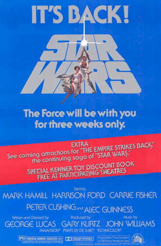
I really do like this "Star Wars" style D poster, with the 1930's style graphics and the remnants of old torn posters seemingly underneath. I remember first seeing it for it's 1980(?) re-release
I like this one, too. Of the numerous "Star Wars" posters, this one is probably my favorite. That and perhaps the "Empire" advance with Vader's head in a starfield. The "Star Wars" Style D, by the way, was used for the film's summer 1978 re-release.
 
Posted by Matt Barth (Member # 3429) on 01-03-2006, 11:40 AM:
 
Hanging above my desk is the We Were Soldiers original...on order for my full-size back-lit case, American Psycho Style B Teaser.

---Matt
 
Posted by Hillary Charles (Member # 769) on 01-03-2006, 04:45 PM:
 
quote: Michael Coate
The "Star Wars" Style D, by the way, was used for the film's summer 1978 re-release.
Good call, Michael! I do remember when I saw it at the time, there was a trailer for "The Empire Strikes Back." That was one of my main reasons to go see it again. Would there have been a teaser trailer that early, or might that poster have been used later as well?
 
Posted by Andy Muirhead (Member # 712) on 01-03-2006, 06:46 PM:
 
The only poster I really liked enough to put on my wall was from 'The Virgin Suicides'. I'm gutted it got lost sometime after I moved.

After a quick search I only found the US one sheet version, which looks really bad. The one I had was the UK quad, which works so much better.
 
Posted by Michael Coate (Member # 757) on 01-04-2006, 02:05 AM:
 
quote: Michael Coate
The "Star Wars" Style D, by the way, was used for the film's summer 1978 re-release.
quote: Hillary Charles
Good call, Michael! I do remember when I saw it at the time, there was a trailer for "The Empire Strikes Back." That was one of my main reasons to go see it again. Would there have been a teaser trailer that early, or might that poster have been used later as well?
The "Empire" trailer was shown during the 1979 re-release, for which another poster was created. Of course, it's possible your theater simply re-used the poster from the previous year. I would since it was a lot more stylish than the one they came up with for '79. (If my posters weren't in storage I'd scan and post an image of the '79. Maybe I'll search the web for one and post a link if you're curious to see what it looks like.)
 
Posted by Hillary Charles (Member # 769) on 01-04-2006, 06:28 AM:
 
The theater (the long-gone Academy in Lebanon, PA.) must have re-used the earlier poster in that case. The two things I distinctly remember about that showing was that particular poster and the trailer with shots from the asteroid sequence that were spectacular.

Based on what you say, I'm sure I'd be disappointed in the 1979 poster.
 
Posted by Michael Coate (Member # 757) on 01-04-2006, 11:32 AM:
 
A link to an image of the "Star Wars" 1979 re-release one-sheet. If anyone can make the image appear in this post, please do.

http://www.theforce.net/collecting/posters/anh/1979-re.asp

 -

[ 01-04-2006, 03:43 PM: Message edited by: Rachel Gilardi ]
 
Posted by Mike Blakesley (Member # 26) on 01-04-2006, 12:22 PM:
 
Michael - you can do it yourself. Navigate to the image, save it on your computer, and then edit your post and use the "click here to upload an image" link (next to the "preview post" button below) to upload it. It's simple.
 
Posted by Hillary Charles (Member # 769) on 01-05-2006, 06:06 AM:
 
Thanks for posting that Michael. Funny, I don't remember it from that time, but maybe I just overlooked it for the cool "D" version. I see what you mean about this one, it's practically generic!
 
Posted by Bobby Henderson (Member # 840) on 01-05-2006, 03:45 PM:
 
Whew, the red and blue on that "Star Wars" re-release one sheet is pretty hard on the eyes. Bad color vibration. Certain reds and greens butted up against each other can do the same kind of thing. Some problems in color vibration can actually make people feel sick.

ITC Serif (the type family used on much of the poster's text) had its heyday in the late 1970's and early 1980's. NBC used the hell out of it. It's rare to see anyone use it anymore anywhere.
 
Posted by Paul Mayer (Member # 355) on 01-07-2006, 10:58 PM:
 
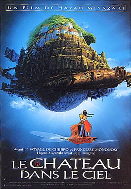
Of my feature-length anime theatrical posters, this one is my current favorite, the French release poster for Miyazaki's Laputa - Castle in the Sky (Tenkuu no Shiro - Rapyuta):

 -
 
Posted by Louis Bornwasser (Member # 3063) on 01-08-2006, 10:26 AM:
 
I have an original Camelot, framed for over 33 years. Reds are faded. Style: not full height. The significance is that is the very first 35mm film I projected. The theatre is the one at University of Louisville in their first student center: The Red Barn; a building I personally saved from the wrecking ball and converted into a multi purpose room, complete with Army surplus projection equipment. Louis
 
Posted by Christian Volpi (Member # 2370) on 01-09-2006, 01:20 PM:
 
My favorite is one that I own, Frank Sinatra and Doris Day in "Young at Heart."
 
Posted by Steve Scott (Member # 630) on 01-09-2006, 01:46 PM:
 
My Eternal Sunshine set is my baby. I have the three cast one-sheets, the reviewed one-sheet, the final one-sheet with Jim & Kate on the ice, a set of smaller cast cards & the foam lobby display with the film's newspaper review.

2nd place: Novocaine red w/ Steve Martin's mug.
 
Posted by Allison Parsons (Member # 2728) on 01-09-2006, 03:05 PM:
 
Here's a VERY short list of pictures of my fav's that I own. VERY short... I'll add more later if I get bored.

 -

 -
 -

 -
 
Posted by Paul Mayer (Member # 355) on 01-10-2006, 03:39 PM:
 
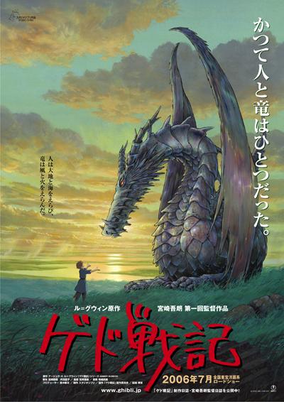
Perhaps I'm cheating a bit here since I don't have this one in my hands yet, but I will. This is the advance poster for Studio Ghibli's next film, Tales From Earthsea (Gedo Senki, lit. Ged's War Chronicles) opening in July in Japan:
 -
 
Posted by Richard Greco (Member # 2032) on 02-18-2006, 11:46 AM:
 
My fav would have to be the autographed "Fight Club" poster....

Hey, this is my 1000th post!!!!
 
Posted by Brian D. Whitish (Member # 825) on 02-20-2006, 12:54 AM:
 
Here is my favorite. A question for Joe Redifer, where did you get your poster frames?

 -
 
Posted by Frank Angel (Member # 248) on 02-20-2006, 01:42 AM:
 
Anyone notice that the "transparency" posters (as we call them - you put them in a light box and that's what they look like...almost) have this tendency to crack more easily. If you fold them the paper cracks alot easier than one sided 1 sheets. I have no idea why, they just seem durable.

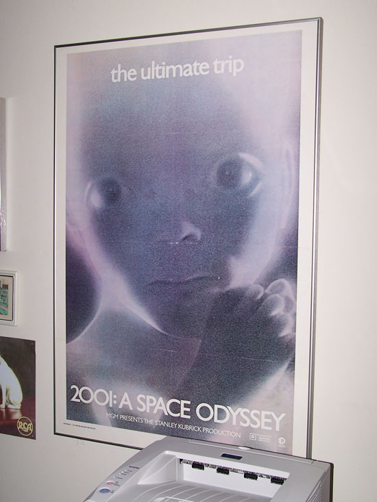
My favorite, which I won't post again is the 2001 - Star Child 1-sheet. Mine is not in as good a shape but it's dry-board mounted because the paper has become brittle and can no longer be handled. For me, aside from the fact that I think 2001 is a truly a masterpiece, but it also was the seminal film for the opening of our big theatre. Before I got there, the projection booth was empty except for the Eastman 25Bs. I told them if they wanted to run film in a 2500 seat house, we needed to put in 70mm. I got the go for only 35mm, not 70 (bureaucratic morons all).

I insisted that they needed mag penthouses -- I knew I wanted to open with 2001. Somehow they got the impression from the way I worded it that you couldn't get sound on any 35mm prints unless you had mag and a 4 channel house sound system. [Wink]

Since then, I've run 2001 at least 5 times in all these years and I ran it again just last year with Keir Dullea speaking after the film. He was as charming as he was informative.

In all my years at the Center, working with a list of artists and celebrities, I have never done the trashy thing of asking for an autograph; it's considered unprofessional and quite low-brow, but for Keir Dullea, I swallowed my pride and after the show told him how this film was our seminal picture which opened Brooklyn Center Cinema. I asked if he wouldn't mind signing some of the original 11x14 graphics from the film that I just happened to have saved over the years and right there with me in my briefcase. I handed him 8 of them, asking if he would pick anyone he liked to sign. He was amazed that this stuff still existed. Not only did he sign one and then another, but on one he wrote, "Thanks Brooklyn Center Cinema and Frank for a great show." Then he let myself and our stage crew take pictures with him standing in front of the 1 sheet. I also have a 3-sheet (remember those?) but I didn't drag that out. I also have a replica of the HAL interface (red LED in the "eye" and all). He is quite a gracious gentleman. And of course I was floating on a cloud for a week.

I also have a CAMELOT odd size poster "NOW AT POPULAR PRICES" across the top after it came out of Roadshow.

[ 02-23-2006, 11:41 AM: Message edited by: Frank Angel ]
 
Posted by Robert Burtcher (Member # 3227) on 02-21-2006, 04:50 AM:
 
quote:
Perhaps I'm cheating a bit here since I don't have this one in my hands yet, but I will. This is the advance poster for Studio Ghibli's next film, Tales From Earthsea (Gedo Senki, lit. Ged's War Chronicles) opening in July in Japan:
Paul, that is a beautiful poster. I wish I could get my hands on one as well!

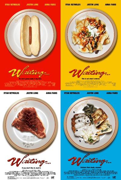
As for my favorites, I really liked Waiting...'s teaser posters.
 -
 
Posted by Sam Graham (Member # 2889) on 02-21-2006, 08:28 PM:
 
quote: David Stambaugh
My favorite movie poster is Sam Graham.
D'OH! Only took me a month and a half to see THAT. [Big Grin]

I was always quite fond of this one. Not enough to actually see the movie, but I loved the poster...

 -
 
Posted by Bobby Henderson (Member # 840) on 02-21-2006, 11:32 PM:
 
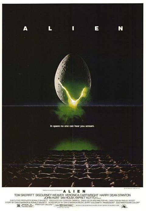
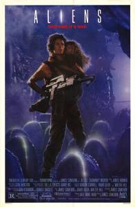
The Alien poster was good for its simple design, which carried over into the videos and DVDs. Extra kudos for the blurb: "70mm & Dolby Stereo in selected theaters."

However, have you seen the teaser trailers for Alien? Whoa, they're cheesy! Yeesh!
 
Posted by Frank Angel (Member # 248) on 02-23-2006, 12:13 PM:
 
 -

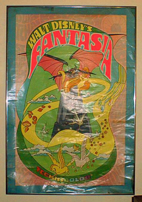
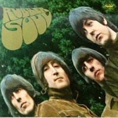
Guys, I apologize for posting a 1-sheet in such poor condition as this is, but I still love the 70's look of this poster of what I still think is the best Disney film of all time (it doesn't look quite this bad in person -- reflections were problematic). The lettering, which has no relation to the film in terms of style, is very reminiscent of the hand draw publicity cards of the period of that re-release which had become very popular at the Filmore East and West (rock clubs) and the Electric Circus on in the East Village in NYC -- fluid, fat letters, usually curving around the central artwork. Many were sold as art posters in their own right. The Beatles "Rubber Soul" is a good example of this hand drawn style. No doubt Bobby can tell us if it has been turned into an actual font with a name.

 -

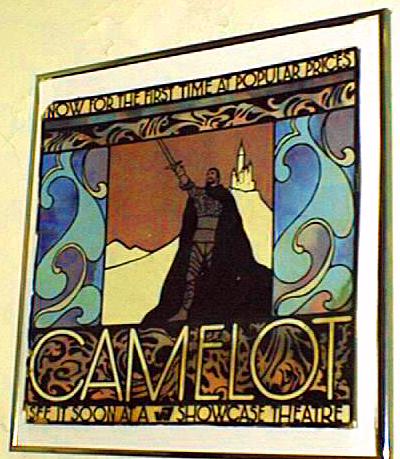
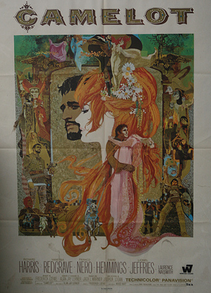
And since CAMELOT was mentioned, here is one of the non-standard posters they used in the NYC subways.
 -

Are any films nowadays released at popular prices? Or do they pretty much keep them all at unpopular prices? [Big Grin]

Talking about font styles, is there a name for the bizzare font that you always find at the bottom of movie posters --that elongated, squished font that so often marrs an otherwise nice looking 1 sheet? It is obvious that it came out of the need to squeeze tons of credits in a small space while still maintaining size and where small point size wouldn't work. Thing is, most people couldn't give a flying rat's ass about most of the people listed. I guess you could call it EgoUtilitarian. [Razz]
 
Posted by Jason Miller (Member # 2341) on 02-23-2006, 09:46 PM:
 
I will post images when I can get pictures...

My 3 favorite:

Spiderman Teaser: Twin Towers

Alien: Directors Cut (numbered limited)

Army of Darkness

I also like Reign of Fire, Underworld, Van Helsing, Dinosaur (the one where if you put light through it you would see another dinosaur in the eye), Final Destination Lenticular (the kids faces would turn to skulls as you walked by)

I havent looked in my collection box in a while...
 
Posted by Allison Parsons (Member # 2728) on 02-24-2006, 01:56 AM:
 
quote: Frank Angel
And since CAMELOT was mentioned, here is one of the non-standard posters they used in the NYC subways.
Frank, what size is that poster? Is it a 'Bus shelter' size?? LOVE the Fantasia poster!!!! Is it on glossy paper (which I think almost never happened back in the day) or am I just seeing the glass from the frame?
 
Posted by Mitchell Dvoskin (Member # 751) on 02-24-2006, 10:32 AM:
 
The 40x60 version of that Fantasia poster was printed with Da-Glo ink, and is quite spectacular under a black (unltraviolet) light. Unfortunetly, the one sheet is just regular ink.
 
Posted by Tim Reed (Member # 137) on 02-24-2006, 01:43 PM:
 
This movie got terrible reviews, but I loved it. It was harmless fun. (The scene with the boat salesman was hilarious!) The one-sheet captures the mood of the film wonderfully.

I also like Scott's "Sky Captain" poster.

 -
 
Posted by Paul Mayer (Member # 355) on 09-02-2006, 12:17 AM:
 
Robert, contact me off-list about one of those Ghibli Earthsea posters. I PM'd you as well.
 
Posted by Hillary Charles (Member # 769) on 09-02-2006, 11:02 AM:
 
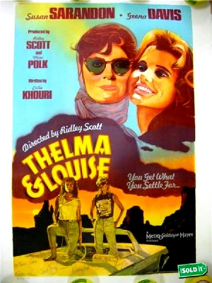
Another new favorite I never thought I'd find. A "Thelma & Louise" poster created a year after release as a limited edition. Only 200 stone lithograph prints were made, and I got this through the 'bay, only able to afford it because the seller wasn't aware of its background. Not only is it from one of my favorite movies, but it's done in the style of the old 1940's posters I really like. Oh, and the autographs of the major names from the movie is a nice bonus.

 -
 
Posted by Dennis Benjamin (Member # 1137) on 09-02-2006, 12:15 PM:
 
I would have to say that my absolute two favorite posters I have in my collection are "Willow" and "Princess Bride".

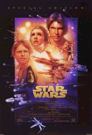
I also LOVE the special edition Star Wars posters that go right along with the new Star Wars films. I have all six hanging on the wall at home. I also have the three Lord of the Rings posters hanging up. At my office, I have "Hero", "Kung Fu Hustle", and "Fists of Fury" on the wall.

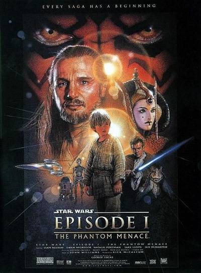
I'll put two of the Star Wars ones up here, as we all have seen them before. I like the fact that the same artist did them and they are all similar.

 -

 -
 
Posted by Louis Bornwasser (Member # 3063) on 09-02-2006, 01:28 PM:
 
Sam; note that on the Alien poster. you can see FINGERPRINTS in the clay logs that make up the "net." Interesting....gives you an idea of the size of the original art. Louis
 
Posted by Tim Reed (Member # 137) on 09-02-2006, 02:00 PM:
 
Hillary, that's absolutely GORGEOUS! I love it. [thumbsup]
 
Posted by Hillary Charles (Member # 769) on 09-02-2006, 08:54 PM:
 
Thanks Tim. You have excellent taste! [Big Grin]

I didn't know these existed until reading the liner notes in the DVD case. According to the notes, they originally sold for $2500! A cheap reproduction of that artwork would have suited me just fine, but then this one came up for auction, and there was only one other bidder.
 
Posted by Christian Appelt (Member # 1067) on 09-03-2006, 10:25 AM:
 
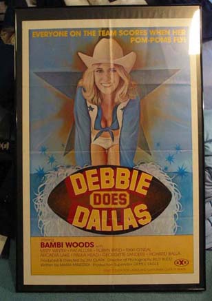
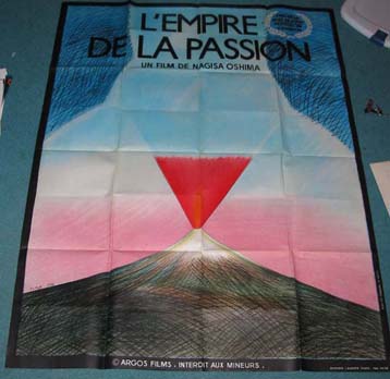
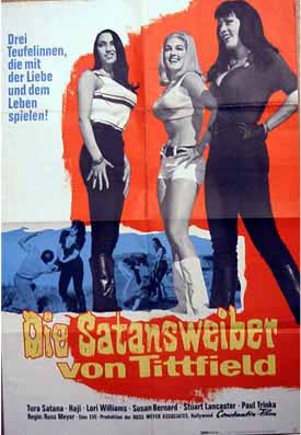
Not as beautiful as the original US poster, but it replaced the SUPERVIXENS poster I had before.

 -

Some visitors felt threatened by it and forgot what they wanted to say because they kept looking at it. [Big Grin]

 -
 
Posted by System Notices (Member # 2357) on 11-01-2007, 08:49 PM:
 

It has been 424 days since the last post.

 
Posted by Shane Cooper (Member # 2510) on 11-01-2007, 08:49 PM:
 
Time for a bump...

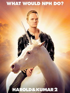
I don't know if it is my favorite, but this is one of the funniest/silly posters I have seen lately.

 -
 
Posted by Frank Angel (Member # 248) on 11-01-2007, 09:55 PM:
 
Allison, I had lost track of this thread (excellent as it is) - excuse my not answering your question, but since it is back,...
quote: Allison Parsons
Frank, what size is that poster? Is it a 'Bus shelter' size?? LOVE the Fantasia poster!!!! Is it on glossy paper (which I think almost never happened back in the day) or am I just seeing the glass from the frame?
The CAMELOT poster is Bus/Train size -- 21x24 aprox. I am not home so I don't have the exact size.

That's correct -- the FANTASIA poster is on gloss paper and you are right again, gloss stock was not as common as it is today. I also have the that same FANTASIA in a 3 sheet size. I haven't taken it out in years -- it will be fun to see how well the colors held up. The 1sheet that's been in my guest room all these years has definately suffered from some fading. When I get some time I'll compare the two.
 
Posted by Allison Parsons (Member # 2728) on 11-02-2007, 12:53 AM:
 
Thanks for the reply Frank [Big Grin]

quote: Frank Angel
FANTASIA in a 3 sheet size
ahhhh, 3 sheets. I had a original Michael Caine Italian Job in mint condition. I sold it on ebay years ago for $800. If I knew it was worth that much, I would have kept it. I have a few more around here somewhere. I'd love to frame one or two but there's no way my budget for a framing it would be possible!

Was the Fantasia 1sh folded? Sorry, I'm in awe of that trippy Disney poster. [Smile]
 
Posted by Cameron Glendinning (Member # 3516) on 11-02-2007, 02:51 AM:
 
My favorite poster is my "The Exorcist" signed "Cameron, with much gratitude, William Friedkin." Now if I could only find it!
 
Posted by Tim Rectanus (Member # 3282) on 11-02-2007, 12:42 PM:
 
 -

I smile when I look at it, not sure why.
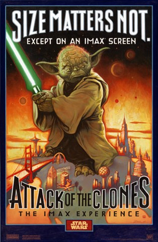
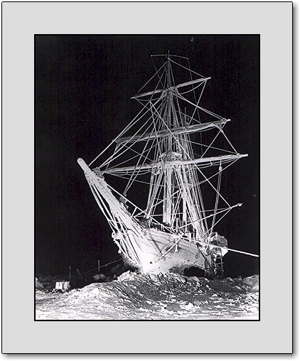
The rest of the ones on my walls get rotated, mostly with what we are showing in the near future or movies that I just liked that they did in IMAX. Right now, Polar Express, Beowulf, Apollo 13, Star Wars above, Hurricane on the Bayou, and the Shackleton's Antarctic Adventure Ship pic below (used 20 flashes to get the pic)
 -
 
Posted by Frank Angel (Member # 248) on 11-02-2007, 01:43 PM:
 
Allison, both the 1s and 3s FANTASIA were never folded. The only other 3s I have are MIDNIGHT COWBOY and SAND PEBBLES. If I remember correctly, I think the SAND PEBBLES was made in two pieces instead of a single large sheet.
 
Posted by Per Hauberg (Member # 529) on 11-04-2007, 05:43 PM:
 
 -

-And yes, -it was in 70mm, as that little, clumsy note down right suggests. [Smile] Last run about 1981. I believe the print is today with the norwegian film museum. -Lucky bastards !

Unfortunately, danish filmdistibutors in those days insisted in shipping posters folded and in A4 envelopes [thumbsdown]
 
Posted by Charles Greenlee (Member # 3856) on 10-10-2008, 02:17 AM:
 
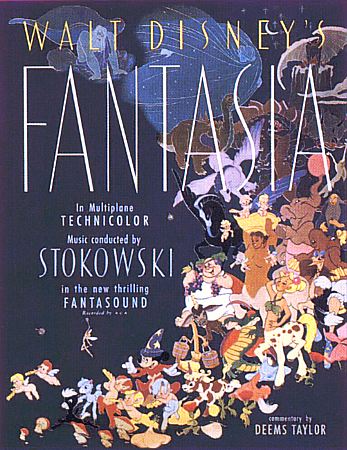
My fav. is the original Fantasia poster, with mention of its Fantasound. I simply can't find it anywhere, yet I know it exists. I grabbed a pic of it off of the Wide screen Museum site. I tried asking them where they got it, no help there. Tried checking all of the major poster sites, including one that can get you vintage originals, even one of a kinds, and nothing. But I like sound technology posters, THX, DTS, Dolby Digital, etc. So I figured I just gotta have the grandaddy of them all. The first example of a cinema surround sound setup is worth note. Even if it never took off as a mainstream format.

 -
 
Posted by Tyler Potts (Member # 4952) on 10-10-2008, 03:16 AM:
 
Here's what's currently framed and hung:

 -
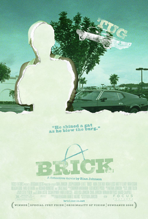
My favorite movie

 -
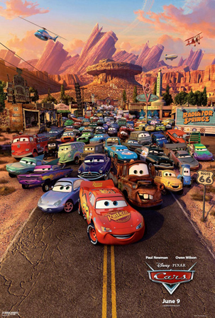
Kept up because everyone that visits can somehow pick my favorite car...

 -
It makes Donnie Darko looks like a car safety video

 -
No one else seems to enjoy this flick but me

 -
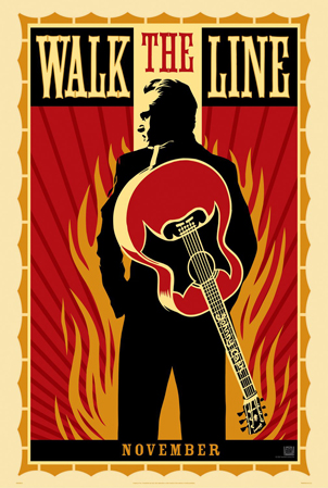
When I first put this up, I heard so many rumors as to who the man in black was, it was great to see the shock that it was Joaquin.


Powered by Infopop Corporation
UBB.classicTM 6.3.1.2