This is topic Kodak unveils new logo in forum Film-Yak at Film-Tech Forum ARCHIVE.
To visit this topic, use this URL:
https://ft-forum.com/ft/cgi-bin/ubb/ultimatebb.cgi?ubb=get_topic;f=8;t=004431
Posted by Paul Mayer (Member # 355) on 01-07-2006, 06:47 PM:
A change for the better? I dunno... ![[Shrug]](graemlins/shrug.gif)
Here's the article from yesterday's Rochester Democrat and Chronicle. What say you?
quote:
Kodak Unveils New Logo
Event marks the company's first such change in more than half a century
Ben Rand
Staff writer
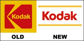
(January 6, 2006) — In another break with the past, Eastman Kodak Co. is introducing a new corporate logo designed to help the company forge a new image as a cutting-edge, 21st century innovator.
Kodak's new corporate symbol retains the company's distinctive red and yellow colors, but does away with the boxes that have contained the word "Kodak" for the past 70 years.
The logo change was introduced today during a sweeping speech by Kodak Chairman and Chief Executive Antonio Perez at the International Consumer Electronics Show in Las Vegas. In his speech, Perez called on the industry to work together to make digital imaging and digital photography easier and more useful in the context of daily life.
The new mark, based on a customized typeface, is designed to give the company a contemporary look but be flexible enough to apply in new ways and new venues across Kodak's varied businesses --everything from tiny handheld digital cameras to computer software to the letters on Kodak buildings around the world.
The logo is one part of Kodak's larger effort to redefine its brand-name identity, through advertising, public relations, supplier and partner relationships and other in areas.
"We want to break out of the box, in a lot of ways," says Betty Noonan, director of brand management and marketing services at Kodak.
The announcement caps a busy week for Rochester's best-known company. Kodak late Thursday announced an important technology-sharing-and-marketing alliance with Motorola Inc. aimed at making imaging more widespread in electronic devices. Earlier, it unveiled what is believed to be the first digital camera with two lenses, and new software that combines Internet telephone calls with photo sharing.
Posted by Phil Hill (Member # 371) on 01-07-2006, 06:55 PM:
I like the old logo better...
The new one sux and is too Jewish!
It's just one more reason to switch to FujiFilm! ![[thumbsup]](graemlins/thumbsup.gif)
Posted by David Stambaugh (Member # 1102) on 01-07-2006, 07:22 PM:
The old logo definitely looks dated. The new logo, I dunno, I like it but it doesn't seem like a home-run. Maybe it'll grow on me.
Posted by Bobby Henderson (Member # 840) on 01-07-2006, 07:22 PM:
The new Kodak logo is too trendy, at least in the choice of letter forms. Give it a few years and the logo will look dated and need changing once again.
Also, I think it's too plain looking. There's not much to the design to really make it work as a true logotype. It's just lettering framed with two rule lines.
Kodak has valid points for wanting to get rid of the boxes -to get people to start thinking "outside the box" when it comes to Kodak.
The problem is that K box really worked as a logotype or symbol for the company. It may not be as well known as Dolby's Double D icon, but lots of people could probably identify the element on its own without the Kodak letters being stationed inside of it.
Intel just unveiled a major redesign of their logo, basically getting rid of the comic book style "Intel Inside" letters but keeping the swoosh element. Intel kept the swoosh even though the swoosh thing has really gone out of fashion in terms of logo design trends.
Posted by Bob Maar (Member # 763) on 01-07-2006, 08:06 PM:
The new logo is a Major Mistake. I think they will re-think this new and go back to the old.
The new lacks imagination, is very plain and "dull'.
Posted by Wayne Keyser (Member # 2420) on 01-07-2006, 08:33 PM:
Brainwaves picked up from the Kodak boardroom:
"I dunno what to do ... we completely missed the digital wave ... might as well still be selling box cameras ... we could maybe develop better products to win the consumers back ... no, I got it! A new logo!"
Posted by John Hawkinson (Member # 1135) on 01-07-2006, 09:29 PM:
Somehow, I can't but help think that KODAK needs to be printed magenta-on-cyan. ![[Smile]](smile.gif)
Oh--and with funny spacing pseudorandomly inserted between the letters.
[ Really, I dislike the lack of stems in the "da". ]
--jhawk
Posted by Louis Bornwasser (Member # 3063) on 01-07-2006, 10:09 PM:
Heritage thrown away....at a cost of millions! Another dumb move by a major American company. (like the Att&T bell) Louis
Posted by Mark Gulbrandsen (Member # 72) on 01-07-2006, 10:59 PM:
Its as bad as clear coke!
Posted by Mike Heenan (Member # 392) on 01-07-2006, 11:23 PM:
Ya know if you look at the new one long enough, it looks like it's saying "Kooek". I'm not one who has a font fetish like some, but in this case, the font looks foreign to me (in that the spelling looks like it's Russian or Czech or some Eastern Euro country) and just doesn't look like Kodak at all. ![[thumbsdown]](graemlins/thumbsdown.gif)
Posted by Brad Miller (Member # 2) on 01-08-2006, 12:27 AM:
Agreed, the new logo sucks. The old logo may be a little dated, but it IS branding that everyone is familiar with and is a superior logo than this weird concoction.
(Sorry John)
Posted by Monte L Fullmer (Member # 2797) on 01-08-2006, 02:09 AM:
quote:
Its as bad as clear coke!
..or "New Coke" of 1985?
Posted by Steve Guttag (Member # 268) on 01-08-2006, 03:24 AM:
The new logo seems totally "uninspired"...not something one would want in a "logo"...in fact it doesn't have a "logo" feel to it. As someone else noted...a good logo should convey the company, even if the company's name is not on it. Like Dolby's double-D...you see those Double-Ds and you know it is Dolby.
For me, I could never see Kodak's "classic" logo without thinking of a Super-8 film cartridge...perhaps that was one of the problems.
Then again, I think Dolby has fussed way too much over its logo over the more recent years. There was Dolby System, then Dolby Stereo and then just Dolby, with a box without a box all caps and caps/lowercase...who gets paid to keep changing something like that and do they really think that the cost of changing everything will be recouped in sales due to the new logo?
Logos should identify the brand in a unique way such that one instantly identifies the company when they see it. That is all it really has to do and you are better off not messing with it once that is achieved unless it really somehow dates you out of your present technology. The traditional Kodak logo doesn't do that...it is a timeless piece and only one company I know has a logo like it. What they've done is a bad move and a waste of money and time, if you ask me (and they didn't).
Posted by Dan Lyons (Member # 1454) on 01-08-2006, 03:50 AM:
If you stare at the new logo for a while, it starts to look like some strange foreign writing.
I don't like it.
Posted by Louis Bornwasser (Member # 3063) on 01-08-2006, 10:03 AM:
Steve has it exactly! Louis
Posted by Scott Norwood (Member # 30) on 01-08-2006, 12:18 PM:
I agree with the majority--the old logo was fine and the new one just looks "odd."
Having said that, I looked at some Kodak packaging and it seems that they don't really feature the logo very prominently on their current packages:
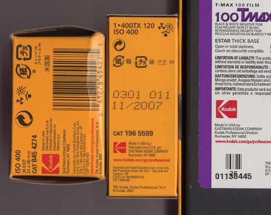
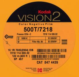
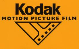
For motion-picture products, they seem to favor this logo (which I think is quite good, actually):
As for the Bell System Bell, AT&T doesn't have the rights to use it--those rights were assigned to the BOCs. Verizon doesn't use it very much (it's not on the phone book covers), but it does appear on the back of their trucks, on some payphone enclosures, and on their payphone instruction cards:

Posted by Brian Michael Weidemann (Member # 2243) on 01-08-2006, 12:47 PM:
Not only is the new one plain, it's not a logo, insofar as my understanding of design is concerned. It's the company name in a font! The lines aren't incorporated in any way and could drop out or be omitted with changing the look or feel. There's no character at all, and thus nothing to identify.
I believe in the less-is-more theory of graphic design, but the-simpler-the-better is a bad mentality for its own sake.
A logo works when you can see it from a distance or at a glance and the brain knows what you're looking at and makes its associations before you can think consciously of the company name. This won't do that, and not just because it's still new, but because ANY word boxed by lines is something you see all the time on ANY sign.
Maybe if a company changed its brand every 10 years, you could get away with it, and use the excuse of keeping things fresh and hip and new. What was it, 70 years? A corporate board room voted in a word-and-lines sign to "redefine its brand-name identity"? That sounds like a contradiction in terms to me. Established for 70 years, and they want to start over?
Posted by Louis Bornwasser (Member # 3063) on 01-08-2006, 02:51 PM:
It's as if they thought they should be ashamed of the old company and its heritage.
This is just as bad as movie posters with "only a head shot" of an actor! (ref: not a logo; just a font with lines.) Louis
Posted by Bruce Hansen (Member # 281) on 01-08-2006, 06:51 PM:
A little update of their logo would have been OK, but I also think the new logo just doesn't cut it. It looks like your typical management-moron decision, "we don't know how to fix our problems, so let's just change the logo".
Posted by Cory Isemann (Member # 2517) on 01-08-2006, 10:40 PM:
Wonder what John P's thoughts are??
Posted by Brian Michael Weidemann (Member # 2243) on 01-09-2006, 04:26 AM:
I wonder if he's even allowed within 100 yards of a public opinion on the matter. ![[Wink]](wink.gif)
Posted by Bill Enos (Member # 440) on 01-09-2006, 08:35 AM:
I'mm guessing that if John likes his job his comments will be non critical
Posted by Mike Blakesley (Member # 26) on 01-09-2006, 12:14 PM:
I think it totally lacks imagination. I wonder how many hundreds of thousands of dollars that cost? (and will cost, in signage, etc.)
Posted by Phil Hill (Member # 371) on 01-09-2006, 12:36 PM:
I don't think a company's logo has to be "prominently" displayed on their products for them to be recognized. Actually I get annoyed at companies that feel they have to be in one's face in a BIG way.
It's almost like they are compensating for an inferior product. Sorta like the guy that has to have a Corvette to make up for shortcomings in other "things".
IMHO, Kodak is making a HUGE mistake by dumping their long-time logo that is easily recognized by both those in and out of the industry. BTW: I also like the style of their old "text" logo.
quote: CoryBoi
Wonder what John P's thoughts are??
quote: Bill Enos
I'mm guessing that if John likes his job his comments will be non critical
Even if "allowed" to, it's a wise man that doesn't bite the hand that feeds him.
Posted by John Pytlak (Member # 331) on 01-09-2006, 01:05 PM:
I was not involved in the choice of the new logo.
As I understand it, part of the need was for the Kodak name to be readable on small digital displays, as on a camera phone display. The Kodak "box", while known and beloved by many, just did not have the room for legibility of the "Kodak" name on small displays. The stylized "d" and "a" catch the eye, and will be successful if they don't distract.
Here's the six logos used in the last century:
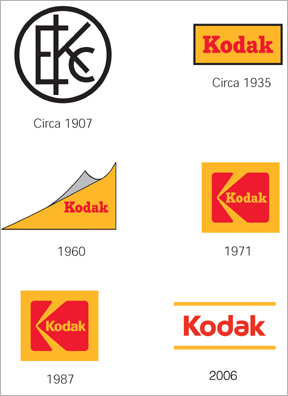
As Scott and Phil noted, the Kodak corporate logo is not usually a prominent part of motion picture product packaging. Gives me a reason to order new business cards however, and maybe get some new shirts.
Posted by Phil Hill (Member # 371) on 01-09-2006, 05:37 PM:
John, send me your old Kodak shirts, smelly, dirty, or not! Ummm... that is except the ones with the rotted out armpits! I'll wash them and wear them at ShoWest!
BTW: Send me a pass to ShoWest... I'll even wear the "I (heart) KODAK" shirt!
OBTW: Tell Eric I said Hello... even though he's a jerk for ignoring me! HA!
Posted by Joe Redifer (Member # 3) on 01-09-2006, 06:38 PM:
I definitely prefer the 1987 logo over the 1971 logo. The 1907 logo sucks ass and should not be able to be used legally. What a stupid and useless year.
Tell Eric I said "Hi". Oh and also Jean, Tim, Samuel, Jim, Ted, Steph, Shauntraniece, and Bill as well. And John "Zippy" Rogers if he is still there. Get to it. Thanks.
Posted by Mike Blakesley (Member # 26) on 01-09-2006, 07:15 PM:
I like 1960's logo the best. It reminds me of my dad, he was heavy into photography when I was a kid and we had dozens or hundreds of boxes of stuff with that logo around the house.
Posted by William Hooper (Member # 71) on 01-10-2006, 02:50 AM:
I think the 1935 logo translates without dating.
The new logo looks kinda Cyrillic to me, too.
Wonder why the 'a' wasn't good enough for them any more & they had to go with a schwa? Maybe the letter 'a' is now associated with moribund technologies. They probably did some focus group research.
Posted by Richard Hamilton (Member # 321) on 01-10-2006, 08:49 AM:
quote: Phil Hill
It's almost like they are compensating for an inferior product. Sorta like the guy that has to have a Corvette to make up for shortcomings in other "things".
Are saying that the Corvette is inferior? I know the car has it's shortcomings, but I make it look good! ![[Razz]](tongue.gif)
Rick
Posted by Phil Hill (Member # 371) on 01-10-2006, 09:05 AM:
Not at all, Rick. I was referring to this commercial. ![[Eek!]](eek.gif)
(A Quicktime *.mov)
Posted by Joseph L. Kleiman (Member # 3097) on 01-10-2006, 03:32 PM:
That new logo is as panoramic as the misaligned photo I took with Kodak's new two-lens camera at CES. When aligning three photos into one panoramic photo, as the new camera allows you to do, reference points don't mean crap when people move!
Posted by John Pytlak (Member # 331) on 01-11-2006, 10:03 AM:
You should have asked the people around you to "play statue" and not move between shots. ![[Big Grin]](biggrin.gif)
Powered by Infopop Corporation
UBB.classicTM
6.3.1.2