This is topic Annoying movie posters. in forum Film-Yak at Film-Tech Forum ARCHIVE.
To visit this topic, use this URL:
https://ft-forum.com/ft/cgi-bin/ubb/ultimatebb.cgi?ubb=get_topic;f=8;t=005980
Posted by Ian Parfrey (Member # 5122) on 12-06-2009, 03:54 PM:
If I ever see a job going as Movie Poster Designer, I may just apply. Surely it can't be too hard? All one needs are two standard things going by current traditions.
- First and foremost is of course, Trajan type font. This is a given.
- Second, and more important, is a male star with a gormless look on his dial.
Now granted, the two movie posters which leave me absolutely cold don't use the Trajan type font, but they do excel in the "Gormless Grin" look.
These are the posters for "Hudson Hawk" (1991) with Bruce Willis and the current release for "The Informant!" (2009) with Matt Damon.
I didn't mind Hudson Hawk all that much, it was ok for what it was- and I have yet to see The Informant (note to typesetter- DON'T forget the "!") so I am unable to comment.
.....but what is it with the dopey grin?
I can imagine the Actor Wanted ad now..."Actor wanted- must be great with the Grin - able to sustain big close up for one sheets- shiny teeth and lop sided jaw thrusts prefered"
There must be other annoying movie posters out there.
A penny for your thoughts.....more thoughts, more pennys.
Posted by Bobby Henderson (Member # 840) on 12-06-2009, 04:24 PM:
Most movie posters these days suck out loud for a variety of reasons, not just the continuing overuse of Trajan (or Trajan Pro), the "Arial" of movie poster typefaces.
Movie posters formerly used a great deal of illustration. Artists like Bob Peak and Drew Struzan put out a lot of great movie posters throughout the 1970s and the 1980s. Lots of classic movies featured illustrative paintings.
Today, we just have Photoshopped close up photographs of one actor's melon. Or we have a Photoshopped collage of actor heads. Most movie posters today are forgettable shit. Many are already designed for the tiny DVD/Blu-ray case cover rather than the 27" X 41" one sheet format.
I think the marketing arms of movie studios just have guys pump out about 40 or so movie poster comps. They focus group the hell out of it and then committee it to death so they can boil the poster concept down to the most safe and forgettable design possible. The days of an art director hiring an illustrator and having him create something pretty cool looking seem to be over. Now it's just cut and paste bullshit. Formulaic, assembly line garbage. It's about as far from "art" as it gets. The boring nature of contemporary movie posters reminds me of how so many cars look anger inspiring boring. Design by committee often just sucks. The results are almost always safe, forgettable bullshit.
Same goes for the type. Whatever fonts come bundled in an Adobe Creative Suite will often be used, with Trajan at the top of the list.
Logos? How often does a movie have an actual logo these days? Rarely if ever. Star Wars, Raiders of the Lost Ark, Apocalypse Now, Back to the Future and even shitty movies like Xanadu had nifty looking logos on their posters. Today we just have type.
Avatar has somewhat unique looking lettering, but I suspect someone just brought up that Papyrus typeface and floated it around before someone finally tweaked it. The Matrix? Crap. It's just Times New Roman fractured up a bit in Adobe Illustrator. The tiny Japanese Katagana characters scrolling vertically in the background are more interesting.
The sucksational quality of movie posters today is merely another symptom of Hollywood studios concentrating far more on home video than giving a movie a proper start in commercial movie theaters.
quote: Ian Parfrey
.....but what is it with the dopey grin?
Matt Damon plays something of a naive dumbass in The Informant!
Posted by Mitchell Dvoskin (Member # 751) on 12-06-2009, 05:38 PM:
There is an excellent documentary that PBS airs every now and again called The Man Who Drew Bug-Eyed Monsters. It is the biography of artist Reynold Brown, who always dreamed of being a serious western landscape painter, but spent most of his life creating movie posters for monster and horror movies in the 1950's and 60's to support his family.
Posted by Mark J. Marshall (Member # 1409) on 12-06-2009, 06:03 PM:
Tell us how you really feel, Bobby. ![[Wink]](wink.gif)
Posted by Mike Blakesley (Member # 26) on 12-06-2009, 06:24 PM:
The new trend that bothers me these days is posters that DON'T have the title on them at all. The first one I saw was the 1985-ish BATMAN movie -- just had the bat-logo. Current offenders are the next TOY STORY movie (which the posters just have "3" on them). WTF don't they put the name of the movie they are advertising on the posters?? This would seem to be Marketing 101 stuff.
Posted by Mark Ogden (Member # 43) on 12-06-2009, 06:43 PM:
quote: Mitchell Dvoskin
artist Reynold Brown
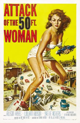
Probably the greatest sci-fi one-sheet artist ever, so long as you didn't expect the film to live up to the artwork. His classic poster for Attack of the 50-Foot Woman is one of the truly iconic examples of the genre. Every once in awhile, to this day, you see a magazine cover or piece of newspaper art that is based on it.
Posted by Bobby Henderson (Member # 840) on 12-06-2009, 07:06 PM:
In one of the extras on the Blu-ray of Monsters vs. Aliens a wall poster is in the background with the character Susan/"Ginormica" posed in the same manner as the Attack of the 50 Foot Woman poster art.
Dreamworks chose something far more conventional for the Monsters vs. Aliens one sheet.
Posted by Jeremy Jorgenson (Member # 2989) on 12-07-2009, 07:31 PM:
quote: Mike Blakesley
The new trend that bothers me these days is posters that DON'T have the title on them at all. The first one I saw was the 1985-ish BATMAN movie -- just had the bat-logo. Current offenders are the next TOY STORY movie (which the posters just have "3" on them). WTF don't they put the name of the movie they are advertising on the posters?? This would seem to be Marketing 101 stuff.
They are advertising the movie, not the title, right? I can't imagine that there is any confusion about what the Toy Story 3 teaser posters are advertising. Plus, these are just teasers. I was 13 when the first Tim Burton Batman was released in 1989. I definitely knew what the Batman symbol was, and which movie it represented, I didn't need the title written on the poster for me to figure it out. Now, if The Bad Lieutenant: Port of Call - New Orleans poster just showed Mr. Cage & said something like "BL2" or something stupid not giving the title, then I'd be in agreement with you.
Posted by Caleb Johnstone-Cowan (Member # 3710) on 12-08-2009, 06:22 AM:
Cloverfield used the lack of a name on the poster to great effect. Got everyone guessing, along with the brilliant trailer.
What really annoys me is when the 'teaser' materials you get ages in advance look far superior to the final posters. Two recent examples are A Christmas Carol and Avatar, I didn't want to put the new stuff up and didn't bother with the latter, the new Avatar poster sucks.
I have started to prefer banners to posters internally. At my last work I actually stopped putting up posters for anything other than limited release films, because with Hollywood features the banners and standees looked a lot better than the posters do.
Posted by Mike Blakesley (Member # 26) on 12-08-2009, 11:17 AM:
quote: Jeremy Jorgenson
They are advertising the movie, not the title, right? I can't imagine that there is any confusion about what the Toy Story 3 teaser posters are advertising. Plus, these are just teasers.
My point is, why NOT put the title of the movie on? What would it HURT their marketing campaign by putting the well-known Toy Story logo on there, instead of just a big "3" on a black background? The only clue that it's a Toy Story movie is the slogan, "No toy gets left behind" which, if you're not already a fan of the series, means nothing.
The most recent of this silliness is the Alvin & the Chipmunks 2 posters, which simply have the words "the squeakuel" on them. But at least they have the Chipmunks characters so it's not quite as bad.
Posted by Martin McCaffery (Member # 37) on 12-08-2009, 11:51 AM:
Remember, the target audience is post-literate. Words just clutter things up. Marketing is everywhere, so I assume the assumption is by the time they see a poster in a theatre, the target audience already knows what it is for and are just having their appetite whetted and reinforced.
Or, they just think they look cooler that way
Posted by Mark J. Marshall (Member # 1409) on 12-08-2009, 08:44 PM:
I actually like the "3" poster for Toy Story.
Posted by Paul Mayer (Member # 355) on 12-09-2009, 01:22 PM:
Just for the heck of it, here's a link to an international poster collection wiki page I worked on for Ponyo, Hayao Miyazaki's latest animated film, which had a short 800-screen run here a couple of months ago. Some critics knocked the US poster (by Disney, Ponyo's US distributor) for using CG elements in a poster for a defiantly old-fashioned hand-drawn 2D cel-animation film.
http://www.nausicaa.net/wiki/Ponyo_on_the_Cliff_by_the_Sea_(posters)
Posted by Dennis Benjamin (Member # 1137) on 12-09-2009, 01:31 PM:
While we are on this subject:
Is it me - or did a majority of the Pixar/Disney releases NEVER actually release regular one sheets for thier films?
MONSTERS INC.
CARS
THE INCREDIBLES
UP
FINDING NEMO
I never saw actual regular posters for these films, with all the credit info at the bottom. I know that at my theatres, we would recieve what I would call a 'teaser' and then never get anything else. When I would call the production houses, they would tell me that what I got was the only poster released.
?
Posted by Bobby Henderson (Member # 840) on 12-09-2009, 02:01 PM:
Pixar doesn't give the sort of "top billing" or other mention of the voice talent (and other talent) in its movies. They don't do that with their movie posters. Come to think of it, Pixar doesn't do that with their movies either. You just get the title at the front of the movie and all the credits at the end.
Posted by Todd McCracken (Member # 4718) on 12-09-2009, 02:24 PM:
quote: Mitchell Dvoskin
There is an excellent documentary that PBS airs every now and again called The Man Who Drew Bug-Eyed Monsters. It is the biography of artist Reynold Brown, who always dreamed of being a serious western landscape painter, but spent most of his life creating movie posters for monster and horror movies in the 1950's and 60's to support his family.
http://www.youtube.com/watch?v=8f-hXDOUiVE
Link to the full doc
Posted by Mike Blakesley (Member # 26) on 12-09-2009, 03:11 PM:
quote: Bobby Henderson
Pixar doesn't give the sort of "top billing" or other mention of the voice talent (and other talent) in its movies. They don't do that with their movie posters.
I do believe Pixar DID put the names Tim Allen and Tom Hanks on the Toy Story 2 posters.
In general, Disney usually doesn't issue posters "with credits" for any of their animated films (there are the occasional exceptions). Some of the other studios have followed suit with this.
Posted by Frank Angel (Member # 248) on 12-10-2009, 08:00 AM:
It's been a strange tradition of using that elongated, tall typeface at the bottom of 1-sheets. Is that a unique font or do they just take a sans-serif and optically elongate it? I understand why they need to do it -- to fit all those credits in such a small space, but I would have thought that by now they'd have created a font specifically for that purpose, given that every poster under the sun uses it.
Posted by Bobby Henderson (Member # 840) on 12-10-2009, 12:11 PM:
Specific, ultra condensed style fonts are available and are used on the credit listings of most movie poster one sheet designs.
The designers are not supposed to take a normal width typeface, such as Arial Regular, and squeeze it to 10% or 20% of its normal width. And that's because that sort of type treatment only looks like shit and gives the design the horrible stink of amateur hour odor. It's rarely ever acceptable to distort type. It's almost as bad an offense in typography as setting a script in all capitals.
I don't know the name of the original typeface movie studios most commonly use for credit listings on posters, but URW created a version of it called "Bee" in four different face weights in the mid 1990s. Here's an example of it:

At times movie studios will also use more commonly available condensed typefaces. Univers Thin Ultra Condensed is one of the best, most common alternatives to Bee. The version from Linotype is better digitized and tracked better. However, it looks noticeably different from Bee. I used a compressed weight of Univers for some of the type in this image:
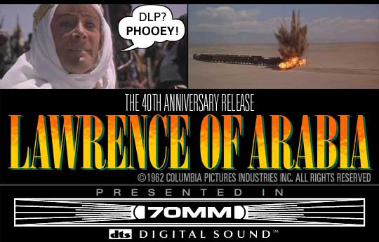
There's a growing number of other ultra compressed fonts that are weights of larger type families. I'm kind of surprised the growing number of choices aren't showing up on poster designs. Most of the credits are still set in Bee. It's just like the bigger type work being done in Trajan.
Posted by Mike Blakesley (Member # 26) on 12-11-2009, 11:21 AM:
I read somewhere that the reason for the tall/thin look of poster credits is also because the studio agrees to make the credits a certain point size.
Posted by Bobby Henderson (Member # 840) on 12-11-2009, 12:02 PM:
The studios go into even more detail on poster lettering sizes. Actors and other key people involved in the production may demand their credit listings be sized a certain percentage in ratio to the title and/or placed in front of the title in the lower block of listings and above the title for the large listings at the top of the one sheet layout. Any number of odd demands could be made regarding the poster layout as to how names are sized and arranged. Never mind the critical factor of geometry and whether all the elements will fit in the sizes being demanded.
I always laugh a bit at a movie poster credits list where one actor in the group demands to have a rectangle put around his name. I feel like the box needs the extra tagline "and featuring the special guest asshole: (actor's name)."
I can imagine a studio executive and talent agent arguing at length about stuff like this over lunch and then the poster design flunkie getting a long laundry list of crap he has to do to the copy. "Don't forget to use Trajan on the title!"
Powered by Infopop Corporation
UBB.classicTM
6.3.1.2