This is topic Can Anyone Name This Font? in forum Film-Yak at Film-Tech Forum ARCHIVE.
To visit this topic, use this URL:
https://ft-forum.com/ft/cgi-bin/ubb/ultimatebb.cgi?ubb=get_topic;f=8;t=006260
Posted by Hillary Charles (Member # 769) on 09-25-2010, 11:41 AM:
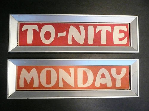
With the font knowledge here, I thought this would be a good place to find out what this is. We'd like to reproduce some other signs to insert into the frames, and are looking for something similar if not identical. Thanks in advance. ![[Smile]](smile.gif)
Posted by Bobby Henderson (Member # 840) on 09-25-2010, 03:19 PM:
Judging by the differences in repeated characters (the "O," "N" and "T") I would say the lettering is custom hand drawn or digitized. If it was a typeface those repeating characters would look identical.
For something a little bit similar I would suggest using Showcard Gothic by Font Bureau. It's a fairly common typeface; I see it loaded on lots of Windows-based PCs. Not sure what applications bundle it.
Font linky
Posted by Brad Miller (Member # 2) on 09-25-2010, 04:59 PM:
Or you could use Trajan. Its Bobby-certified and approved for ALL purposes. ![[Razz]](tongue.gif)
Posted by Bobby Henderson (Member # 840) on 09-25-2010, 07:03 PM:
Yeah, Trajan is kind of movie related.
But for the sake of all things sacred, please do not use Comic Sans, or the even worse looking "Kids" font. For that matter, don't use Arial either. Distorted or left in its proper proportions Arial sucks.
Posted by Joe Redifer (Member # 3) on 09-26-2010, 12:08 AM:
My boss makes me use Arial all of the time in my video projects. Sometimes he gets crazy and makes me use Arial Bold.
Posted by Randy Stankey (Member # 64) on 09-26-2010, 12:20 AM:
Can he tell the difference between Arial and Helvetica or any one of the other Helvetica knockoffs like Triumverate?
http://www.fonts.com/findfonts/detail.htm?pid=202957
Not a lot of people can tell. I'd switch just to see.
Posted by Joe Redifer (Member # 3) on 09-26-2010, 12:29 AM:
Probably not. He had me edit a wedding video he shot on the fly for some of his friends and told me to use a certain cursive-like font. I didn't like it, so I used a different cursive-like font. He never said a word. Though he did get mad that I added a stroke to the title because there were light and dark parts of the image. He insisted that strokes or "outlines" are never, ever used in graphic design. He also insisted that was the reason why the text looked all jaggy when he watched the DVD. I told him that was his crappy DVD player on his computer not deinterlacing very well (it was a 60i project), but he was having none of that!
Oh well, he pays good!
Posted by Hillary Charles (Member # 769) on 09-26-2010, 09:24 AM:
Thanks for the info, Bobby. You're right, it's not a very consistent font, is it? Showcard Gothic looks like it would fit nicely for that kind of feel.
And just for shits and giggles, I think I might do them in Trajan just for a back-up.
Seriously, I appreciate the help.
Posted by Randy Stankey (Member # 64) on 09-26-2010, 09:48 AM:
Joe,
Cursive fonts almost always suck when shown on a video screen, even if it's Hi-Def. Contrast between foreground and background colors can make it even worse.
Outlining or stroking could make the problem worse or better, depending on the stroke color and it's relationship to the colors around it.
I'm not trying to tell you anything you don't already know. It just sounds like we have similar types of bosses. Hey! I'll make you a deal. If you come to Pennsyltucky and kill my boss I'll go to Colorado and kill yours. ![[Wink]](wink.gif)
Posted by Richard Hamilton (Member # 321) on 09-26-2010, 10:44 AM:
quote: Hillary Charles
just for shits and giggles
Ha, I haven't heard that for a long time. My grandma used to say it when our family got together and played poker (nickle/dime). Never could tell if she was bluffing or not ![[Roll Eyes]](rolleyes.gif)
Posted by Mark Lensenmayer (Member # 134) on 09-26-2010, 02:04 PM:
Comic Sans works very well with dyslexic readers. They like the clarity of the letters. My wife is a trained dyslexic tutor, and she's now using Myriad Pro. This font is recommended by many national dyslexic teaching organizations.
Posted by Bobby Henderson (Member # 840) on 09-26-2010, 07:12 PM:
quote: Joe Redifer
He insisted that strokes or "outlines" are never, ever used in graphic design.
Joe, your boss could be buying his groceries blind-folded. Food package design has lots of examples where lettering is outlined, drop-shadowed, highlighted and more.
I do agree tasteful restraint should be used whenever possible. And that often means leaving lettering not embellished with various effects. But sometimes those embellishments are necessary to give a certain design the kind of visual "pop" it needs to grab attention or at least stand out from a noisy background. And that's why so much of food package design is so cheesy with the various lettering embellishments. The brand has to do what it can to stand out among all the other packages on the shelf. Loud color, certain visual elements and tricked out lettering are pretty standard in many kinds of package design.
Sign design isn't all that different, although there are more opportunities for tasteful design.
quote: Randy Stankey
Cursive fonts almost always suck when shown on a video screen, even if it's Hi-Def. Contrast between foreground and background colors can make it even worse.
It really depends on the script typeface. Letter stroke width is the real key. A typeface with an extreme contrast of stroke widths (very thick and thin) will be lousy for video use. The same kinds of fonts suck badly for any kind of signs even though some customers insist they be used. I'm not fond of Commercial Script because of its thin/thick stroke widths. The only way such a typeface works in signs and many other applications is by being set very large on the page or display.
"Modern" class typefaces, such as Bodoni or Didot, are very bad for the same reasons. They're not script typefaces, but since some of their features are very thin such typefaces are usually best avoided unless they can be set at really large point sizes -like when they're making up the headline of a magazine like Vogue.
quote: Mark Lensenmayer
My wife is a trained dyslexic tutor, and she's now using Myriad Pro. This font is recommended by many national dyslexic teaching organizations.
I'm confused, is Comic Sans the one recommended by those dyslexic teaching organizations or is Myriad Pro good to use?
I use Myriad on occasion. It's a decent more rounded alternative to Frutiger, although Myriad doesn't have the really bold "black" weights of Frutiger. Windows Vista and Windows 7 don't support Adobe Type Manager so you have to use Windows XP to use the old Type 1 Multiple Master version of Myriad. I don't know if Mac OSX will support Type 1 Multiple Master fonts. It wouldn't surprise me if it doesn't. Older versions of Adobe Illustrator used to have a Multiple Master weight slider palette (which saved the trouble of installing various instances in ATM). None of the CS versions of Illustrator have it.
Posted by Mark Lensenmayer (Member # 134) on 09-26-2010, 09:35 PM:
Typefaces for Dyslexics
Many people with dyslexia find Comic Sans easy to read, Tutors have found that Myriad Pro or Lexia Readable give better accuracy.
Posted by Chris Slycord (Member # 4239) on 09-26-2010, 10:34 PM:
I'm dyslexic and the analysis at the above link seems pretty accurate for me.
Posted by Adam Martin (Member # 641) on 11-15-2010, 07:36 PM:
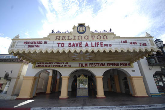
I need a font that resembles or complements the "ARLINGTON" part of the marquee.
Posted by Mike Olpin (Member # 1115) on 11-15-2010, 08:48 PM:
Trajan compliments everything!
Posted by Chris Slycord (Member # 4239) on 11-15-2010, 09:38 PM:
Not to be the grammar nazi, but as an FYI complement isn't compliment.
Posted by John Wilson (Member # 269) on 11-15-2010, 10:20 PM:
^ Grammar Nazi.
Posted by Paul Mayer (Member # 355) on 11-15-2010, 10:42 PM:
No kerning for you!
Posted by Bobby Henderson (Member # 840) on 11-16-2010, 12:14 AM:
quote: Adam Martin
I need a font that resembles or complements the "ARLINGTON" part of the marquee.
I don't know of anything off hand that matches the "Arlington" title exactly. The lettering looks dimensional as if it may have been custom carved or cast. Depending on the wording you need to display it may not be necessary to match the typeface either.
Try looking through the MyFonts web site and use search terms like "Art Deco" or "Victorian". You'll find typefaces that look similar and you may even have some of those typefaces already.
Rounded serif typefaces like Poor Richard, Windsor and Cooper would work with that "Arlington" title. There's lots of sans-serif faces that have an art deco feel. If you have a lot of body copy to set you'll need to go with a more conservative, under stated choice. Designers are using the living hell out of Gotham these days for its very clean and almost timeless appeal. Neutraface is a nice alternative (and also expensive).
Posted by Adam Martin (Member # 641) on 11-16-2010, 12:46 AM:
The ARLINGTON lettering has neon in front of it. It's definitely not a standard font; there is a good amount of signage in the building where you can see inconsistencies in the lettering.
I skimmed through the MyFonts site earlier and nearly went blind trying to match the style of the "A" and "N", but was able to note a few candidates. That site is pretty neat in that you can type in text for it to use in the samples.
Posted by Steve Guttag (Member # 268) on 11-16-2010, 10:01 AM:
The "N" has almost a Paisley lowercase "n" feel to it. Screw it...just go with an OCR typeface.
Steve
Posted by Mike Blakesley (Member # 26) on 11-16-2010, 11:42 PM:
Just a little side note here -- what's the reason for having those Arlington showtimes at 1:45, 4:45 and 7:45? Why not 2:00, 5:00 and 8:00? It would be easier for the sign-reading public to remember.
Posted by Bobby Henderson (Member # 840) on 11-16-2010, 11:50 PM:
Maybe those ":45" times seem a little more specific and non-flexible. Just think about it. Someone asks you, "what time does the movie start?" You answer, "7:00." Perhaps most of those people would be inclined to think "around 7:00" and then further translate that into drag-ass, delay, moron, need to be beaten around the neck and head to be forced to arrive by 7:25.
On a related note, here in Oklahoma sometimes OK DOT likes to screw with drivers when it comes to construction zone speed limits. Normally you have the usual 35mph or 45mph construction zones on Interstate highways. Here you might see something like a 42mph sign.
Powered by Infopop Corporation
UBB.classicTM
6.3.1.2