This is topic New Site in forum Film-Yak at Film-Tech Forum ARCHIVE.
To visit this topic, use this URL:
https://ft-forum.com/ft/cgi-bin/ubb/ultimatebb.cgi?ubb=get_topic;f=8;t=006327
Posted by Sean McKinnon (Member # 612) on 12-31-2010, 09:55 PM:
Wow... Happy new year huh? This is the first major overhaul I have seen in a while and I like it a lot. Nice job guys! ![[Cool]](cool.gif)
Posted by Tom Petrov (Member # 1534) on 12-31-2010, 11:47 PM:
The new site is great!
was wondering when they were going to do an update.
Posted by Robert E. Allen (Member # 1351) on 01-01-2011, 01:18 AM:
WOW!!!! I must have been asleep and didn't see this coming. It's great Brad! I hope it's as easy to navigate as the previous one 'cause it took this old showman awhile to master it.
Posted by Lionel Fouillen (Member # 1475) on 01-01-2011, 01:30 AM:
Congratulations on the new layout. The former one certainly had room for a fresh note. Now, customizing the menu bar and getting rid of the old vertical menu on the left would be great.
Posted by David E. Nedrow (Member # 4981) on 01-01-2011, 02:34 AM:
Great! I can at last bookmark threads.
BTW, manuals?
Posted by Joe Redifer (Member # 3) on 01-01-2011, 02:37 AM:
I was originally contacted to redo Film-Tech's site, but when they saw my previous work they declined.
Posted by Jeremy Spracklen (Member # 18) on 01-01-2011, 02:41 AM:
Manuals will be returning soon along with some new additions to the warehouse. Stay tuned!
Posted by Aaron Garman (Member # 1653) on 01-01-2011, 03:08 AM:
Still simple and refined: what I've always loved about the site.
AJG
Posted by Adam Martin (Member # 641) on 01-01-2011, 03:15 AM:
The warehouse is back online (with a new video, even!) but is still buggy. Post here if you find something on the site that's not working as expected.
Posted by Damien Taylor (Member # 4255) on 01-01-2011, 07:04 AM:
Wow, it looks really nice! Great work Brad and co.
Posted by Jonathan Worthing (Member # 803) on 01-01-2011, 07:18 AM:
![[puke]](graemlins/puke.gif)
Posted by Ian Parfrey (Member # 5122) on 01-01-2011, 07:32 AM:
quote: Joe Redifer
I was originally contacted to redo Film-Tech's site, but when they saw my previous work they declined.
I can't for the life of me see why, Joe.
Your work there has a certain restraint and judicious use of negative space that is simply superb.
Posted by Kenneth Wuepper (Member # 1174) on 01-01-2011, 07:55 AM:
Congratulations Brad,
This new WEB Presence looks and works very well.
You have a real class act here.
Thanks for providing this window into the Cinema Exhibition Industry.
Sincerely,
KEN ![[thumbsup]](graemlins/thumbsup.gif)
Posted by V.V.Tushit Vijay (Member # 5455) on 01-01-2011, 11:11 AM:
Happy New Year.
Awesome Website Mr Brad.
Make much more updates and information to get well known about the tech features and updates about Cinema
Regards,
V.V.Tusith
Posted by Joe Redifer (Member # 3) on 01-01-2011, 11:50 AM:
I must admit that when I first saw the forums, I thought I was visiting another website. But I am glad that the chat refresh will no longer interrupt my forum browsing on my iPod. Some of my ideas were implemented, like reducing the amount of buttons and putting all of the cool stuff under a simple "Warehouse" button.
Posted by Mitchell Dvoskin (Member # 751) on 01-01-2011, 11:57 AM:
Is there any way to get the display to fill the width of my screen?
Posted by Chris Slycord (Member # 4239) on 01-01-2011, 12:14 PM:
quote: Adam Martin
Post here if you find something on the site that's not working as expected.
The link at the main page for the video of the Arlington SMG theater doesn't work. Go to "Home" then click the link and see it fail...
edit: Nevermind. Worked after I refreshed the page. Must've been a glitch on my end...
Posted by Joe Elliott (Member # 4006) on 01-01-2011, 12:34 PM:
Mitchell, there's always CTRL and +, but then it is sooo many pages just to get down one topic.
Posted by Jim Bedford (Member # 4) on 01-01-2011, 01:39 PM:
quote:
quote: Joe Redifer I was originally contacted to redo Film-Tech's site, but when they saw my previous work they declined.
I can't for the life of me see why, Joe.
Your work there has a certain restraint and judicious use of negative space that is simply superb.
Perfect Ian.
But as Mitchell asks, is there a way for forum views to fill the page (other than Control +)?
Damn fine upgrade though. 9 out of 10 for sure.
Posted by Alan Plester (Member # 852) on 01-01-2011, 01:59 PM:
Happy new year to all in film land, thought i had gone to a different place when F/T opened up, very shiny, a really smart job, credit where credit is due,excellent.
Posted by Mike Blakesley (Member # 26) on 01-01-2011, 02:43 PM:
Looks very nice, but I want that jumping frog emoticon. (Wait: No, I don't.)
I like the header the best. Very nice colors. Is that the Film Tech screening room?
Posted by Joe Redifer (Member # 3) on 01-01-2011, 02:57 PM:
There needs to be a "mark forum read" button. You used to be able to click the FT logo about a dozen times to clear the "new threads" but that is now gone.
EDIT: I guess you can click the FORUM HOME button a dozen times to accomplish the same task.
Posted by Mark Lensenmayer (Member # 134) on 01-01-2011, 03:14 PM:
Very nice. Very nice.
Posted by Brad Miller (Member # 2) on 01-01-2011, 03:23 PM:
Thanks for the compliments. The site is not quite done yet, so for example the logo that you can click on to reset the "read" threads will be back.
Posted by Joe Redifer (Member # 3) on 01-01-2011, 05:18 PM:
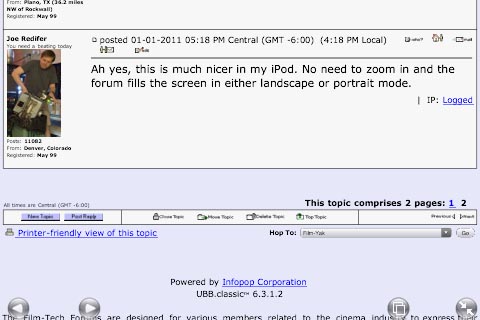
Ah yes, this is much nicer in my iPod. No need to zoom in and the forum fills the screen in either landscape or portrait mode.
[ 01-01-2011, 08:30 PM: Message edited by: Brad Miller ]
Posted by Mike Blakesley (Member # 26) on 01-01-2011, 08:36 PM:
Would it be possible to add a "new posts since last visit" button? Another forum I belong to has that and it's extremely handy.
Posted by Brad Miller (Member # 2) on 01-01-2011, 08:39 PM:
Assuming you are logged into the forum from your last visit, topics with new posts will be identified as having a green "new posts" icon on the index screen or a red folder on the individual forums screen. Clicking the "blue arrow" will jump you to the last unread post.
Otherwise the front page of the website will list the day's topics. (There is a "more" button there to see all of them.)
Posted by Frank Angel (Member # 248) on 01-01-2011, 08:42 PM:
What? There's a new look?
Just kidding....very cool.
Posted by Joe Redifer (Member # 3) on 01-02-2011, 01:21 AM:
Did the forums just get about 50-75 pixels wider? I mean in the last few minutes or so? The forums grew and then the banner grew. Don't think I don't notice that shit. I'm on to you!
Posted by Tom Mundell (Member # 4555) on 01-02-2011, 03:39 PM:
Nice, I like the new design! Looks much better than the old version.
quote: Mitchell Dvoskin
Is there any way to get the display to fill the width of my screen?
Yes, this can be done with a user style sheet. Add the following line to a user style sheet will do the trick:
.bodycolor { width: 100% !important; }
how to do this will vary from browser to browser; I have Firefox which has a userContent.css file I tested the above line in (see here for Firefox directions).
Posted by Adam Martin (Member # 641) on 01-02-2011, 03:58 PM:
What is your screen resolution? Most people find it difficult to read a page of uber-wide text.
Posted by Joe Redifer (Member # 3) on 01-02-2011, 04:13 PM:
Ah, good. You changed the font of the buttons to something acceptable. The ones that were up last night and early today were an improvement over the old purple buttons that had JPEG mosquito noise, but the text looked bad. These buttons are good. If you really want to go all-out, change the buttons for URL BOLD QUOTE, etc as well. ![[Wink]](wink.gif)
Posted by Tony Bandiera Jr (Member # 2365) on 01-02-2011, 06:23 PM:
Gotta say the new look is great, once I got over the initial shock the first time I saw it. ![[Big Grin]](biggrin.gif) I really like the new look to the "Products" section as well.
I really like the new look to the "Products" section as well.
As with any change, it will get better over time especially since Brad and Co. are very willing to listen to the masses.
Big kudos to Brad, and best wishes to him and everyone here for 2011. ![[beer]](graemlins/beer.gif)
Posted by Brad Miller (Member # 2) on 01-02-2011, 06:38 PM:
The credit doesn't go all to me. Adam Martin and Jeremy Spracklen have been major parts of the upgrades.
Posted by Michael Brown (Member # 890) on 01-02-2011, 06:51 PM:
Unable to start a new thread in the feature info forum:
Get this error message:
quote:
An error has occurred:
CGIPath/ubb_new_topic.cgi: Cannot open file NonCGIPath/reminder_3.html: No such file or directory at CGIPath/ubb_new_topic.cgi line 20.
Please inform the board administration of this error so that they may fix the problem. Thank you!
Posted by Chris Slycord (Member # 4239) on 01-02-2011, 07:51 PM:
It's also a minor thing but if you've got cookies set, until you refresh the page, the old site's left-side panel will remain with the rest of the webpage looking like the new style.
Posted by Mark J. Marshall (Member # 1409) on 01-02-2011, 07:59 PM:
FYI... If you click a category (like "Community") there's no bread crumb for "Film-Tech Forum" to take you back to the root.
Posted by Chris Slycord (Member # 4239) on 01-02-2011, 08:14 PM:
What do you mean by "bread crumb"?
If you want to go back to the root of that category, you can always just hit the browser "back" button until you get back to there.
And if you want to go to the root of the entire forum, just hit the forum linky at the top of the page.
Posted by Brad Miller (Member # 2) on 01-02-2011, 08:34 PM:
Clicking the main "Film-Tech Forums" logo in the top left corner will take you to the root. Two clicks of the logo will clear the notifications on new posts that you have read.
Posted by Adam Martin (Member # 641) on 01-02-2011, 08:38 PM:
quote: Michael Brown
Unable to start a new thread in the feature info forum
Fixed.
Posted by Louis Bornwasser (Member # 3063) on 01-02-2011, 09:46 PM:
You guys are good. . . really good! Louis
Posted by Mark J. Marshall (Member # 1409) on 01-02-2011, 10:32 PM:
quote: Chris Slycord
What do you mean by "bread crumb"?
Do you see at the top of this page where it says:
Film-Tech Forum » Community » Film-Yak » New Site
Those are bread crumbs. The last one is not a link but everything before it is. If you click on "Film Yak" then you will see:
Film-Tech Forum » Community » Film-Yak
If you click on "Community" you should see:
Film-Tech Forum » Community
But you don't see anything and you're kind of stuck in the "Community" category until you go to the "Forum" link at the top like you said.
I do love the look of the new site, by the way. I was just pointing out the buggy bread crumbs.
Posted by Joe Redifer (Member # 3) on 01-02-2011, 10:51 PM:
The text in the "Film-Tech Forums" logo is way skinnier than the text in the "Film-Tech Cinema Systems" logo. Try using Copperplate Gothic Bold for both.
Posted by Bobby Henderson (Member # 840) on 01-03-2011, 12:15 AM:
There are bolder weights of Bank Gothic. Font Bureau's Agency Gothic looks similar and has lots of weights and widths.
Posted by Joshua Waaland (Member # 287) on 01-03-2011, 08:40 AM:
LOVE the new site guys! Great work!
Posted by Jim Bedford (Member # 4) on 01-03-2011, 01:38 PM:
How come I don't get a slice of cherry pie that comes out of my DVD port when I log on like it used to? No cherry pie, no fun!
Posted by Chris Slycord (Member # 4239) on 01-03-2011, 05:39 PM:
quote: Mark J. Marshall
But you don't see anything and you're kind of stuck in the "Community" category until you go to the "Forum" link at the top like you said.
Or click "back" like I said.
Posted by Mark J. Marshall (Member # 1409) on 01-03-2011, 10:10 PM:
Or if you just go into a forum under the category then all of the bread crumbs come back, but why should you have to do either of those things?
Posted by Joe Redifer (Member # 3) on 01-04-2011, 12:46 AM:
The Film-Tech Forums logo is right above where your "bread crumbs" would usually be. Just click it.
Posted by Jason Black (Member # 684) on 01-04-2011, 03:45 AM:
New Year.. New look... :-) Thought for a second I had typed the site in incorrectly in my browser... but alas, it is just the "digital upgrade".. LOL..
Good work fellas!
Posted by Mark J. Marshall (Member # 1409) on 01-04-2011, 07:59 AM:
Look, I'm not saying "Help! I'm Stuck!!!" I'm saying that the bread crumbs are currently broken when you get to a certain level. If you guys don't like the bread crumbs or the way they're supposed to work then you should probably get rid of them. Or else they should be fixed. That's all I'm going to say on it because it's silly to argue about it. I like the new design. It's a welcomed improvement! ![[Smile]](smile.gif)
For those unfamiliar with the term "bread crumb" here's a link to the definition for you, although Wikipedia has it as one word. I've seen it used both ways.
Link
Posted by Mitchell Dvoskin (Member # 751) on 01-04-2011, 10:22 AM:
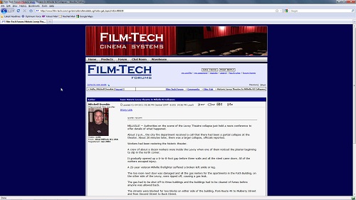
Now that I have lived with it a few days, I like the new site, but you need to make the default width wider, or allow users to set the default width like other forum software does. This narrow column in a sea of blue is a waste of screen space.
Posted by Brad Miller (Member # 2) on 01-04-2011, 02:12 PM:
Mark, please give me a specific example. All appears to be working here.
Also are you using Firefox? If not, we throw the complaint out.
Posted by Mitchell Dvoskin (Member # 751) on 01-04-2011, 04:06 PM:
Firefox 3.6.13 on both Windows 7 AND Windows XP. Nothing wrong per se, but wasting lots of screen space.
Posted by Adam Martin (Member # 641) on 01-04-2011, 07:47 PM:
How about if we fill those blue sides with ads, then? ![[evil]](graemlins/evil.gif)
Posted by Damien Taylor (Member # 4255) on 01-04-2011, 11:38 PM:
This web page is not displaying correctly on my computer, I do not understand, I have upgraded to the latest version of Mosaic.
Posted by Mike Blakesley (Member # 26) on 01-05-2011, 07:25 PM:
I'm using Firefox here. On my machines you can press CTRL and then roll the mouse wheel to zoom in and out, so it's an easy thing to make Film Tech fill the screen.
Posted by Joe Redifer (Member # 3) on 01-05-2011, 08:13 PM:
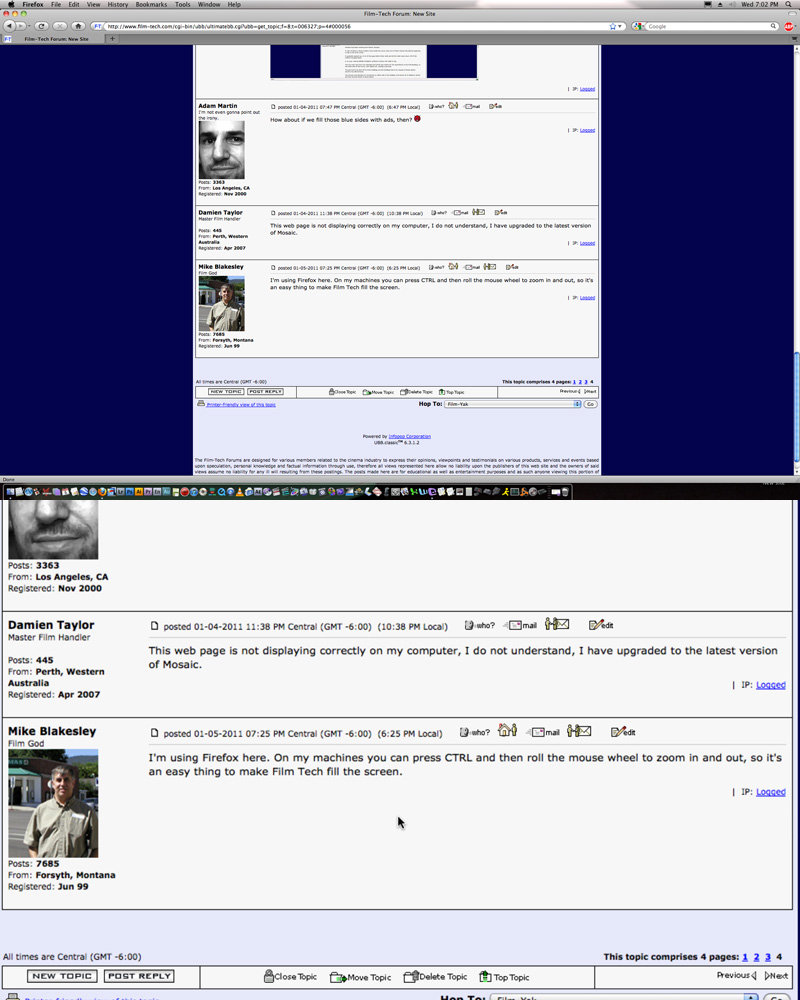
If you are on a Mac (which means you are an a-hole), you can zoom the entire screen no matter what browser you are using by holding CONTROL and playing with the mouse wheel.
Top image is normal, bottom is zoomed in:
Posted by Mark J. Marshall (Member # 1409) on 01-05-2011, 08:42 PM:
When I'm in this thread, this is what I see:
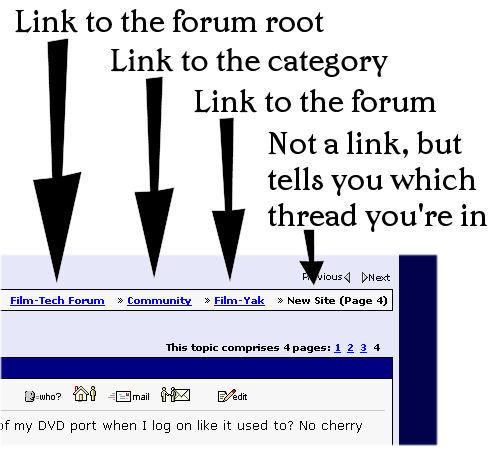
There are links all the way back up from where I came from, and a final entry on the line that's not a link that tells me where I am. In fact, when I'm here replying the bread crumbs go even further:
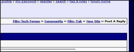
The thread itself became a link and "Post A Reply" is where I am now.
So as I go back up those links, if I go to the "Film-Yak" forum, I should see the link for the "Film-Tech Forum" followed by a link for "Community" and a non-link for "Film-Yak" which is what I see.
If I click on "Community" then I should see a link for the "Film-Tech Forum" followed by a non-link for "Community" - but I don't see anything there. This effectively leaves you stuck there with no way to get back up without starting over with the "Forum" link at the top, or by going deeper into "Community" by selecting a forum under it.
Also, just because you CAN use the browser's back button to eventually get back up, that doesn't mean the user should have to rely on that to get back where they came from.
It's not the end of the world, but from a design perspective it's not right. And yes, of course I use Fire Fox!
Posted by Steve Guttag (Member # 268) on 01-05-2011, 09:08 PM:
The new site does not do as good a job of letting one know there is a "chat" going on. Since the side-bar is now gone...so is the chat status. Only if one is on the "home" screen does one get the status.
Perhaps, it would be a good idea to have the "chat room" button change color or indicate a "chat in progress" would help annunciate the chat better.
Of course, with the passing of Phil, I suspect chats will be less frequent.
-Steve
Posted by Brad Miller (Member # 2) on 01-05-2011, 09:17 PM:
quote: Steve Guttag
Perhaps, it would be a good idea to have the "chat room" button change color or indicate a "chat in progress" would help annunciate the chat better.
Already in the works.
Mark - I see what you are saying now. Not sure why that is the way it is, but I'll bet Adam can either fix it or explain that it isn't possible.
Posted by Joe Redifer (Member # 3) on 01-05-2011, 09:32 PM:
Mark, if you are in "Community" for example, clicking the Film-Tech Forums logo takes you to THE EXACT SAME PLACE the Film-Tech Forum link otherwise would have. It is the exact same thing. There is no missing functionality. The logo is about 250 pixels away from where the link would have been and that is not much of a mouse movement, to be honest.
If the CHAT ROOM link lights up, that's cool. Just as long as whatever page I am on is not constantly doing a refresh to find out if someone is in chat because that is really annoying and fucks up viewing the site on mobile devices, especially when trying to post. I say people who are interested in chat should just go to the home page to find out.
Posted by Mark J. Marshall (Member # 1409) on 01-05-2011, 10:50 PM:
How many forums have you been to, Joe? Most have some sort of bread crumb feature that functions exactly the way I described. I'm not complaining that the link isn't there or about how far I have to move my mouse. I have no problem finding my way around this site. I'm pointing out that Film-Tech's forum's bread crumbs disappear when you're one level deep in the forum, and that is NOT the way bread crumbs work in any other forum that I have seen anywhere on the Internet. That's all. Adam will either fix it or he won't. The world will continue to spin either way.
Carry on!
Posted by Joe Redifer (Member # 3) on 01-05-2011, 11:39 PM:
quote: Mark J. Marshall
How many forums have you been to, Joe?
Well, let's see...
I set up and administer all aspects of the forums at Magic Box and Sega-16. I also regularly visit the forums at PCEngineFX. Those are the main ones, along with Film-Tech, that I visit each day.
What you are complaining about is a flaw in the ancient UBB Classic forum software which Film-Tech did not write and has long since been discontinued. Film-Tech must stick with UBB because of an individual who calls himself Adam Martin and all of the stuff he has written for it that is tied in to the rest of the site.
Posted by Brad Miller (Member # 2) on 01-06-2011, 01:48 AM:
UBB6 has proven itself to be extremely stable, and yes much of the rest of the site is based around that database (for example, the entire "warehouse"). To change it and to preserve the forum archives would be a monstrous PITA taking weeks of non-stop work.
At some point in the future we may upgrade, but for now it would be foolish.
Posted by Mark J. Marshall (Member # 1409) on 01-06-2011, 04:53 AM:
quote: Joe Redifer
I set up and administer all aspects of the forums at Magic Box and Sega-16.
Nice working bread crumbs on both of those forums! (They're on the top left of the page.)
Posted by Mike Blakesley (Member # 26) on 01-06-2011, 12:18 PM:
I think I've heard the term "bread crumbs" more in this thread than in all the rest of my 54 years put together.
Posted by Damien Taylor (Member # 4255) on 01-06-2011, 12:55 PM:
quote: Joe Redifer
ancient UBB Classic forum software
All about the vBulletin these days. One of the major forums I frequent found even that was too bandwidth intensive and pretty much rewrote the whole thing removing much redundant and useless code. With over 148,000 registered users, and as I type over 8500 logged in users, stock forum software just couldn't handle it.
Kudos to Brad, Adam, et al for keeping this UBB distro humming along so well.
Posted by Jake Spell (Member # 5294) on 01-08-2011, 02:02 AM:
I feel like its staring me in the face, but where did the upload button go?
Posted by Brad Miller (Member # 2) on 01-08-2011, 03:21 AM:
It is on the page where you submit your post.
Posted by Jake Spell (Member # 5294) on 01-08-2011, 11:55 AM:
Yup, staring me right in the face... lol Thanks!!
Powered by Infopop Corporation
UBB.classicTM
6.3.1.2