This is topic Starbucks new logo Pass or fail? in forum Film-Yak at Film-Tech Forum ARCHIVE.
To visit this topic, use this URL:
https://ft-forum.com/ft/cgi-bin/ubb/ultimatebb.cgi?ubb=get_topic;f=8;t=006334
Posted by Tom Petrov (Member # 1534) on 01-08-2011, 01:20 AM:
I am going with a fail.
Taking the Coffee part off the logo is a big, big, BIG mistake.
Posted by Brad Miller (Member # 2) on 01-08-2011, 03:21 AM:
We have this neat thing called an image upload.
Posted by Chris Slycord (Member # 4239) on 01-08-2011, 07:31 AM:
Posted by Sam Graham (Member # 2889) on 01-08-2011, 08:42 AM:
Um...no.
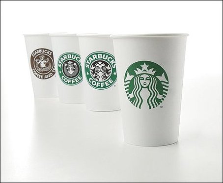
Here's all the logos from original (left) to new (right).
(Me? I gots no opinions.)
Posted by Randy Stankey (Member # 64) on 01-08-2011, 09:13 AM:
Bobby once said this: A logo needs to be instantly recognizable and instantly associated with the company and its products.
The McDonald's "Golden Arches."
The Nike "Swoosh."
Etc., etc.
The Starbuck's mermaid is too complex to be instantly recognizable from any distance. Not enough people associate the mermaid with Starbuck's to make it a universal symbol. Hell! I know a lot of people who don't even know that Starbuck's has a mermaid, even when they're standing there with a cup in their hand.
The Starbuck's logo sans text does not pass the test.
Fail!
Posted by Bobby Henderson (Member # 840) on 01-08-2011, 10:21 AM:
Well, I'm going to beg to differ and say what Starbucks is doing is actually a good idea. There's a very long discussion about the new Starbucks logo at the "Brand New" web site. It takes a lot of guts to eliminate unneeded details from a logo/brand.
First of all, very few companies can completely eliminate lettering from their logos and have the brand remain recognizable. Apple, Nike, McDonalds, Dolby, Target and a few others have been able to do this. I think the Starbucks brand has become so well known that the company can get rid of the lettering and make the siren/mermaid character the whole brand. The vast majority of people, especially anyone who visits Starbucks on any sort of basis, will recognize the brand.
Second, the siren by itself is going to work a lot better on store front signs and pylon signs. The current logo (with lettering circling around the siren) has limited readability. The siren can be enlarged considerably. Since it's still circular in shape the new design can be dropped into old sign cabinets easily without having to do an entire sign replacement. Most Starbucks store fronts have channel letters on one or more elevations of the building. So really the lettering circling around the logo is needlessly redundant.
Here's another reason why I think this change is excellent: The Arm & Hammer baking soda logo.
People are used to seeing the previous Starbucks logo, but many do not realize how much it looks like the Arm & Hammer baking soda logo. Lots of logos from the late 1800's used circular motifs. Arm & Hammer has used its Futura-like lettering within a thin and thick cicle for a lot longer than Starbucks has been around. I think it would be tougher for Arm & Hammer to ditch the circles and just go with the hand and hammer illustration since the brand has changed so little since the Great Depression. Lettering circling around an icon is really a dated motif more identified with municipal seals and departments of government rather than product brands. In ditching the circles, Starbucks is getting rid of the dated parts of its logo and finally getting rid of the similarities to that baking soda logo.
Posted by Jim Cassedy (Member # 4115) on 01-08-2011, 10:51 AM:
I don't know.
I don't care.
Even though there are places here in San Francisco where
you can stand on the corner, look down the street and
see half a dozen Starbucks, I avoid them like the plague.
Several years ago, someone gave me a Starbucks gift card.
I gave it to someone else.
The only time I've actually set foot in a Starbucks was
when I worked for a large company and they decided to
hold an early morning staff meeting in one of Starbucks'
meeting rooms. (I didn't drink the coffee.)
Mabye it's just here in SF, but for the most part I
find Starbucks to be populated by a pride of pretentious
pricks purchasing overpriced products while perusing
the morning papers.
Posted by Randy Stankey (Member # 64) on 01-08-2011, 12:15 PM:
I understand what Bobby is saying but I think that Starbucks siren/mermaid design is too complex.
Arm and Hammer's logo is simple enough to be recognized from a distance regardless of whether there is lettering encircling it. It is a black and white etching of an arm and a hammer inside a red circle. You can tell what it is in a short time, from a fair distance even if you don't make the association between the design and the product.
Starbuck's siren appears as a bunch of white squiggles on a green background from a distance and, even from up close, you need a second to figure out what it is. Don't forget that movement makes it more difficult for the viewer to visually parse the design.
If the customer is driving or walking along and looks at a sign, his movement and any movement in the sign, itself, will add to the time it takes for the mind to parse it.
I agree that logos without words can be better. (e.g. The aforementioned McDonald's "Golden Arches and the Nike "Swoosh.") If a company wants to go international, they'll need a symbol that doesn't depend on text in a specific language to get its meaning across.
To that end, the new logo is all right but I still don't care for it.
BTW: If you want to have some fun at Starbuck's, go in, step up to the counter and loudly order, "Coffee... I just want plain coffee!" ![[Wink]](wink.gif)
Posted by Bobby Henderson (Member # 840) on 01-08-2011, 12:21 PM:
I just like the new Starbucks logo version because I no longer think about Arm and Hammer baking soda when seeing the logo. The old Starbucks logo made me think of baking soda. Not good. Basically the old Starbucks logo wasn't original looking for its lettering and circles treatment. It riffed on the Arm and Hammer brand. I don't know if that was intentional or accidental, but the visual similarities are plainly there.
Posted by Randy Stankey (Member # 64) on 01-08-2011, 12:41 PM:
If they would have gone back to a style more like the original design that looked like a black and white etching I would have liked it better. I think they oversimplified the design and removed all the detail that makes it unique.
Where, once, it looked almost photo realistic, it now looks like a bunch of green and white squiggles. Even as an etching, the Arm and Hammer symbol can be read much easier.
The eye chooses the details that are important. When detail is removed recognition is lost.
Posted by Mike Blakesley (Member # 26) on 01-09-2011, 12:46 PM:
The only thing I think about when seeing a Starbucks logo of any kind is, that's a place I don't want to go into.
Posted by Brad Miller (Member # 2) on 01-09-2011, 12:47 PM:
![[thumbsup]](graemlins/thumbsup.gif) to Mike.
to Mike.
Posted by Chris Slycord (Member # 4239) on 01-09-2011, 12:59 PM:
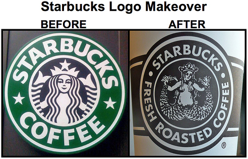
Strange. I thought the pic I posted was actually showing the new logo (as opposed to their original from the early 70's). Guess the internet tricked me...
Posted by John Wilson (Member # 269) on 01-09-2011, 01:44 PM:
quote: Jim Cassedy
I don't know.
I don't care.
Ditto, baby. The reason they're not worried about removing the words on it is that anyone who would voluntarily drink this slop they pass off as 'coffee' most probably cannot read anyway.
quote: Mike Blakesley
The only thing I think about when seeing a Starbucks logo of any kind is, that's a place I don't want to go into.
quote: Brad Miller
to Mike.
I rest my case.
Posted by Ian Parfrey (Member # 5122) on 01-09-2011, 01:57 PM:
Needs more cleavage.
Posted by Randy Stankey (Member # 64) on 01-09-2011, 02:06 PM:
She used to have more cleavage until they went national. Then they PC-sanitized it.
Posted by Cassandra Palko (Member # 5362) on 01-09-2011, 02:12 PM:
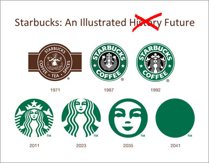
A diagram of where the logo has been, what the logo is and what it will be:
Posted by Tony Bandiera Jr (Member # 2365) on 01-09-2011, 02:17 PM:
Cassandra: Good one!!
I am in the ranks of don't care and regard Starf**ks as an evil corporate conglomerate with overprice, horrible tasting product.
Posted by John Wilson (Member # 269) on 01-09-2011, 02:29 PM:
quote: Ian Parfrey
Needs more cleavage.
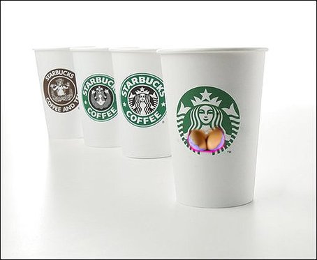
You're right. Much better.
![[Razz]](tongue.gif)
Posted by Ian Parfrey (Member # 5122) on 01-09-2011, 02:55 PM:
Now, that I LIKE! ![[Big Grin]](biggrin.gif)
Posted by Brad Miller (Member # 2) on 01-09-2011, 03:15 PM:
This video sums it up very well.
![[Cool]](cool.gif)
Posted by Eric Robinson (Member # 2966) on 01-10-2011, 02:12 AM:
quote: Tony Bandiera Jr
horrible tasting product
Coffee is not one of their better products. In fact its nasty.
And, I am a coffee whore, so I know. ![[Eek!]](eek.gif)
Posted by Christian Appelt (Member # 1067) on 01-10-2011, 10:43 AM:
To me the 1992 logo had more impact because it was a closed form and had contrast between black center and green border areas. The 2011 logo has open edges and no contrast. If they don't like the 19th century badge or stamp approach, they should have created something new, but now it seems just watered down.
That said, the only times I had coffee at Starbucks was when business partners passing through town asked me to meet them there because it was the only café they knew near the train station/airport.
Is there a difference between U.S. and European Starbucks coffee (like in the 1987 movie BAGDAD CAFE when the brewing of coffee comes as a cultural shock to both Americans and foreigners) ?
Posted by Joe Redifer (Member # 3) on 01-10-2011, 11:12 AM:
Don't like coffee of any kind, only go into Starbucks when a client demands to meet there and couldn't care less about their still-shitty logo. Two tails? OK, that means Starbucks causes mutations. Avoid.
Posted by Bruce Hansen (Member # 281) on 01-10-2011, 12:10 PM:
I don't drink coffee, awful stuff. Now if Starbucks had beer I might care. ![[beer]](graemlins/beer.gif)
Powered by Infopop Corporation
UBB.classicTM
6.3.1.2