This is topic Help with .jpg images. in forum Film-Yak at Film-Tech Forum ARCHIVE.
To visit this topic, use this URL:
https://ft-forum.com/ft/cgi-bin/ubb/ultimatebb.cgi?ubb=get_topic;f=8;t=006383
Posted by John Wilson (Member # 269) on 02-28-2011, 08:04 PM:
I'm using GIMP to make our house slides and then moving them over to NERO to make an MPEG to play on our servers. The problem I'm having is that text that looks fine as a JPEG is looking like crap when it's finally an MPEG while all around it (original text and images) look fine and almost unchanged.
Here is one example as a JPEG...
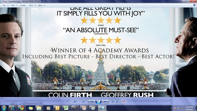
You can see the text I've added is still of high quality (even though it's Trajan ![[Wink]](wink.gif) )
)
Now the next shot it how its quality ends up after being exported from Nero as an MPEG. All the original text and images seem OK but the added text is pretty shoddy.
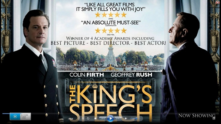
Can anyone tell my why this would be happening? I never had issues with the old Nero I was using.
Posted by Joe Redifer (Member # 3) on 03-01-2011, 12:17 AM:
Looks like a deinterlacing issue. I don't know what the hell GIMP is, but have you tried flattening the layers of the image before compressing? Using a sans-serif font also helps greatly when dealing with video.
Why is the image 738 pixels wide? MPEG2 for DVD stops at 720 regardless of region. Doesn't your player allow still images for a slideshow? If so, that would be a far better than making an MPEG. MPEG sucks. Remember that because it is a fact. You're not having an issue with JPG, you're having an issue with MPG. MPEG4 is good, but any previous number sucks. If doing a slideshow with image files is not an option, just use a different (and heavier) font. try to match the other type on the image.
Posted by Bobby Henderson (Member # 840) on 03-01-2011, 11:47 AM:
GIMP is an open source image editor. Though it's no replacement for Photoshop it's not all that bad either. The program has plenty of capability for casual users. I have recommended GIMP and the vector graphics program Inkscape to people wanting free alternatives to Adobe Photoshop and Adobe Illustrator.
John, when creating raster-based "bitmap" images (anything based on pixels) you always want to create the artwork natively for the output device/format. Vector-based art is the only thing that allows the user to ignore this since vector art is scalable/resolution independent.
If your server display is 720p, you need to design a 1280 X 720 pixel image.
I agree with Joe, MPEG sucks for graphics. It's not very efficient on compression (nowhere near as efficient as MPEG-4 AVC). Graphical items like lettering are the most prone things in an image that will look fuzzy, noisy and just plain crappy once anything more than moderate or severe image compression is applied.
When I output graphical animations to play on electronic message centers I try to use MPEG-4 with as high a bit rate that's practical to transmit. If it's a small message center and file size isn't a problem I'll use uncompressed AVI. For something like 720p material uncompressed AVI would be insane. For still graphics images displayed on screen I prefer to use lossless TIFF or uncompressed BMP files; if I can't use that then I'll go with JPEG saved in highest quality.
quote: John Wilson
You can see the text I've added is still of high quality (even though it's Trajan )
If you have the Gill Sans type family on your computer (many Windows PCs with MS Office get the Monotype version of Gill Sans) it would be better to use that and keep the type treatment consistent with the lettering on the rest of the poster.
Additionally, sans-serif typefaces work better in low resolution graphical layouts. Serif typefaces, particularly those with really skinny stems (like Didot) need large sizes and vector-based output.
Posted by John Wilson (Member # 269) on 03-01-2011, 05:36 PM:
Thanks guys.
Unfortunately the player will only recognize MPEG2 files so not much of a choice there. I've changed the res to 1280 x 720 and that's made a fair bit of difference. Not sure why that wasn't the original size.
I'll drop to another font too. Many thanks for the advice.
Powered by Infopop Corporation
UBB.classicTM
6.3.1.2