This is topic Las Vegas Sands font in forum Film-Yak at Film-Tech Forum ARCHIVE.
To visit this topic, use this URL:
https://ft-forum.com/ft/cgi-bin/ubb/ultimatebb.cgi?ubb=get_topic;f=8;t=006445
Posted by Christian Volpi (Member # 2370) on 06-03-2011, 11:27 AM:
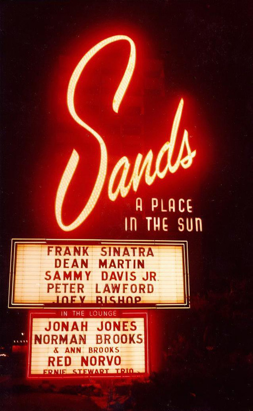
I was wondering if anybody knew of a type of font that I might be able to download that would be close to the one used in the original Sands Hotel/Casino sign. I've searched and searched and have come up empty handed.
Posted by Bobby Henderson (Member # 840) on 06-03-2011, 12:08 PM:
The lettering is custom designed. No typeface really matches it. Companies like House Industries and Letterhead Fonts have some script faces that have some of the same "feel" to them, but they're not identical to the "Sands" lettering.
Some of the lettering design reminds me of Brush Script, but Brush Script is bolder and doesn't have the extra swash on that lowercase "s". The huge capital "S" is balanced so it has some of the same weight as the much smaller "ands" letters. That's something you wouldn't get from a standard digital typeface.
Posted by Gordon McLeod (Member # 33) on 06-03-2011, 01:16 PM:
What about the type face for the portion A Place in the Sun
Posted by Paul Mayer (Member # 355) on 06-03-2011, 02:07 PM:
You might want to get in touch with someone at Young Electric Sign Co (YESCO). They have been the major sign design and maintenance company for most of the major hotel/casinos in Las Vegas for many many years. They may have a historian that might know about the origins of the font used for the original Sands sign.
One also might contact someone at The Neon Museum in Las Vegas. Their curators may also have some technical and historical knowledge about the Sands signage.
Posted by Wayne Keyser (Member # 2420) on 06-03-2011, 09:39 PM:
To my not-very-trained eye, a face named Aladdin has many similarities.
Posted by Bobby Henderson (Member # 840) on 06-03-2011, 11:11 PM:
The "Aladdin" font (typically found "freeware") is not close at all.
Young Electric Sign Company, otherwise known as "Yesco" has indeed been involved with a number of Las Vegas spectacular signs, as have a number of other companies. That's no guarantee anyone from those companies will offer up an available digital typeface based on the Sands casino lettering.
I do a bunch of this stuff for a living and have studied type for more than 30 years. My own judgment is the Sands lettering is custom. It is not based on any standard typeface. I can hand draw or paint some lettering as part of a logo very easily, scan it, digitize it into vector form and then scale it to the size of a building for giant sized sign applications. Back in the day when the Sands Casino was built, the sign designs had to be hand drawn or painted. Then they had to be blown up onto target material via projector or scaled based on a grid. The channel letter faces, backs and returns had to be cut by hand. All the chase light fixtures had to be drilled, cut and installed by hand. No computer assistance. That makes it even more difficult for anyone to offer an accurate digital equivalent to the Sands artwork.
Powered by Infopop Corporation
UBB.classicTM
6.3.1.2