This is topic CBS Eye Logo Turns 60 in forum Film-Yak at Film-Tech Forum ARCHIVE.
To visit this topic, use this URL:
https://ft-forum.com/ft/cgi-bin/ubb/ultimatebb.cgi?ubb=get_topic;f=8;t=006534
Posted by Frank Angel (Member # 248) on 10-23-2011, 01:19 AM:
I remember it as a kid, when TV stations would broadcast only a part of the day and at other times just displayed their logos and you could turn on the TV and see that big eye looking back at you for hours before programming would start (earlier even than that there would be nothing -- just the snow from which poltergeists could get into your room).
I wonder if the aging network execs long for that simpler time when there were only three of them with no other competion and no worries over dwindling viewership. There seems to be this mood to wax nostalgic over their past. NBC's three note audio signature and xylophone logo....
....that had become so familiar to audiences in the early days of broadcast TV was dropped for decades but then quite recently, the three note tone logo all of a sudden started popping up all over their station breaks as a kind of ode to their past glories. It was nice to start hearing it again.
What I am wondering is if they actually do still, somewhere in the bowels of their corporate inner sanctums actually call themselves the words what the logo letters actually represent. In the early days, most audiences knew what those letter meant because announcers would actually say the name along with the visual logo. People knew that NBC meant the National Broadcasting Company. But that is so far removed from present day audiences that Joe TV Watcher might be hard press to tell you that ABC represents actual words -- The American Broadcasting Companies.
While CBS is tipping their hat to their original great CBS logo, they should also remind everyone that those letters stood for something -- The Columbia Broadcasting System. I wonder if they still do or has that name faded into oblivion?
Posted by Monte L Fullmer (Member # 2797) on 10-23-2011, 01:50 AM:
in 1974, the name was changed to "CBS, Inc.".
Now, it's "CBS Corporation"
Posted by Robert Throop (Member # 61) on 10-23-2011, 12:51 PM:
I once ran a theatre that I took over from a guy that had an ad agency. The carpet had the CBS eye in black on a dark red background. He told me that at the CBS building in NYC each floor had the same pattern with a different color background. I have no idea how he got the carpet in the first place. It was great carpet though. It was ten years old when I took over and I ran it for fifteen more with very little wear.
Posted by Tony Bandiera Jr (Member # 2365) on 10-23-2011, 02:45 PM:
Robert, back then, carpets, like everything else, was made to last so I am not surprised to hear that story.
Frank: Thanks for posting this!! I remember all of those logos and announcements from my youth. I also remember the NBC "Peacock" and the "Presented in Living Color" tagline and music. Like this:
Living color NBC logo
Posted by Jesse Skeen (Member # 586) on 10-23-2011, 03:24 PM:
quote: Frank Angel
I remember it as a kid, when TV stations would broadcast only a part of the day and at other times just displayed their logos and you could turn on the TV and see that big eye looking back at you for hours before programming would start
NOW you can just turn them on and see their logos always onscreen DURING the programs! Now THAT'S progress!
Posted by Bruce Hansen (Member # 281) on 10-23-2011, 06:08 PM:
Here's looking at you kid. (the CBS logo).
Posted by Louis Bornwasser (Member # 3063) on 10-23-2011, 07:08 PM:
Remember when all good TV was on 3 channels? You do? You're older than I thought!
Now the same amount of good programs is scattered over 580 channels. Louis
Posted by Monte L Fullmer (Member # 2797) on 10-23-2011, 07:35 PM:
..and don't forget the PBS channel .. four in the local area.
I grew up with CBS and it wasn't til 10yrs later that we finally got a NBC station. The nearby city picked up ABC and PBS .... and that was it... - long before cable wasn introduced.
Posted by Martin McCaffery (Member # 37) on 10-23-2011, 08:39 PM:
quote: Frank Angel
What I am wondering is if they actually do still, somewhere in the bowels of their corporate inner sanctums actually call themselves the words what the logo letters actually represent.
About as often as the suits at KFC say what that used to mean ![[Wink]](wink.gif)
When I was in 3rd grade ('66 ish) we lived way out on the far end of Long Island. You could only pick up one station with rabbit ears. Both sets of grandparents lived with in a block and they had...CABLE! With that cable they got all three networks and the local announcement channel that was a camera panning back and forth all day across (all analog, of course) a clock, a barometer, a thermometer and an a local announcement board. Nearly as exciting as the Weather Channel today. You could also start the day with the Indian Head test pattern and end it with the Star Spangled Banner (not that I was allowed up that late).
Posted by Randy Stankey (Member # 64) on 10-23-2011, 10:01 PM:
Watching test patterns and TV station logos also reminds me of old stories about growing up but mine aren't your average childhood nostalgia. What you are about to read is a truly warped situation. Every bit of it is true, to the best of my memory.
Background: My parents used to own a bar. It was the old fashioned kind of place where the house and the business are attached. That's where I lived when I was growing up until I went away to college. That's where this story takes place.
I was probably six or seven years old. My brother was five or six, two years younger. Just like you guys probably all did, we used to get up early on Saturday mornings to watch cartoons. You young guys just don't understand what a big deal Saturday Morning Cartoons were.
My brother and I were sitting in front of the TV the living room, eating bowls of Froot Loops, watching the test pattern, waiting for cartoons to come on. This was a routine that we knew well. It was the Star Spangled Banner at 6:30, followed by "Davy and Goliath."
So, there we sat, getting buzzed-up on sugary cereal, waiting for TV to come on when... SMASH! BANG! GODDAMM YOU! CRASH!
All hell breaks loose in the bar. Naturally, us kids go to investigate.
We push open the swinging saloon door that separates the bar from the kitchen and peer around the corner of the bar.
There, at the other side of the room, is my father, down on one knee, grabbing some guy by the shirt collar. The guy is laying on his back on the floor. My dad is beating the living shit out of this guy, literally treating the guy's head like a punching bag!
Another guy comes up behind my dad and breaks a pool cue over his back. To which, my dad responds, without missing a beat, by grabbing a beer bottle off the table and, with a backhanded swing, smashes the guy in the face with the bottle. That guy falls over backward onto the floor then dad immediately goes back to pounding the tar and feathers out of the first guy.
Right about this time, Mom comes out to the bar and rushes us kids back to the living room. "What's Dad doing?" I remember asking. "Never you mind!" said Mom, "Go back and watch cartoons!" she ordered.
No matter... Davy and Goliath was on so my bother and I went back to eating our Froot Loops and watching TV.
I swear on my death bed that this is true or at least as much as I remember 40 years in the past. My father is dead. He died of alcoholism over 25 years ago. Every once in a while, I'll mention it to my mother. She always says, "You still remember that?"
I remember it almost like it was yesterday.
That's what TV station logos always remind me of. ![[Eek!]](eek.gif)
Posted by Mike Blakesley (Member # 26) on 10-23-2011, 10:09 PM:
Our local (Billings) CBS affiliate used to end every day with the Iron Eyes Cody anti-pollution spot
quote: Louis Bornwasser
Now the same amount of good programs is scattered over 580 channels.
Actually I think there are fewer good programs.
Posted by Robert E. Allen (Member # 1351) on 10-23-2011, 10:10 PM:
I remember CBS when they identified themselves as "The Columbia Broadcasting System" and ran only radio stations along with The National Broadcasting Company, The Mutual Broadcasting System (whatever happened to them?), and The American Broadcasting Company. Going back even further there was the Red Network and the Blue Network. When I first had TV all we saw during the day was a test pattern. Programming came on at 7pm and the stations signed off at midnight with the National Anthem after a closing word from a preacher.
Posted by Joe Redifer (Member # 3) on 10-23-2011, 11:01 PM:
Is that what it's supposed to be? An eye? I guess I just never gave much thought to the logo. I certainly didn't know it was something to commemorate.
Posted by Mike Blakesley (Member # 26) on 10-24-2011, 12:38 AM:
These days, anything that lasts longer than about 4 years is commemoratable.
Posted by Frank Angel (Member # 248) on 10-24-2011, 01:14 PM:
You got that right Mike.
And Joe, don't feel bad, I owned a Saturn for two years and one day I was driving with a friend to a dealership because he was interested in getting one and as we drove up the drive entrance with the big Saturn sign and their logo, he said, "Pretty cool the way they worked the rings of Saturn as their logo." I stared at it for a few seconds and then it dawned on me that what that design was. All that time looking at it on my steering wheel and it never clicked.

I like those moments of enligntened revelation, where something just clicks in your head. So cool...at least for the first ten seconds or so before you feel like a complete idiot.
Posted by Bobby Henderson (Member # 840) on 10-24-2011, 02:32 PM:
While the CBS eye logo is very simple (as in "they paid someone for that design!?" simple) it is an important example of the sweeping change that took hold in graphic design during the 1950's.
The "International Typographic Movement," often called the "Swiss Movement" gave birth to things like the Helvetica type family and lots of bold, minimalist design. It shoved aside the previous trend of hand lettered scripts, twinkling stars & arrows and illustrations riffing off Norman Rockwell. That very dated looking "retro" style has tried to re-emerge from time to time, but only does so out of schtick. In reducing designs down to their most minimal, fundamental level the Swiss movement succeeded in creating arguably timeless designs.
For better or worse, large corporations embraced this graphic design movement over the next 20 years. They shed brand marks that either looked dated, too complicated or even too illustrational to be clean, timeless and truly corporate looking. William Golden's CBS Eye logo design is one of the examples that has endured for decades.
Paul Rand and Saul Bass deserve mention in this topic because the two were among the heaviest hitters in creating minimalist brand marks. Paul Rand created the logos for IBM, ABC, Westinghouse and UPS. Saul Bass designed the old Bell Telephone AT&T logo as well as the newer "death star" logo. He made logos for the United Way, Girl Scouts, Minolta, Warner Bros. (1970's version), United Airlines and many more.
I don't like the current brand mark CBS is using. Obviously they still use the eye logo. But they have some clunky looking techie lettering set next to it. When William Golden originally designed the logo he set the "CBS" letters in the Didot typeface. That combination works. The new one doesn't.
Posted by Joe Redifer (Member # 3) on 10-24-2011, 04:18 PM:
quote: Frank
Those are the rings of Saturn? Have they even seen Saturn? Maybe that's what the rings would look like as the entire planet was spiraling to it's doom.
Oh wait I see it now. One of the "rings" I see is the actual planet, though transparent. God damn it.
Posted by Mike Blakesley (Member # 26) on 10-24-2011, 05:45 PM:
Well don't feel bad, Joe & Frank. I'm in the auto parts business and have seen that logo for years and never got that until just now. I just never thought about what it might 'really' be.
I am now wondering if there's some strange meaning to the stupid-looking Toyota logo, or if Chevy's bowtie design means something extra.
Posted by Joe Redifer (Member # 3) on 10-24-2011, 05:50 PM:
Just how many jobs do you have, Mike? Music, movies and autos?
The Toyota logo is apparently just 3 ovals, but I always thought it looked like a bull (long face with bull horns). I dislike anything western or cowboy-ish (other than a few good western movies) so the logo looks like trash to me. My guess is they switched to that logo to make their trucks look more manly and certainly more "redneck-y".
Posted by Mike Blakesley (Member # 26) on 10-24-2011, 06:17 PM:
quote: Joe Redifer
Just how many jobs do you have, Mike? Music, movies and autos?
Just 2 actually. Music and auto parts are in the same building. (Car parts -> Car audio -> CDs and such)
Posted by John Wilson (Member # 269) on 10-25-2011, 04:38 AM:
quote: Joe Redifer
Just how many jobs do you have, Mike? Music, movies and autos?
Oh, and he's the Mayor.
Posted by Mike Blakesley (Member # 26) on 10-25-2011, 10:20 AM:
No, thank God...you couldn't give me that job!
Posted by Bobby Henderson (Member # 840) on 10-25-2011, 06:20 PM:
quote: Joe Redifer
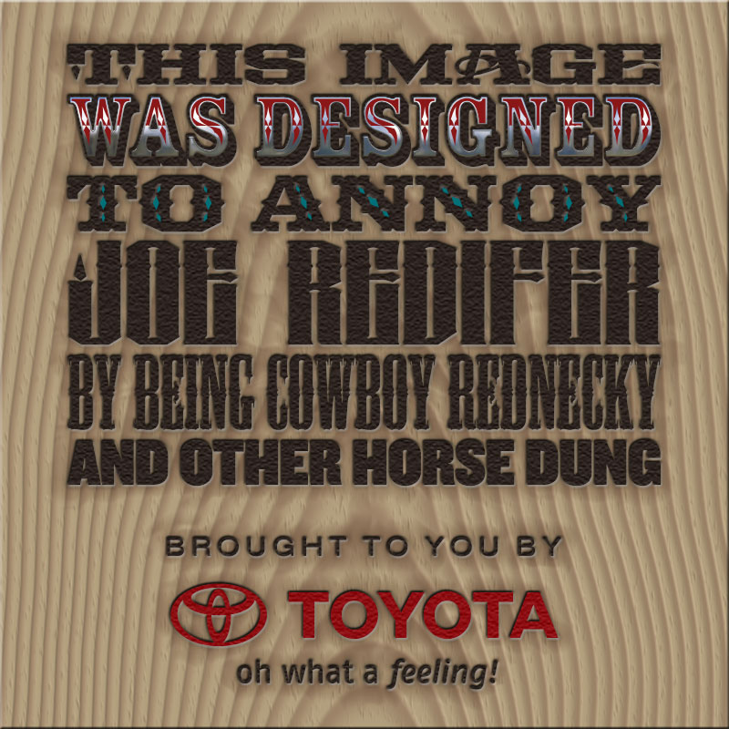
The Toyota logo is apparently just 3 ovals, but I always thought it looked like a bull (long face with bull horns). I dislike anything western or cowboy-ish (other than a few good western movies) so the logo looks like trash to me.
Couldn't pass up the opportunity:
Posted by Mike Blakesley (Member # 26) on 10-25-2011, 07:01 PM:
That's probably the coolest font Joe's name has ever been rendered in.
Posted by Randy Stankey (Member # 64) on 10-25-2011, 07:36 PM:
What? No Trajan?
Posted by Joe Redifer (Member # 3) on 10-25-2011, 08:42 PM:
Well that definitely does the trick! I like how the J in my name has a candle flame on it. Also, the board is a nice touch ![[Smile]](smile.gif)
Posted by Bobby Henderson (Member # 840) on 10-25-2011, 08:49 PM:
quote: Randy Stankey
What? No Trajan?
While Trajan has been used for the poster art on westerns like Open Range, it has been used on far too many other movie posters and movie title sequences to be considered a western genre typeface.
And I also know you're joking. Ha. Ha.
FWIW, the fifth line of copy was set in Mesquite. That's the typeface used on the original poster artwork for Tombstone. Also, every one of those typefaces (and more western theme typefaces) were used in the end titles of Rango.
Powered by Infopop Corporation
UBB.classicTM
6.3.1.2