This is topic Japanese posters for Pixar's 'Inside Out' in forum Film-Yak at Film-Tech Forum ARCHIVE.
To visit this topic, use this URL:
https://ft-forum.com/ft/cgi-bin/ubb/ultimatebb.cgi?ubb=get_topic;f=8;t=007310
Posted by Paul Mayer (Member # 355) on 05-31-2015, 11:50 AM:
I love to collect Japanese theater posters, but usually only for Japanese films. But with their beautiful kanji character calligraphy, these five for Pixar's upcoming Inside Out got my attention:
From Rocket News 24:
quote:
Personified emotions from Pixar’s “Inside Out” get nifty kanji makeover in Japanese posters!
Fans of Pixar are sure to be eagerly waiting the release of the studio’s newest movie, "Inside Out" (or "Inside Head" as it’s being called in Japan). The film may have caused a slight stir on the Japanese Internet for having a theme that’s noticeably similar to that of the Japanese manga and movie Poison Berry in My Brain (Nonai Poison Berry), but Pixar’s new offering is bound to draw huge crowds when it comes out on June 19 in the U.S. and July 18 in Japan.
And one thing the movie certainly seems to have going for it in Japan is cool poster artwork. Check out these Japanese posters for Inside Out which feature beautiful kanji calligraphy representing each of the emotions that appear in the movie!
Inside Out depicts the goings on in the mind of the protagonist Riley, a pre-teen kid, where her five main emotions in personified form are hard at work to help guide her throughout the trials of life. For the Japanese market, Pixar has created a poster for each of the emotions, with the kanji character symbolizing each particular emotion appearing prominently at the top. The kanji letters used in the posters are the work of Japanese calligraphy artist Sisyu, who has created work for an impressive list of clients including the Japanese government and major corporations such as Mitsubishi Corporation, Nissan Motor Company and Asahi Breweries.
Each letter has been written by Sisyu in a specific style that reflects the emotion it symbolizes.
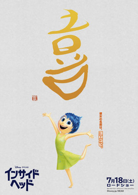
▼ The letter for “joy” (yorokobi: 喜), which is said to be the first emotion a newborn baby feels, is written to represent a feeling as bright and warm as the sun.
▼ “Fear” (osore: 怖), given the name bibiri (scaredy-cat) in the Japanese version, has a delicate personality and is quick to perceive danger, which serves to keep Riley safe.

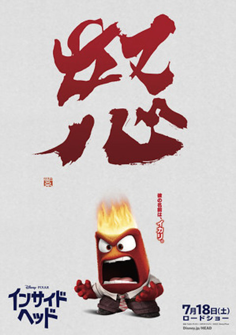
▼ “Anger” (okoru: 怒る ), given the name ikari in the Japanese version, is depicted as a feeling that is necessary for you to stay true to your convictions and carry out what you feel is right, and is shown in a lovable light, even if it is an angry emotion.
▼ “Disgust” (iya: 嫌), called mukamuka (nausea) in the Japanese version, is an emotion that keeps you happy by helping you detect and avoid what may disgust or upset you.
I 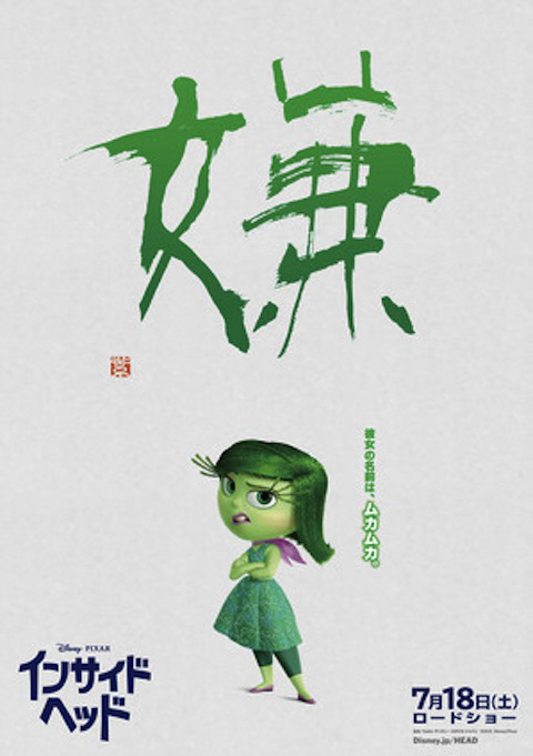
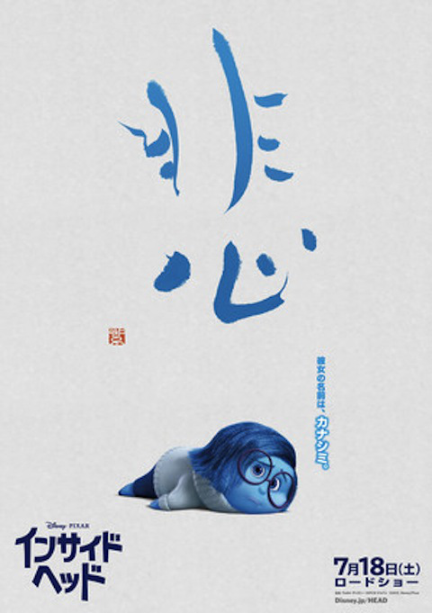
▼”Sadness” (kanashimi: 悲) is a feeling that allows you to appreciate joy all the more, and the letter is written to give it the appearance of an emotion that needs to be embraced.
So, what do you think of the emotions and their kanji letters? In Japan, at least, the familiar kanji characters will be likely to endear the five feelings to the public. Plus, the calligraphy by Sisyu in itself is highly entertaining to look at. We have to say, the posters certainly make us wish we had such lovable beings in our head to help us sort our often muddled emotions … but who knows? Maybe we do, and we just don’t know it!
Posted by Mike Blakesley (Member # 26) on 05-31-2015, 01:07 PM:
This is sort of a sideline, but I don't understand how Oriental calligraphy "works." First, starting off with I've heard there are over 900 characters...? (I'm not sure if I'm talking about Japanese, Chinese or both, so bear with me.) Doesn't that make it extremely hard to learn to write, and isn't it really hard to read given different people's styles of handwriting? And what about keyboards?
Is this the reason why Japanese electronics always had English wording on their front panels?
I'm not making fun here, just trying to understand something I've always wondered about.
Posted by Martin McCaffery (Member # 37) on 05-31-2015, 01:28 PM:
No way I can explain it, but they are ideograms vs alphabets.
quote:
An ideogram or ideograph is a graphical symbol that represents an idea, rather than a group of letters arranged according to the phonemes of a spoken language, as is done in alphabetic languages.
So, like hieroglyphs, they don't represent the spoken language in the same way western written languages do. Which is one of the reasons they are considered an art form, and not at all suitable for a typewriter.
So, I imagine to learn the written language, you have to forget everything you know about spelling and grammar.
Posted by Frank Cox (Member # 6258) on 05-31-2015, 02:20 PM:
It's my understanding that you use something called pinyin to represent Chinese characters with things like computer keyboards.
I have no clue how that actually works, but I have run across pinyin input as an option for Linux computers.
Posted by Paul Mayer (Member # 355) on 05-31-2015, 02:23 PM:
As Martin notes, kanji characters are ideograms - each is a word. They can be strung together to form compound words, and the more complex characters are made up of combinations of simpler kanji. The Japanese adopted these kanji characters from their Chinese trading partners starting around 700 AD.
Yeah, learning to read and write using them is a challenge! Today the Japanese ministry of education has designated about 2200 characters as being "daily use" or Joyo kanji - newspapers and magazines are encouraged to restrict themselves to using just these - if they must use a non-daily-use one (i.e. with old place or family names), they can do so, but usually have to include that character's pronunciation in small phonetic script just above the character. Japanese school kids begin learning these in first grade, taught in the order of frequency of use (the ones that are used the most are taught first) - getting from one to several hundred introduced in each grade up through graduation from high school. Most literate people know at least the 2200 daily-use ones, plus anywhere from one to several thousand additional ones - more educated people tend to know more kanji.
There are the "official" ways of hand writing the characters, and lots of more stylized ways to do it - that's where the art aspect of comes from, as in these examples in the Pixar posters.
Keyboarding is fun. A Japanese word processor is loaded with four- or five-thousand of the characters, using "double-byte" 16-bit ASCII codes. There is a QWERTY-style layout for the Japanese syllables, but many people type using the romanized pronunciation for each word and the English alphabet. Where there are many homonyms for a word, the word processor displays a pulldown menu of the characters that match that sound, and the user selects which one to use. The word processor is context sensitive, and gets better at guessing which kanji you mean to use as you type.
Yeah, sometimes it's just easier to use an English-language label on some things like control panels! ![[Smile]](smile.gif)
Spelling and grammar... generally to look up a kanji in a dictionary, you count the number of strokes - that's how they're sorted. Also, traditionally there are around 80 kanji characters that are designated as "radicals" - the more complex characters use one or more of these radicals. Kanji are sorted into groups based on the radical and the number of strokes. A "spelling" mistake would happen if you use the wrong radical or the wrong number of strokes.
I did say that learning kanji is "fun", right? ![[Big Grin]](biggrin.gif)
Posted by Claude S. Ayakawa (Member # 1401) on 05-31-2015, 03:36 PM:
I am a Japanese - American and do a decent job speaking the language, I can neither read or write the language, however. My late father was was able to do all three because he was educated in Japan. He was good at caligraphy and his Kanji was very beautiful.
-Claude
Posted by Allan Young (Member # 6332) on 06-04-2015, 06:58 AM:
quote: Martin McCaffery
So, like hieroglyphs, they don't represent the spoken language in the same way western written languages do.
Egyptian hieroglyphs were a mixture of "ideograms" (strictly speaking, "logograms") and other characters that corresponded to spoken language sounds. The latter are in fact the original ancestors of the characters in every western written language.
Posted by Bobby Henderson (Member # 840) on 06-04-2015, 12:40 PM:
I got some good exposure to Japanese Kanji, Katagana and Hiragana when I was a kid. I already knew Romanji. My dad was the Marine Corps and one of our duty stations was MCAS Iwakuni for 3 years.
My brother, friends and I all like watching Japanese super hero shows like Ultraman and Kamen Rider. I still may have some comic books and other things from those shows. I was getting to where I could read all the Katagana and Hiragana alphabets fluently, but Kanji was far more challeging.
quote: Paul Mayer
Yeah, learning to read and write using them is a challenge! Today the Japanese ministry of education has designated about 2200 characters as being "daily use" or Joyo kanji - newspapers and magazines are encouraged to restrict themselves to using just these - if they must use a non-daily-use one (i.e. with old place or family names), they can do so, but usually have to include that character's pronunciation in small phonetic script just above the character.
Many of the Japanese comic books I "read" (mainly just for the illustrations) had the tiny Hiragana "training wheels" characters above the more complex Kanji glyphs.
I have at least a couple dozen Asian double-byte fonts. Some were included with Adobe Creative Suite and/or Creative Cloud. Others are bundled into Windows. I really wish I had more access to this kind of thing when I was a kid. It might have made learning how to read Japanese a little less difficult.
quote: Paul Mayer
Spelling and grammar... generally to look up a kanji in a dictionary, you count the number of strokes - that's how they're sorted.
I'm wondering how well Adobe follows this in the glyphs palette within Adobe Illustrator.
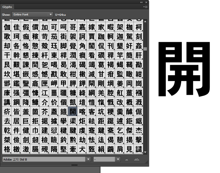
Notice all the little arrows on the lower right corner of each glyph listing. That toggles a fly-out containing one or more alternate glyphs. Yeesh! These Asian double byte fonts contain around 8000 glyphs!
quote: Claude S. Ayakawa
My late father was was able to do all three because he was educated in Japan. He was good at caligraphy and his Kanji was very beautiful.
That's one of the things I really like about Kanji. It can be incorporated into artwork, like a wood block carving, and not seem like an advertisement. There is an art to it. Our Boy Scout troop in Iwakuni did a lot of activities with Japanese Boy Scouts. We had some basic lessons in Japanese calligraphy, making huge characters on big sheets of paper using a large brush and black ink. Every year they had this historic parade in Iwakuni and all the local boy scouts got to march in it, dressed up in these boy-sized battle outfits. That was really cool. The adults were wise enough though to have the practice swords locked so they couldn't be taken out of their sheaths.
Posted by Paul Mayer (Member # 355) on 06-05-2015, 02:09 PM:
Kinda sorta on topic for this thread :
From KQED:
quote:
Watch Pixar Slam San Francisco Pizza in This Clip From ‘Inside Out’
By Emma Silvers
Jun 4, 2015
The heartstring-tugging animation wizards over at Pixar are known for slipping winks and visual references to real Bay Area locations into just about every one of their films. It makes sense, since the company’s based in Emeryville, and the little in-jokes — like Oakland ice cream parlor Fenton’s guest appearance in Up — make the movies that much more fun for us locals.
But this time? This time they’re hitting where it hurts: They took a swipe at San Francisco’s foodie culture.
In this clip from Inside Out, which opens June 19 with an all-star cast of voice actors (Amy Poehler, Bill Hader, Mindy Kaling, Lewis Black), and which is sure to be delightful as all hell (despite your most valiant attempts to maintain a wall of cynicism and/or disdain for so-called children’s entertainment), a family that has recently moved to San Francisco attempts to grab some pizza. Some normal, average pizza. They are not pleased with what they find.
Watch the clip below. Is it just us, or do a few clues (the absence of tomato sauce, the employee’s appearance, the racks of bread in the background) wink rather pointedly toward our beloved Arizmendi, in particular? Their Emeryville location is, incidentally, literally next door to Pixar studios. Discuss.
"Pizza" Clip - Inside Out
Posted by Jason Metcalfe (Member # 5739) on 06-05-2015, 03:42 PM:
Just wanted to add my two cents:
I think Kanji works the same way but I know for Chinese that most characters are constructed of a few "radicals" that work together to form the word, so that even if you aren't familiar with the character you can usually figure out the pronunciation and also the meaning from the meanings of the separate radicals
for example the adjective "good" (Hao) in chinese is constructed from two characters that mean "woman" and "child"
The development of the writing system is very similar to what I imagine happened with Egyptian hieroglyphs, where originally all of the characters were basically little pictures of what they were trying to represent, and then over time they were simplified
Powered by Infopop Corporation
UBB.classicTM
6.3.1.2