This is topic Mobile Friendly Version of Film-Tech in forum Film-Yak at Film-Tech Forum ARCHIVE.
To visit this topic, use this URL:
https://ft-forum.com/ft/cgi-bin/ubb/ultimatebb.cgi?ubb=get_topic;f=8;t=007436
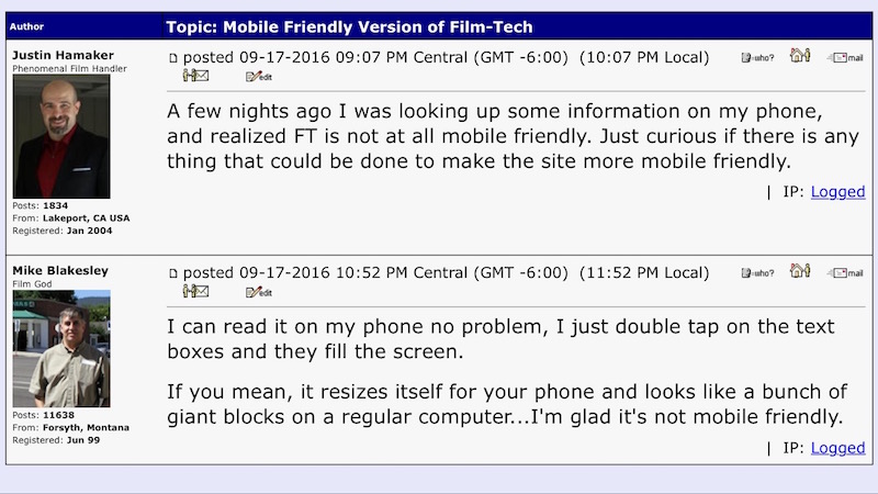
Posted by Justin Hamaker (Member # 2165) on 09-17-2016, 09:07 PM:
A few nights ago I was looking up some information on my phone, and realized FT is not at all mobile friendly. Just curious if there is any thing that could be done to make the site more mobile friendly.
Posted by Mike Blakesley (Member # 26) on 09-17-2016, 10:52 PM:
I can read it on my phone no problem, I just double tap on the text boxes and they fill the screen.
If you mean, it resizes itself for your phone and looks like a bunch of giant blocks on a regular computer...I'm glad it's not mobile friendly.
Posted by Aaron Garman (Member # 1653) on 09-17-2016, 11:05 PM:
Try flipping sideways for widescreen viewing. Looks splendid on my iPhone 6.
Posted by Harold Hallikainen (Member # 5405) on 09-17-2016, 11:26 PM:
So far, all the mobile friendly stuff looks awful on my tablet. I have to go hit "get desktop site" to get something usable.
Harold
Posted by Jim Cassedy (Member # 4115) on 09-18-2016, 06:43 AM:
The last thing I need/want is another app on my phone.
IMO, FT works just fine on my phone & tablets.
Posted by Frank Cox (Member # 6258) on 09-18-2016, 03:24 PM:
So you're saying that it's already mobile friendly; it's just picky about who its friends are.
Posted by David Buckley (Member # 2600) on 09-18-2016, 04:12 PM:
quote: Harold Hallikainen
So far, all the mobile friendly stuff looks awful on my tablet
This. I'm an iPad user, and "ordinary" websites look just fine on it. Then some arse website decides I'm a "mobile device" and I need the "mobile friendly" version of their site. Arrgh!!! The better sites have a "use desktop version" link, but usually buried so far away its almost impossible to find. But the really arsey websites, well, they just do mobile version for me.
The annoying thing is that its possible to design a website that just works on a phone, an iPad, and a desktop. Responsive design. It works.
Posted by Mike Blakesley (Member # 26) on 09-18-2016, 08:08 PM:
The biggest problem I have with "responsive design" sites is, they're clearly usually designed mostly for phones. Thus, everything is gigantic on a regular computer screen. To see anything you have to scroll and scroll and scroll. I would like to spend more than one second on a screen before I have to scroll down.
Posted by Justin Hamaker (Member # 2165) on 09-18-2016, 09:59 PM:
For me there are 2 main issues which are problematic with websites which are not optimized for smaller screen sizes.
1. Page elements which are hard codes to be a specific size, which is wider than most phones, and even tablets. This includes banners at the top of the page, table layouts, and form elements. Often these elements cause the page to load very small to accommodate the widest element, resulting in the need to zoom, and scrolling back and forth to view the page.
2. Navigation elements which are difficult to use on small touch screens. Especially when most links and are navigation elements are mainly text.
In my opinion, a screen size smaller than about 450 pixels should be automatically directed to a mobile page for most sites. I agree with Mike about pages which scale and then wind up being REALLY big. I try to limit the scaling on my pages to 600 pixels, and anything wider would still get the size for 600 pixels.
A well designed desktop page can use relative sizing for most elements so the page layout works well on different size screens, and avoids funky layout issues when things scrunch up - such as images overlaying text.
Posted by David Buckley (Member # 2600) on 09-18-2016, 10:02 PM:
quote:
Responsive design.... To see anything you have to scroll and scroll and scroll.
Responsive design makes a web page work on a screen of different sizes. Having one big web page as opposed to many web pages is a different issue; you can still have a web site structured by pages with responsive design.
Posted by Aleksandar Obradovic (Member # 7266) on 09-20-2016, 04:37 AM:
Same question came across my mind on several occasions. This site is ok for regular desktop browsing but for mobile browsing is problematic.
Does anybody knows is there some app for android for UBB Classic forum boards similar to TapaTalk? I've been searching but no avail.
Alex
P.S. Maybe some of us can team up and build some custom app for android/iphone for this purpose? For example i can write code which will be able to pull data from server and write posts back but when it comes to UI I will need help from someone familiar with UI design.
Alex
Posted by Randy Stankey (Member # 64) on 09-20-2016, 05:11 AM:
The term "mobile friendly" means "can't design a proper website."
Somebody who knows his shit should be able to design a website that functions well on both desktop and mobile devices but doesn't look or operate any differently on either platform.
Maybe text and images might be larger or smaller but, unless you held the two versions up, side by side, you'd have a hard time telling the difference.
Posted by Mike Blakesley (Member # 26) on 09-20-2016, 02:01 PM:
The only thing on Film-Tech that I would consider a "problem" is when you want to go to a specific page of a topic, you have to zoom in to the page numbers. I've been doing it long enough that it's natural to me, but a "next page" button somewhere might be a help.
Typing a post is sort of clunky, but that's the way it is on all sites, even most mobile-friendly ones I've seen (which is admittedly not all that many). Some things are just better suited to desktop computing...."one size fits all" just leads to problems.
Posted by Bobby Henderson (Member # 840) on 09-20-2016, 03:17 PM:
In theory so-called "Responsive Design" can be a very good thing for web sites. In practice, the "responsive" movement has ruined many web sites and turned "web development" into a thing where creativity and design have little if any place at all.
Today, most web sites that have any decent responsive function to them are nothing more than a canned template with different pictures and other assets pasted into it. The webby people call the templates "themes," but it's really just a fucking template. WordPress is the most popular, but there are others like Wix, Drupal, etc.
Wordpress-style themes have taken over most web sites because of two reasons: 1.: it takes way the hell too much time to hand code a properly functional responsive web site of any significant size and 2.: the "designer" practically needs a masters degree in computer science just to know what the hell he is doing with all that damned code.
quote: Randy Stankey
Somebody who knows his shit should be able to design a website that functions well on both desktop and mobile devices but doesn't look or operate any differently on either platform.
I say there's far fewer people who really "know their shit" with current web design standards than there was 10 years ago. And even if someone really knows his shit that someone has only so much time to spend hand coding page layouts.
If someone wants to build a proper responsive website there's no way in hell he's going to get the job done with just one or two layouts per page. Computer monitors come in a wide variety of sizes and resolution settings. Same goes for mobile devices, and they add vertical orientation to compound the misery and drudgery of the situation.
The common trick these days is using break points. The user's web browser will have a view port so many pixels wide. A responsive page's code will load a version of the layout closest to one of its break points so it looks optimized in that browser. The problem is choosing how many break points and versions of the page layout you're going to create, along with all the appropriately sized images, logos and other assets for each layout. You can go anywhere from 480 pixels wide for someone still using a museum piece computer or phone to something over 5000 pixels wide for some high end computer monitors. That's what the web page builder must do if he wants any control of the page composition. He could go with a more "liquid layout" with containers and objects that automatically scale to cut down on all the different layouts for just one page, but do so at the risk of it looking like an Excel spread sheet.
It's a big pain in the ass just to visually compose a bunch of different layouts for one page in a code-free web design app like Adobe Muse. It's an even bigger pain in the ass to hand code all those different break point layouts.
Break point layouts don't always work. Some mobile phones squeeze more pixels into their displays than a lot of computer monitors, making for some huge differences in pixels per inch. My Samsung Note 5 has a 2560x1440 pixel screen, but it doesn't really need to load a web layout geared for a 27" computer monitor. This is essentially why we still have "mobile version" web sites getting built. Some phone users just don't feel like pinch-zooming every web page they read.
I just wish all the desktop and mobile devices were designed for horizontal display. That would have greatly simplified the situation and cut down on the number of layout break points needed in a properly designed web site. It might have also reduced the amount of horrible vertical video afflicting the Internet and spreading to TV networks even.
Posted by Justin Hamaker (Member # 2165) on 09-20-2016, 04:42 PM:
quote: Randy Stankey
Somebody who knows his shit should be able to design a website that functions well on both desktop and mobile devices but doesn't look or operate any differently on either platform.
I disagree with this point. When I'm looking at a "mobile friendly" page, I expect to see a more minimal design. For example, a movie's showtimes listings shouldn't have every bit of detail about the movie you might see on a desktop site. Otherwise the page becomes too long and results in lots of scrolling, or constantly jumping to the next page. Not to mention the mobile site should take into consideration the fact a person may not be accessing from a consistently fast connection. Or that mobile browsers may not support certain features like Flash (which should be on it's way out anyways).
Of course it largely depends on the purpose of the site. I agree with having consistency in design, but the layout of the site should be such that the information users are looking for is easy to access. Generally speaking desktop users are more likely to be browsing and exploring, where mobile users are more likely to be looking for specific information.
Posted by Joe Redifer (Member # 3) on 09-21-2016, 01:19 AM:
I can't stand browsing the web on my phone. Mainly because it is so slow. Even the most modern phones have cripplingly-slow CPUs and GPUs. And most websites are overdesigned because that makes web sites better. Through my studies I have found that combining these two features does not work well. I long for the old simple Geocities sites... well those loaded slow because the server was probably running off of someone's dial-up modem. But the sites were simple. Every graphic icon was an animated GIF. Even the page backgrounds were animated GIFs. It was wonderful. And frames all over the place. Anyone miss frames? How could one not???
Also I have T-Mobile who only has a single cell tower in the entire country so that may have something to do with it.
Posted by Marcel Birgelen (Member # 6801) on 09-21-2016, 07:56 AM:
I'm actually amazed at the amount of punch they pack into a Galaxy S7 or recent iPhone... Look at what kind of mobile games are being produced. My phone display probably has as many pixels as the PC I'm typing on right now, but this one has serious issues to play a full HD video, my phone doesn't...
So, processing power isn't really the problem here. Actually, I'd even say that bandwidth isn't a real killer anymore, at least if you're living in a spot that's halfway decently covered by 4G or at least 3G.
What is a problem though, is design. A website that requires you to constantly pinch around to zoom in/zoom out and pan across the site isn't really mobile friendly.
Fixed with layouts rarely work well on mobile devices and I particularly hate it when somebody creates a distinctive mobile site that strips out all the functionality. Just like the IMDB site for example. Ah, you want to know the stuff you didn't know already? Hah, got 'ya... And the "desktop site" works awful on a mobile device.
So, a well thought-out responsive design is the best solution for a mobile-compatible website in my opinion. The problem is though, it's particularly hard to build one that works great for all scenarios. You might end up with tons of possible break-points in your design, components that need to scale, etc. And then there is cross-browser-compatibility.
Considering it all, you can ask yourself if it's worth it.
Posted by Bobby Henderson (Member # 840) on 09-21-2016, 09:19 AM:
IMHO, the disorganized mess of web development tools and standards combined with all the different screen sizes and screen orientations is a big reason why so many web users have retreated to the "walled gardens" of social media apps.
It's a hell of a lot easier to set up and maintain pages in several social media apps/sites than it is to set up a modern web site of your own. And if you're going to be stuck loading text and images into someone else's canned "theme" template then what's wrong with using the page template in a social media app? The WordPress theme and social media page both effectively work as a walled garden.
The cycle feeds on itself enough that I wonder just how often the average person uses a web browser anymore. On mobile phones most people are using apps to check email, social media sites, etc. Web browsers are more vital on a traditional desktop or notebook computer, but the average person's browser history will be heavy with social media use.
I don't think this is what the guys behind the movement to kill Flash and push "HTML5" intended. They wanted to try to make the web more "free" but forgot to include "user friendly" in the equation. So now we have a lot of walled garden prisons.
This situation isn't great for traditional web site forums like Film-Tech. It's not inside some walled garden like Facebook. It's on the broader part of the web fewer people seem to be using.
Forums like this aren't really "mobile friendly." The viewer needs a bigger traditional computer screen to read all the text without pinch zooming like crazy. And the forum participant will need a real keyboard to type out new posts, responses, etc. since it will probably involve writing whole paragraphs rather than something that can fit in a tweet.
Posted by Randy Stankey (Member # 64) on 09-21-2016, 12:31 PM:
quote:
quote: Randy Stankey Somebody who knows his shit should be able to design a website that functions well on both desktop and mobile devices but doesn't look or operate any differently on either platform.
I disagree with this point. When I'm looking at a "mobile friendly" page, I expect to see a more minimal design. For example, a movie's showtimes listings shouldn't have every bit of detail about the movie you might see on a desktop site. Otherwise the page becomes too long and results in lots of scrolling, or constantly jumping to the next page.
I agree with that, in principle, but I would also say that it doesn't matter whether it's a page for mobile or for desktop. Web pages should be well designed in the first place.
You shouldn't have to see dozens of lines of text unless you choose to see it. You shouldn't have to see huge pictures covering the screen area or you shouldn't have to see teeny-tiny icons that you have to squint in order to see.
It shouldn't matter whether you are looking at a website via a mobile device or a stationary device. Websites should just work.
Posted by Scott Jentsch (Member # 1681) on 09-21-2016, 04:56 PM:
Lots of good points here. The issues surrounding how to handle multiple devices, portrait vs. landscape, and depth of information depending on whether a device is considered to be "mobile" or "desktop" are the kinds of things professional web designers deal with all the time.
All the things that have been brought up here can be addressed from a technical standpoint, but at what cost of time and money? Today's reality does not reward those who take the time to do things right, but rather those who do things fast and right enough to be tolerable.
When I created the "mobile-friendly" version of The BigScreen Cinema Guide, I did not just reformat all the content for a smaller screen. I thought about how someone on a phone might want to use the site, and what information they would be looking for. As a result, much of the information is pared down to streamline the process, as you can't possibly fit all the relevant detail about a movie or a theater onto a screen that fits in your hand.
For those that want the full experience, every page on our site has a "Switch to Desktop Site" in the main options menu.
Some businesses that I work with have no desire to spend an extra penny, so they don't have mobile-friendly versions of their web site. That's their choice. In a future redesign, I'll push adding a mobile-friendly layout as part of the package, but they may still not want to pay a single penny more for it.
It's all a tradeoff, so every business, publisher, blogger, etc. needs to decide how much money/effort they're going to expend to what benefit. Kind of like everything else in life...
Posted by Scott Jentsch (Member # 1681) on 09-22-2016, 09:16 AM:
After reading this post that I left yesterday, I realized that it may have come off as sounding like an excuse for poor quality work or laziness. I have typically fallen on the "wrong" side of popular demands for speed over quality, as my natural tendency is to make things as good as possible before releasing it. One can spend months working on every detail to make it as good as possible, and hopefully it hits the right mark. Today's market has no patience for such things.
The contrasting approach is to release something that's good, but not perfect, and then continue to fine-tune it based on feedback from real-world use. A good web site is a continual work in progress. Unfortunately, when it's a client paying the bill, they're not always willing to invest in fine-tuning on an ongoing basis.
Posted by Justin Hamaker (Member # 2165) on 09-22-2016, 04:49 PM:
quote: Scott Jentsch
I thought about how someone on a phone might want to use the site, and what information they would be looking for.
This has always been my approach when it comes to our theatre's mobile pages. When I have a chance, I actually talk to our customers to see if the site is meeting their needs.
When I encounter a customer who uses Fandango or Flixster instead of our site, I try to find out what makes those sites more appealing than ours. In some cases it's access to multiple locations, in some cases it's information about movies we aren't playing. At least I know it's factors I can't control.
Powered by Infopop Corporation
UBB.classicTM
6.3.1.2