This is topic The new DreamWorks logo is stupid in forum Film-Yak at Film-Tech Forum ARCHIVE.
To visit this topic, use this URL:
https://ft-forum.com/ft/cgi-bin/ubb/ultimatebb.cgi?ubb=get_topic;f=8;t=007644
Posted by Mike Blakesley (Member # 26) on 02-26-2019, 10:24 PM:
The new "How to Train Your Dragon" movie comes with a brand new Dreamworks logo, since Universal is the latest in the long line of distributors for DW movies, they must have decided a new logo was due.
They kept the central theme of a kid sitting on the moon and fishing in the clouds, but they put the kid in a circle so his fishing pole is cut off at the end and you can't tell what it's supposed to be. They also got rid of the animation of the kid casting his line and replaced it with a bunch of random clouds that eventually form into what you see here.
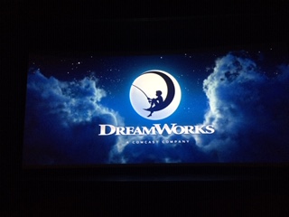
I know, I know....today's "woke" kids don't give a shit about fishing, so it won't matter, and the logo is cool and all, but it now makes no sense.
Rant over.
Posted by Bobby Henderson (Member # 840) on 02-26-2019, 11:46 PM:
I agree the new DreamWorks logo is strange. I'm kind of surprised the Brand New department of the Under Consideration web site hasn't already provided their take on the revised brand.
The biggest problem I have with this brand update is the blatant lack of logic in the moon icon. If that's the moon behind the boy creating the silhouette then what the hell is that thing he's using for a chair? Another moon? Is he trying to fish above Mars or Jupiter? I assume the crescent shape is supposed to be an implied "D."
I can understand why they clipped the end off the kid's fishing pole. Having some thin object poking past the edge of a circular shape is less clean. I get the feeling they hope to be able to just use that circular shape with the kid inside it as a standalone icon where they don't need any additional stuff like "DreamWorks" lettering underneath it. Warner Bros could probably just put the "WB" icon on the screen and nothing else and most people would still recognize the brand.
There is a lot of power in brands that can strip away everything possible to arrive at a very simple icon and nothing else. Starbucks dropped the lettering surrounding its mermaid logo. Some people thought they were insane to do that. But the ploy worked. Their signs and other branding is more immediate and legible because of the choice. AT&T has started using only its "death star" icon on some of its signs. McDonald's has long had a powerful brand because of the M-shaped golden arches. They were one of the first companies to eschew all the other elements and try using just the arches alone. Some of their high rise signs just have the golden arches with a thin red polygon underneath. Those signs cost them a lot of money on maintenance since storms often blow out sections of those arches all the time. But you can recognize a McDonald's sign from over a mile away, and that recognition pays big dividends. I can't imagine Nike going back to including "NIKE" lettering under their swoosh. They don't need it anymore.
I'm glad Dreamworks dropped the "SKG" thing from their logo. It drives me nuts when smaller businesses insist on including crap like "INC" or "LLC" on their signs. That's something for a tax return or stock report. It's extraneous garbage when it comes to advertising. I can't stand phone numbers on signs either; they're a waste of space. This week I had to include a big QR Code on somebody's building sign layout. There was space for it due to the odd design of their logo. The customer wanted that QR Code included so people driving by in their cars could use their phone's bar code app to scan the QR Code and visit their website as if that's a safe thing to attempt while driving.
They refined the "DreamWorks" lettering so it doesn't look so much like someone grabbed ITC Stone Serif and stretched the shit out of it. Now it looks a little more like a naturally extended typeface.
They also updated the silhouette of the boy. The details are nice and well drawn, but probably won't scale down to small sizes for certain print advertising. There is one aspect of the drawing I find pretty hilarious. Notice how the kid is holding the fishing pole. His arms are almost fully extended. Who the hell holds a fishing pole like that? He's resting an elbow against his knee. But most kids and adults hold fishing poles with their elbows closer to the body and forearms resting on the legs. It's easier. Now here's the hilarious part: the boy's arms are extended outward on purpose. His hands are the only part of his body making contact with the fishing pole. The bottom of the pole stops short of his shin. They deliberately designed the figure like that so the kid would look like he is holding a fishing pole rather than holding his pole.
Gotta always be on the lookout for things that can "read" in potentially offensive ways when doing graphic design work.
Posted by Dave Macaulay (Member # 813) on 02-27-2019, 09:17 AM:
The Starbucks logo is not a Mermaid, it's a Siren. Mermaids have tails, Sirens have something like two legs (and presumably female genitalia between them). The original logo was "NSFW", showing her with bare breasts holding her "legs" spread wide. The new G-rated logo is boob free but her "feet" are still held up beside her head.
Posted by Bobby Henderson (Member # 840) on 02-27-2019, 10:46 AM:
Hair splitting alert (or tail-splitting in this case). The female looking thing in the original logo did not have legs. It had two fish-like tails. Sirens have been portrayed in paintings with human looking legs. Some have been portrayed with a single fishy tail, just like a friggin' mermaid. I guess the only real difference is a siren wants to kill you and a mermaid does not. Both are mythical creatures anyway. So it doesn't really matter in the larger discussion of the DreamWorks logo.
Posted by Frank Cox (Member # 6258) on 02-27-2019, 11:49 AM:
Sirens!
![[Smile]](smile.gif)
Posted by Buck Wilson (Member # 5885) on 03-03-2019, 08:32 PM:
I was at an opening show of HTTYD- a guy in front of me actually commented on it "Wow that new logo is stupid".
I was disappointed that it wasn't so smoothly part of the intro like it was in the first one. I don't recall there being any nice animation to this one, it was just the logo. In the first movie the boy casts his line and the hook actually cuts through the fog of the intro scene and stuff, it gives me nice chills with the intro music.
Lame indeed.
Posted by Marcel Birgelen (Member # 6801) on 03-04-2019, 03:10 AM:
Yesterday, I finally saw Green Book. It still uses the old DreamWorks logo, which is clearly taken from an old 35mm scan, while the movie itself was clearly acquired digitally. Maybe that's why they wanted to have a new logo? Because they probably lost the source files for the original one? Or is this just the new "DreamWorks Animation" logo?
If I'd had to give this logo a name, I would call it "Pancake boy"...
quote: Bobby Henderson
I'm glad Dreamworks dropped the "SKG" thing from their logo. It drives me nuts when smaller businesses insist on including crap like "INC" or "LLC" on their signs.
Someone once told me, the "SKG" was a reference to the egos of the founders, Spielberg, Katzenberg and Geffen and not some exotic legal company form.
quote: Bobby Henderson
This week I had to include a big QR Code on somebody's building sign layout.
Some company here painted a QR code on the side of one of their silos. I don't know if it was a vain effort to get into the Guinness Book of Records, but the ironic part of it is that it's impossible to scan, because the lower part of the QR code is blocked by the buildings in front of it...
Posted by Tony Bandiera Jr (Member # 2365) on 03-04-2019, 12:34 PM:
quote: Marcel Birgelen
Someone once told me, the "SKG" was a reference to the egos of the founders, Spielberg, Katzenberg and Geffen and not some exotic legal company form.
Yep, that is correct. (Except for the egos part...a really unnecessary remark) The three started Dreamworks as a collaborative effort. You had the Director (Spielberg), Producer/Mogul (Katzenberg) and the Record company (Geffen) all under one roof.
Wiki linky
quote:
DreamWorks Pictures (also known as DreamWorks SKG or DreamWorks Studios, commonly referred to as DreamWorks) is an American film production label of Amblin Partners. It was founded in 1994 as a film studio by Steven Spielberg, Jeffrey Katzenberg and David Geffen (together, SKG), of which they owned 72%. The studio was formerly distributing its own and third-party films by itself. It has produced or distributed more than ten films with box-office grosses of more than $100 million each.
In December 2005, the founders agreed to sell the studio to Viacom, parent of Paramount Pictures. The sale was completed in February 2006 (this version is now named DW Studios). In 2008, DreamWorks announced its intention to end its partnership with Paramount and signed a $1.5 billion deal to produce films with India's Reliance Anil Dhirubhai Ambani Group,[2] re-creating DreamWorks Pictures into an independent entity. The following year, DreamWorks entered into a distribution agreement with Walt Disney Studios Motion Pictures, wherein Disney would distribute DreamWorks films through Touchstone Pictures; the deal continued until 2016. As of October 2016, DreamWorks' films are marketed and distributed by Universal Pictures. Currently, DreamWorks operates out of offices at Universal Studios.
DreamWorks' former feature animation unit, now known as DreamWorks Animation (which currently owns the DreamWorks trademarks), was spun off in 2004, and as of August 2016 is a subsidiary of NBCUniversal.[3] Spielberg's company continues to use the DreamWorks trademarks under license from Universal Studios.[4][5]
Posted by Mike Blakesley (Member # 26) on 03-04-2019, 07:59 PM:
quote:
The studio was formerly distributing its own and third-party films by itself... In December 2005, the founders agreed to sell the studio to Viacom..... In 2008, DreamWorks announced its intention to end its partnership with Paramount, re-creating DreamWorks Pictures into an independent entity.... The following year, DreamWorks entered into a distribution agreement with Walt Disney Studios Motion Pictures, .... As of October 2016, DreamWorks' films are marketed and distributed by Universal Pictures. Currently, DreamWorks operates out of offices at Universal Studios....
The people at Dreamworks must spend half their time packing, moving, unpacking, changing mailing addresses, updating their contacts and ordering new business cards. No wonder they haven't got time to design a decent logo.
Posted by Bobby Henderson (Member # 840) on 03-04-2019, 10:54 PM:
quote: Marcel Birgelen
Someone once told me, the "SKG" was a reference to the egos of the founders, Spielberg, Katzenberg and Geffen and not some exotic legal company form.
I thought it was common knowledge regarding the "SKG" standing for Spielberg, Katzenberg & Geffen. There was a lot of media hype going on when Dreamworks SKG was first launched, as if it was a new self-sufficient major studio.
quote: Marcel Birgelen
Some company here painted a QR code on the side of one of their silos. I don't know if it was a vain effort to get into the Guinness Book of Records, but the ironic part of it is that it's impossible to scan, because the lower part of the QR code is blocked by the buildings in front of it...
They probably didn't make the QR code with enough blocks in it. With enough bits of redundant data and error correction a QR code can withstand part of it being covered by a logo, or something else. If the silo is a cylindrical surface that could pose a problem on its own. QR codes are best applied to a flat surface.
quote: Mike Blakesley
The people at Dreamworks must spend half their time packing, moving, unpacking, changing mailing addresses, updating their contacts and ordering new business cards. No wonder they haven't got time to design a decent logo.
The logo looks like it was created by a committee of multiple "chiefs" and one "indian" to somehow mash the creative demands together. Like I said earlier, all the elements in the logo are well drawn and rendered. My guess is the concept was forced by business people who don't really know graphic design and branding.
Posted by Marcel Birgelen (Member # 6801) on 03-05-2019, 03:10 AM:
quote: Bobby Henderson
I thought it was common knowledge regarding the "SKG" standing for Spielberg, Katzenberg & Geffen. There was a lot of media hype going on when Dreamworks SKG was first launched, as if it was a new self-sufficient major studio.
Yes, I remember the hype back in 1994. I think it always was the idea to EVENTUALLY actually start a self-dependent studio, with their own lot or even lots and production facilities, not just a bigger version of Amblin Entertainment. In the end, even though the bigshot names behind it, the capital required didn't seem to materialize.
quote: Bobby Henderson
They probably didn't make the QR code with enough blocks in it. With enough bits of redundant data and error correction a QR code can withstand part of it being covered by a logo, or something else. If the silo is a cylindrical surface that could pose a problem on its own. QR codes are best applied to a flat surface.
The silo is a big, rectangular box, so not a cylindrical surface. About 1/3rd of the bottom is obscured by buildings from all points of view, except those directly in front of the building, which is probably already on their own land.
When you create a QR code, you can define how much error correction you want to have in it, but I doubt even the heaviest form is capable of surviving 1/3rd of it being blocked.
quote: Mike Blakesley
The people at Dreamworks must spend half their time packing, moving, unpacking, changing mailing addresses, updating their contacts and ordering new business cards. No wonder they haven't got time to design a decent logo.
To make matters more complicated, there are two companies called DreamWorks (both of them regularly featuring the "SKG").
DreamWorks (SKG), which nowadays seems to be fully owned by Spielberg's Amblin Partners. DreamWorks Animation (SKG), which is currently owned by NBCUniversal/Universal Studios. From 2004 until 2016 it was a publicly traded company and distributed its movies primarily via Disney's distribution companies.
Interestingly, DreamWorks Animation seems to be the owner of the DreamWorks trademark, which the DreamWorks without Animation licenses.
It will become even more confusing when DreamWorks (without Animation) would release an animated feature. ![[Wink]](wink.gif)
Posted by Bobby Henderson (Member # 840) on 03-05-2019, 10:54 AM:
Maybe they'll come up with a NightmareWorks spin-off for horror movies.
Or SpoogeWorks XXX for porn.
![[Big Grin]](biggrin.gif)
Posted by Monte L Fullmer (Member # 2797) on 03-05-2019, 05:14 PM:
Looks like the cable monster Comcast soaked up SKG and Universal.
Posted by Marcel Birgelen (Member # 6801) on 03-05-2019, 05:40 PM:
quote: Bobby Henderson
Or SpoogeWorks XXX for porn.
I really don't want to see what the logo of that one would look like. I guess they would need to replace the little fishing boy though, to keep it legal.
quote: Monte L Fullmer
Looks like the cable monster Comcast soaked up SKG and Universal.
Yes... meanwhile, AT&T is trying to assimilate Time Warner. In the near future, a big part of the U.S. media industry will be owned by the two of the biggest US communications behemoths... What could go wrong?
Maybe you remember, back in 2004, Comcast once tried to buy Disney. Disney wasn't in a very good shape back then, but they pretty much recovered. I'm still happy that didn't materialize, even though the way Disney expanded in the last years is a bit frighting.
Meanwhile, Sony is actively trying to sell their studio business (Columbia Pictures et all). Let's hope it will not land into the hands of the likes of Amazon or Netflix, as that could be bad news for the exhibition industry.
Powered by Infopop Corporation
UBB.classicTM
6.3.1.2