|
|
This topic comprises 3 pages: 1 2 3
|
|
Author
|
Topic: GWTW @ Loews Jersey - Mitchell Dvoskin ?
|
|
|
|
|
Jeffry L. Johnson
Jedi Master Film Handler

Posts: 809
From: Cleveland, Ohio, USA
Registered: Apr 2000
|
 posted 02-20-2005 05:49 PM


Haver, Ronald. David O. Selznick's Gone with the wind. New York: Bonanza Books, 1986. ISBN 0-517-61532-0.
pp. 84-85: quote:
[T]he sales people felt that exhibiting the picture on the new wide screens that had just come into use would give it a contemporary look and feel, as well as enhancing the spectacle sequences.
The chief difficulty with this latter approach, however, was that most of the maskings of the image necessary to give older pictures a wide-screen proportion were done in the theatre and were largely left up to the projectionists, who took very little care over what they were doing, resulting in heads completely disappearing out of the frame or alternately sitting at the bottom like rows of tenpins. MGM's standards were still the highest in the industry, and many of the people who were working for the company had been entrusted with the care of GWTW ever since its original release. They felt an affection for it, and a proprietary interest in its preservation and proper presentation; the thought of its being left to the arbitrary mercies and sloppy projection practices of most theatres was painful in the extreme. So early in 1954, a special assignment was handed to W. D. Kelly of the MGM editorial department: he was to make a survey of the various theatres in the Los Angeles area to determine the proportion in which they projected their image, and how the projectionists framed and centered the picture during a performance. His report to J. Robert Rubin, the vice president of sales, indicated that "projecting Gone with the Wind with present-day standards...could lead to certain scenes being damaged from the photographic and dramatic standpoint." He had made a study of the picture projected through the various ratios, and found that if the image was blown up slightly, to a 1.6-to-1 proportion, only five scenes in the film would need careful attention from the projectionist: one in the beginning, when Scarlett runs across the lawn at Tara; the first pullback shot of Scarlett and her father standing under the tree looking out over the plantation; two of the spectacular shots in the Atlanta railroad station; and the final pullback shot of the picture. For these, Kelly recommended that the studio itself "reduce the picture aperture...which would obviate the necessity of having...theatre projectionists concern themselves with the adjustment." The rest of the picture could be played at the 1.6 ratio with very little loss of the central image.
p. 86: quote:
MGM's technicians had been feverishly working with the sound tracks Selznick had turned over to them, remixing them for the Perspecta effects, and altering the necessary sections of the picture. They did this by rephotographing portions of the original black-and-white negatives onto a new Eastmancolor single-strip color negative. These altered sections were then inserted into the new Technicolor printing matrices and a completely new set of prints run off, which is why, in certain sections of the 1954 reissue, the color suddenly becomes very grainy and washed-out looking.
| IP: Logged
|
|
|
|
|
|
|
|
Jeffry L. Johnson
Jedi Master Film Handler
Posts: 809
From: Cleveland, Ohio, USA
Registered: Apr 2000
|
posted 02-24-2005 07:54 AM
Usenet newsgroup rec.arts.movies.tech posting 1998 June 07 by Jeff Joseph
quote:
From Los Angeles Times:
Sunday, June 7, 1998
'GWTW': Is Brighter Better?
A Technicolor process will invigorate the colors in the classic, and the debate with purists has begun.
By BILL DESOWITZ
When "Gone With the Wind" returns to theaters June 26 in the splendor of Technicolor's new and improved dye transfer printing process, looking sharper and more vivid, there will be an outcry of revisionism over restoration.
After all, this is a cinematic treasure, and, imperfections and all, the epitome of bold and subtle Technicolor artistry from 1939. So it's no wonder that a few passions have already been stirred among those who care more about preserving our cultural heritage than pleasing contemporary tastes.
"This is not an accurate representation of 'Gone With the Wind,' " asserts Robert Harris, who, along with restoration partner James Katz, is familiar with original and reissue dye transfer prints of the film, and has glimpsed a test reel of the new version. (Harris and Katz are currently preparing the restored 'Rear Window" for dye transfer printing next year.)
"This is a distortion of the original three-strip Technicolor look, a hybrid of two processes [Technicolor and Eastmancolor] at their best and worst," Harris continues. "And the danger here is that the public will be deceived into believing it is seeing 'Gone With the Wind' the way [producer] David O. Selznick and [production designer] William Cameron Menzies intended it to be seen."
There are really two issues in dispute. The first is bypassing the original three-strip nitrate photographic elements (separate black and white silver records containing information for red, green and blue) and printing from a new duplicate color negative, which actually corrupts the integrity of the original colors. The second is transforming this multitextured Civil War epic into eye candy with dye transfer. Even though it yields greater color discrimination and tone scale (ranging from highlights to shadow), it's a new toy like digital sound that requires a certain amount of restraint and discrimination.
In the test footage, for instance, which Technicolor promises will be very close to the release version, the reds jump off the screen in the armory bazaar sequence. Elsewhere, the blacks and whites are overpowering. But this is not "Bulworth" or "Godzilla," the two initial releases in dye transfer, where you want high contrast and an explosion of primary colors.
Rather, you want the kind of subdued palette that can be glimpsed in a 1954 print (original 1939 nitrate prints are difficult to come by), the last version approved by Selznick. Here there's a creamy, luscious, candlelit warmth that was part of an experiment to tone down colors, according to Selznick and Menzies, except for dramatic emphasis in the costumes, illustrating how the Old South lost its beauty after the Civil War.
"We're not saying it's not pleasing to look at," Katz says, "but we want to see it done right. If you're going to spend all this money and use this wonderful new process, why not take full advantage of it with a restoration? The 60th anniversary isn't until next year. What's the rush? Take the time and let audiences enjoy its unique artistry while preserving the three-strip elements for posterity."
Evidently it's not that simple. Distributor New Line (a Ted Turner holding acquired in the Time Warner merger) imposed a summer dye transfer deadline, and Technicolor is neither equipped nor authorized right now to handle nitrate. Sources say there was also pressure from Warner Bros. home video to release a new tape and DVD in November. This will be followed by a Technicolor documentary tie-in on the TCM cable station in December. "They didn't want to do theatrical next year because they were worried
about a millennium blitz in 2000," an insider adds.
"Who's to say what it should look like?" ponders Turner President Roger Mayer. "The test is the best color rendition I've ever seen of 'Gone With the Wind.' This far surpasses our 50th anniversary print in '89. The depth and clarity are astonishing--like 3D. We think audiences will be very pleased."
Certainly the reissue of this legendary classic was an ideal match for reintroducing dye transfer after nearly a 25-year absence, making "color an extension of the creative community once again," according to Technicolor president Ron Jarvis. "We have not yet explored all the possibilities for new and old films," Jarvis says, "but we plan on starting a preservation/restoration division in the next year or so, and I'd really like to do a test on 'Gone With the Wind's' nitrate and see what the results are like."
Also leaving open the possibility is Richard P. May, Warner Bros.' vice president of film preservation. "At some point, we'd like to make a comparison with this new version and see how much difference there really is," he says.
May supervised the 50th anniversary restoration for improved printing in Eastmancolor and claims the nitrate negatives are in excellent condition. Yet he's skeptical about re-creating "Gone With the Wind's" original desaturated, sepia look. "We have no way of knowing if Selznick got what he wanted out of Technicolor back then or not because of the limitations. What's definitive?
New advancements in '54 improved the contrast and sharpness. You can't go by release prints. They vary. Projection lighting was different too. You can only go by the negative, which contains the full color spectrum within it. We think we can make it look better than it was right now while adhering to the original style."
But making it look better is a risky judgment call. Where do you draw the line in using high-tech to sell retro as a filmgoing event? "There's a tendency today to want to use technology to improve everything," notes 'Gone With the Wind" authority Gavin Lambert. "It's revisionism. It's like one step forward and two steps back."
Even the reigning dye transfer alchemist, Dr. Richard Goldberg, agrees that "Gone With the Wind" would be best served by a three-strip restoration. In the meantime, though, he believes the current dye transfer compromise is still preferable to color positive printing. "The process we have today is far superior to anything we had in Technicolor in terms of the materials used, . . . ," says Dr. Goldberg, now a special advisor to Jarvis, and formerly the vice president of research and development during Technicolor's Eastmancolor transition in the '50s.
"The single strip multilayer color film has wonderful properties, but color separation is not one of them," Dr. Goldberg adds. "Color information tends to get interrupted between the layers. With silver there is no interruption. You have three separate channels. You only introduce color in the last step. This is the epitome of color rendition.
"Far be it for me to suggest that you should take a pristine nitrate negative and print matrices [for dye transfer]. Before long, after a year, that precious negative is no longer pristine. I would make instead fine grain separation positives and dupe from them, keeping the channels separate, without color having been introduced. In fact, I would make two sets, one to print from and one for posterity. In true restoration, isn't it necessary to follow exactly what it was before?"
But Warner Bros.' vice president of film preservation doubts whether today's audience would approve of "Gone With the Wind's" original look. "I think they would see that absence of color and ask what we did to the picture," May says. "Few people realize anymore that 'Gone With the Wind' was way ahead of its time in its sophisticated use of color," says Lambert. Who's "Gone With the Wind" is it, anyway? For now, there's the new look for our time, while we wait for that elusive restoration before it's too late, much like Scarlett waits for her beloved Rhett.
| IP: Logged
|
|
|
|
|
|
|
|
|
|
Frank Angel
Film God

Posts: 5305
From: Brooklyn NY USA
Registered: Dec 1999
|
posted 02-28-2005 05:25 AM
quote:
But Warner Bros.' vice president of film preservation doubts whether today's audience would approve of "Gone With the Wind's" original look.
What crap. Today's audiences wouldn't "approve" of the 1939 look as it's supposed to be? The way millions of people saw it and enjoyed it and contended for years that it was the greatest film ever made? What arrogance. That's right, blame it on today's audience and not WB corporate stupidity. It's that same kind of thinking that got us all those horrific wide screens abortions. I am sure some hotshots at MGM thought that audiences wouldn't "accept" the original aspect ratio and the original mono sound mix of GWTW as well, yet it is now being projected 1.37 and no one is running out of the theatre saying they can't enjoy it because it's not wide.
So then how about also allowing the color to look the way the cinematographer and director intended it and not futz with it just because some suit at The Frog thinks he knows what an audience will or will not accept. I think today's audiences are sophistocated enough to deal with a restoration that is true to the original and not one that's been messed around it. It's like after the labs do all the color matching and spectral testing so they can scientifically match the final color to the original elements as closely as scientifically possible, and then along comes this WB VP and says, "gee, no, that doen't look good to me....let's make it brighter," based on his own, what? audience divining intuition? And this is the guy they put in charge of preservation?!!
It's like the new ads that Disney is airing now, concocted to sell the new BAMBI DVD release. It claims they've taken the classic (is anything Disney ever made not a "classic"?) out of the "vaults" and "restored" it. Why on earth would they have to restore and remaster this thing?....they have video masters from at least two prior releases. And then they use that tired old cliche comparison trick -- the ad shows the image on one side dulled down with no contrast and the other half of the picture is bright and clear with proper contrast. The insinuation is that some how the original looked like that low contrast, dull image on the left side of the screen. As if at any time in it's 35mm film or video history, be it VHS, LaserDisc or DVD, it ever looked like the dull half of the screen. Unless they are saying that the video master loose contrast over the years. is there video fade perhaps that we don't know about? And they also do that thing where they threaten that if you don't buy it now, it will "go back into the vaults," implying that no one will be able to buy it ever again (until they decide to sell it again, of course).
My understanding is, once a retailer purchases the product, the DVD or in the old days the VHS tapes, he owns them and he can sell them, rent them or distroy them for that matter, any time he wants. They are his property and they can't be encumbered (except for the copyright restrictions) just because Disney wants to be able to tell the public that they will be stuck if they don't buy them within this imaginary Disney window of opportunity. If Blockbuster bought a shitload of BAMBI DVDs, the only way Disney could legally stop them from continuing to sell them after Disney claims to the public that BAMBI is "back in the vaults," is if Disney buys back Blockbuster's remaining inventory. And of course there is always ebay, were anyone can sell their DVD copy of BAMBI any time they bloody-well please.
Corporate arrogance. I wish I had gobs of money; I would buy a video retail store JUST so I could sell Disney product long after they claim the public can't get them. But then again, I betcha Disney has a VP In Charge of Crushing Such Video Retailers Like Bugs.
Yah, I am in that kind of a mood.
| IP: Logged
|
|
|
|
|
|
Mitchell Dvoskin
Phenomenal Film Handler

Posts: 1869
From: West Milford, NJ, USA
Registered: Jan 2001
|
posted 03-24-2005 01:03 PM
On Friday April 1st and Saturday April 2nd, the Landmark Loews Jersey will present a weekend of black & white widescreen films.
- Woody Allen's - Manhattan
- Elvis Presley's - Jail House Rock
- Evil Old House's - The Haunting (1963 Robert Wise Version)
Click Here for more information and showtimes.
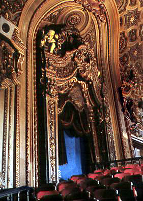
The Loews Jersey is located on Journal Square directly across the street from the PATH subway station connecting Manhattan with Jersey City, and just minutes from the New Jersey Turnpike, Route's 1 & 9, and Route 3. Built in 1929, the theatre still features carbon arc projection, Dolby analog stereo sound, and a huge 50 foot screen.
I'm not sure which films I'm projecting yet, but I should be there for all the shows. If anyone attends, be sure to say hello.
| IP: Logged
|
|
|
|
All times are Central (GMT -6:00)
|
This topic comprises 3 pages: 1 2 3
|
Powered by Infopop Corporation
UBB.classicTM
6.3.1.2
The Film-Tech Forums are designed for various members related to the cinema industry to express their opinions, viewpoints and testimonials on various products, services and events based upon speculation, personal knowledge and factual information through use, therefore all views represented here allow no liability upon the publishers of this web site and the owners of said views assume no liability for any ill will resulting from these postings. The posts made here are for educational as well as entertainment purposes and as such anyone viewing this portion of the website must accept these views as statements of the author of that opinion
and agrees to release the authors from any and all liability.
|

 Home
Home








 Printer-friendly view of this topic