|
|
This topic comprises 3 pages: 1 2 3
|
|
Author
|
Topic: Film Trademarks
|
|
|
|
|
|
|
Bobby Henderson
"Ask me about Trajan."

Posts: 10973
From: Lawton, OK, USA
Registered: Apr 2001
|
 posted 06-22-2007 04:36 PM


Columbia Pictures' branding scheme was sort of hit and miss during the 1970's and 1980's. The starburst thing by itself (which faded into the minimalistic logo thingie) didn't work all that great. OTOH, I liked how the colored starburst was incorporated into the lady's torch, as seen in the opening of Ghostbusters. The torch would intensify in brightness to show that rainbow colored starburst. The lettering on the image had some problems. The rounded and heavy weight ITC Souvenir type with all its shiny embellishment certainly made it a bit difficult to read.
I kind of liked the treatment of Warner Bros' old "sausage links" logo where the camera would zoom through the "W" a couple of times.
Those minimalistic and hard edged graphic logos were all the rage in the 1960's and 1970's. It seemed like most movie studios and TV networks had to develop one. I think the CBS "Eye" logo (first developed in the 1950's) and other icons like the one for IBM were pretty influential. That trend certainly led to the stark graphical logo for MGM on the front of 2001: A Space Odyssey. Warner's sausage link "W" was one of the more successful marks. I remember seeing it on lots of movies and music recordings when I was a kid. Paramount Pictures came up with a decent hard edged logo of their mountain brand during that period.
Paramount is one of those studios that didn't change its opening logo very often. The current CGI flying stars intro has been around for a few years now. I can't remember which movie ushered in that one. I'm pretty sure Top Gun debuted the first flying stars Paramount logo. Previous to that, the traditional mountain painting was used in various configurations, with some transitioning to the hard graphic logo.
quote: Steve Guttag
Universal played with their intro too much for me though each time it was easily identified as Universal.
I don't think Universal has changed its logo more than twice in the last 30 years. The "Saturn rings" logo spanned much of the 1970s and 1980s. Back to the Future: Part II unveiled the version that was used for much of the 1990s. The current Universal motion graphic was introduced with The Lost World: Jurassic Park.
Prior to those three versions, Universal has had a lot of different intro graphics.
Regarding the Tri-Star logo, I liked the music for that motion graphic. But I thought the visuals of the wings coming out of the horse looked pretty fake. The final "print version" logo with the winged horse over the triangle was a nice image.
The thing with Tri-Star also reminds me of Carolco's logo (both were sometimes seen together). Carolco's logo would start out pretty cool looking but after all the dazzling light effects play out and the logo finishes zooming out it just ends up looking fake for some reason. I think it's because the logo was in true 3D perspective at first and then it is collapsed into something with a flat isometric block shadow. It feels like it's breaking a visual rule in its process.
quote: Steve Guttag
Now who can't look up in the sky and see the stars that form Orion and not expect them to start to swirl to form the "O" in Orion?
I was used to identifying Woody Allen movies and such with the Orion logo. After seeing Robocop I always tend to think of that movie whenever seeing those stars swirl around the "O".
quote: Scott Norwood
Is anyone else annoyed when video versions of films have different logos than the theatrical versions? One example that comes to mind is the current DVD of "Trainspotting"--the 35mm prints have the "flying-M" Miramax logo, whereas the DVD has the current "city" logo. Minor, but annoying nonetheless. There are plenty of other examples as well.
In the case of Miramax, their previous logo was so cheesy looking I could forgive them applying the much better looking "city" version to any catalog DVD releases. But from a purist's perspective, I agree any movie re-issue on DVD or in theaters should use the studio graphic from that era.
| IP: Logged
|
|
|
|
|
|
|
|
|
|
Bobby Henderson
"Ask me about Trajan."
Posts: 10973
From: Lawton, OK, USA
Registered: Apr 2001
|
posted 06-23-2007 11:11 AM
I liked the United Artists logo which was used on releases like Goldeneye in 1995. Wasn't that the first movie in which it appeared? It looked kind of cool and the music accompanying it was pretty decent as well, at least it worked well with the James Bond thing.
quote: Monte L Fullmer
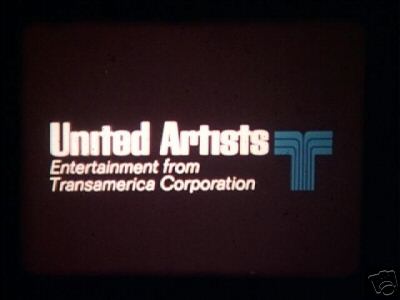
Every time I happen to see the UA trademark with the Transamerica Corporation "T", I think of "Yellow Submarine" and "Fiddler on the Roof" - and to think "Heaven's Gate" destroyed that union...
I always think of animated Pink Panther cartoons when seeing that mark.
Regarding the MGM logo and its roaring Leo the Lion character, I kind of think of that studio logo as being the "Coca-Cola" of movie studio logos. Cumulative history noted, especially during Hollywood's "golden age," this is the most emblematic icon of Hollywood -even more so than 20th Century Fox' icon.
And that's why I think Sony/MGM is sort of stuck with that logo's current arrangement. Even if they put together some flashy new animated motion graphic with the ribbon flying into the frame or some animated montage of lions or something, all the elements would have to line up into the old logo's arrangement at the end, with Leo roaring inside of that ribbon frame.
It will be interesting to see what happens with MGM's motion graphic branding in the next few years with new James Bond movies and such. I think there's a decent chance Sony will risk playing around with it, but they won't have very much flexibility in how they do it.
| IP: Logged
|
|
|
|
|
|
|
|
|
|
|
|
|
|
|
|
All times are Central (GMT -6:00)
|
This topic comprises 3 pages: 1 2 3
|
Powered by Infopop Corporation
UBB.classicTM
6.3.1.2
The Film-Tech Forums are designed for various members related to the cinema industry to express their opinions, viewpoints and testimonials on various products, services and events based upon speculation, personal knowledge and factual information through use, therefore all views represented here allow no liability upon the publishers of this web site and the owners of said views assume no liability for any ill will resulting from these postings. The posts made here are for educational as well as entertainment purposes and as such anyone viewing this portion of the website must accept these views as statements of the author of that opinion
and agrees to release the authors from any and all liability.
|

 Home
Home













 Printer-friendly view of this topic