|
|
This topic comprises 3 pages: 1 2 3
|
|
Author
|
Topic: Film Trademarks
|
Michael Coate
Phenomenal Film Handler

Posts: 1904
From: Los Angeles, California
Registered: Feb 2001
|
 posted 07-05-2007 04:30 PM


quote: Bobby Henderson
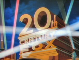
The 70mm print I saw of Die Hard featured a Fox logo horizontally stretched.
This wasn't confined to the 70mm prints; the 35s had it too.
quote: David Stambaugh
I always wondered what the deal was with the Fox logo in front of "Die Hard". Didn't that flat-logo-projected-in-scope error even carry over to home video releases?
quote: Bobby Henderson
I don't think so. Each DVD release has had the 1980's era 20th Century Fox logo properly composed for a 'scope frame. I'm not sure if the stretched logo error carried over to any of the laser disc releases.
I imagine the stretched Fox logo was a simple mistake of the lab cutting into the negative a flat version of the logo rather than a scope one, and then having a lack of time or a cost-factor preventing a correction. But…when I saw the stretched logo reappear two years later on "Die Hard 2" I had to wonder if it wasn't deliberate.
Anyway, I think the first laserdisc edition did retain the stretched logo. To verify, I recently dug into my laserdisc collection (yep, I kept 'em), but the disc I found for "Die Hard" was the 1995 Dolby Digital remastered edition which featured a corrected Fox logo. (As with a lot of remastered releases, I ditched earlier versions upon acquiring a new-and-improved version.)
quote: Bobby Henderson
Since the current Fox motion graphic is CGI-based, it's been relatively simple to customize it. X-Men altered it. The Star Wars special editions and prequels had stationary versions of it, ahead of the Lucasfilm Ltd. brand mark shown during the "CinemaScope Extension" music.
A stationary version (to accommodate the removal of the CinemaScope Extension music) is what I think should be used on contemporary "flat" releases.
quote: Bobby Henderson
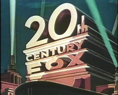
In the 1980s, the Fox logo was altered in weird ways on some 70mm prints. The 70mm print I saw of The Abyss had the Fox logo badly cropped. You could see the "20th" part of it, but much of the lower part of it was clipped.
The off-center cropping in this instance may have been due to the film being shot in Super-35 using a topline composition method. Since "The Abyss" was only Fox's second Super-35 production and was produced fairly close to the introduction of the format, a customized topline Super-35 version of the studio logo probably had not yet been produced.
| IP: Logged
|
|
|
|
|
|
|
|
|
|
|
|
|
|
|
|
|
|
|
|
|
|
All times are Central (GMT -6:00)
|
This topic comprises 3 pages: 1 2 3
|
Powered by Infopop Corporation
UBB.classicTM
6.3.1.2
The Film-Tech Forums are designed for various members related to the cinema industry to express their opinions, viewpoints and testimonials on various products, services and events based upon speculation, personal knowledge and factual information through use, therefore all views represented here allow no liability upon the publishers of this web site and the owners of said views assume no liability for any ill will resulting from these postings. The posts made here are for educational as well as entertainment purposes and as such anyone viewing this portion of the website must accept these views as statements of the author of that opinion
and agrees to release the authors from any and all liability.
|

 Home
Home




![[Frown]](frown.gif)
![[sleep]](graemlins/sleep.gif)
![[puke]](graemlins/puke.gif)



![[Wink]](wink.gif)

![[Confused]](confused.gif)


 Printer-friendly view of this topic