|
|
 
|
|
Author
|
Topic: Once Upon a Time ... in Hollywood 70mm/35mm release?
|
Jean-Pierre Gutzeit
Film Handler
Posts: 43
From: Berlin, Berlin, Germany
Registered: Nov 2012
|
 posted 08-14-2019 09:56 AM


I also think filmmakers today are more attuned to digital color correction. Thus, films do look very different then they have in the past. Even photochemical finish guys like Paul Thomas Anderson and Christopher Nolan, have made their films look bland on film for purposeful reasons, it's the look they're going after.
In my opinion, this also plays a personal role. And at the same time we have the technical problem of color crossings in all versions of HATEFUL 8. Here I would like offer an example from another category, which certainly can't represent 70mm evidence, but due to technical as well as artistic deficits shows the basic tendency of this film. The 70mm print weren't that bad, though. All these views brought back memories of FALL OF THE ROMAN EMPIRE, and the drastic "jumps at you" (sorry for the German voice over sound and the terrible youtube quality - I couldn't find another link)
please): https://www.youtube.com/watch?v=yGI7nns8xAU
This is not the only reason why I share this view again:
I found that the image quality on H8 was all over the place. Depending on the taking lens used (close up versus establishing shot) the quality of the image/sharpness varied greatly.
I also found that the print quality to be very wanting and quite unsteady on the print I saw.
In addition, the use of the negative types Vision 3 250D and Vision3 500T 5219 is subject to the respective characteristics. But I would also add from memory: unsteadomess in image quality even appeared in the DCP.
Like INTERSTELLAR the whole film was strange in colour. The DOP of H8, Mr. Richardson, however, tells in "Variety":
And I think brilliantly so because when I watched the film, the colors scream on 70mm. They scream at you. The red in particular looks like we could have shot this film Kodachrome.
https://variety.com/2015/artisans/in-contention/robert-richardson-hateful-eight-dp-1201655879/
Does he mean the dailies seen or the actual theatre prints?
And here the path of seriousness is abandoned:
And the original negative will probably only give you 15-to-20 prints, maybe, if you stretch it. You don’t want to damage it, but I’m kind of hoping we can go a little further.
https://variety.com/2015/artisans/in-contention/robert-richardson-hateful-eight-dp-1201655879/
How else could the industry and the quality of roadshow prints have been justified other than by direct copying? Has Mr. Richardson ever worked in laboratory? Even after three hundred serial prints, especially off the 65mm negative, there is no need for any damage. I am no longer surprised why HATEFUL 8 chose the unfortunately unfortunate path of intermediate printing. The "cardinal error" in the overall strategy, especially since it is known that for many years no labs has been able to produce good intermediate negatives by purely photochemical means. To change this would require concerted cooperation between the donors as well as between retired lab's experts.
And that's what got me wondering while watching HATEFUL 8. Maybe it has something to do with the original negative (Vision 3) being designed for DI and not for traditional finishing ? Three years ago I had some Vision3 50D printed directly and the soft, pastel, "digital" colors amazed me (in a bad way) and could definitely not be corrected by traditional color correction. I was told Fuji made a print stock to correct this effect but that print stock was long sold out.
There is an adaptation of the original negatives to the needs of the digital intermediate. There are subtle differences, but I would clearly prefer the Kodak film negatives of the 1990s also in terms of skin tones: in terms of color, it was the best material ever to come on the market. But already in the 1990s it had become the practice in some film copying plants (which were under the obligation of another company) to produce theatrical copies on Fuji material. Nevertheless, photochemical copies of the original negative of HATEFUL 8 do not have to look as inconsistent as they did.
I would like to lock down discussion about DI on 70mm prints of H8 too; in fact I really want to know what happened... One very knowledgable lab person in the Netherlands stated those prints were from a DI. I saw the Amsterdam 70mm print in "Eye" Filmmuseum; though I have seen some film in my life I wasn't really sure about this. It was sharp, colors were from time to time really red and yellow (the outfit of Mr. Jackson...) but in general it was not the abundant imagery of old-fashioned Photochemical in my opinion. Could have been the snowy landscape ;-) Really would appreciate some detailed information.
A very courageous statement, but one that suggests a professionally trained eye. I would appreciate to meet this person. Unfortunately I had to make the same observation and I am astonished that there is another comment about it, even if it is not public. To support the above mentioned observation: At least one of the 70mm prints held in the hand had characteristics of K.V.3 C.D.I.F. 5254.
This might meet with the most massive contradiction in the further discussion, since in no written source did a similar observation appear, but the opposite.
***
I'd really like to know where exactly you had a chance to see an LPP UP reprint [FALL OF THE ROMAN EMPIRE] of that movie. Is there one floating around that I havent heard of? Because if there is, I'd love to book it & run it. I know there are none in the US, & the one print in Europe that I do know about has completely faded.
Justifiable counter-question, but this should not put the advantages of older films completely aside. I still know FALL OF THE ROMAN EMPIRE as an nearly unfaded 70mm print. Such comparisons with faded film prints are therefore contestable. For example, the last time I was able to compare 2018 with old material, my 70mm print from 1965 of FALL OF THE ROMAN EMPIRE, which brings back the memories of the few dense scenes. The 70mm version is optically printed with lateral image loss. In the estimation of my teacher, at that time head of the plant, this film did not differ from a spherical print after the Todd-AO or Super Panavision system at its premiere in 1965. This is important to note. This again proves the high level of Technicolor at its time. (For Technicolor in 1964 it would have been no extra effort to print 1:1 in Ultra Panavision, which is why you can't seriously rule it out. There is even the rumor that there was an anamorphic print: in the first run of the Gartenbau-Kino in Vienna, Austria, where the lamination was raised for this film. But there is no evidence and no further report. Let's assume that FALL OF THE ROMAN EMPIRE on 70mm could only be projected in 2.21 :1.)
Also on the faded basis of today's comparisons with material from the time of the first performance (FALL OF THE ROMAN EMPIRE 1965 in the A/B comparison with LAWRENCE OF ARABIA 1963), LAWRENCE OF ARABIA, for example, performs grainier (due to the older negative type). It is a pity that these comparisons or films uses only rarely take place in festivals, as faded prints are generally rejected. It is also a pity that the 70mm film festivals are becoming superlatives and unique selling points of the newer dup prints, as they were not even noticed at the time of the premieres in the 60s, but a debate does not take place. Understandably, people are afraid of this.
Honestly, when doing a photochemical blow up from 35mm to 70mm, there are a lot of variables. Interstellar was "soft" but it had good contrast and excellent colors, especially the 15 perf scenes. I've seen it on 5 perf many times and of course have the BluRay to compare it to. The BluRay looks flat and uninteresting, the 70mm print has so much more depth to it.
INTERSTELLAR was altogether soft, I agree. Both with regard to the photography an impudence and unsatisfactory in the quality of the dup print. The distributor‘s logo was sharper as mentioned. Especially the parts shot in 65mm IMAX would have had to come out more clearly in the detail drawing even in a dup print on 70mm 5perf. The 70mm 15-perf Imax version in Prague/Czech was also very disappointing. For this reason, I suggest that those interested in INTERSTELLAR make a direct comparison between the 70mm 5perf screening of INTERSTELLAR and the Blu-ray Disc on the occasion of the next date. In most photographic parameters the Blu ray Disc is (unfortunately) far superior, it shows natural and vivid colours like in times of best labs and no colour crossings from a colorist's point of view. The same applies to a 70mm Imax print of THE DARK KNIGHT (blue-tinted and flat) seen at the time, compared to the corrections unfortunately made late during Blu-ray evaluation. Very annoying.
Okay, time to get real: film projection is a CRAFT, not an "art." Film processing & printing are CRAFTS, not "arts."
O.K, Let's stick to the material description.
I watched the new print of 2001 made from the original IP, which looked like dogshit, soft, noisy, lots of registration issues. Then I saw the new Nolan version and outside of some very minor issues with Nolans grading choices, it looked amazing. Far better than the BluRay, perfectly sharp and you could actually see the grain, where the BluRay is flat and uninteresting in comparison.
The Nolan version of "2001" from 2018 also contains half of it‘s running time parts of the older interpositive and half of the time of the younger interpositive of 1999. The version from the year 2001 was printed from the old 65mm interpositive to new 35mm and 65mm dupnegatives, and it disappointed many connoisseurs of the film, because the color timing in the then circulating correction prints was extremely different, and only in 2016 I could see an archival print of this now 15 years old version, which was somewhat balanced and nevertheless in no way comparable with the technically perfect first issue print. The latest version by Mr. Nolan shows for a film print in the fourth and also already in the sixth generation still sharp grain images in the dupnegative, which is to be mentioned positively. Apparently it worked with the settings in the printer's image stage. Nevertheless, there is a lack of resolution and sharpness of detail. Unfortunately, there is not a single piece of information that a version other than this green-yellowish one was used in 2018 for 70mm. In the new 70mm version there is a frightening "drowning" of details in the shadow areas from beginning to end. To give an example: please compare the newest 70mm print (see the beginning of the film with Jan Jacobsen's trick shot of a moonrise) with the same scene in the Blu-ray Disc from 2008. In the new 70mm print from 2018 there are hardly any craters visible on the surface of the moon. I made this comparison dozens of times.
The very latest Blu ray Disc from "2001" (2018) again shows an improvement of sharpness compared to the Blu ray Disc from 2008 and is clearly clean and corrected the illumination error. However, it lacks a consistent color and light balance. All in all, the new Blu-ray Disc from 2018 is too bright and too cold, while the final scene in the "Hotel" is clearly too dark. In the jargon of the labs one speaks of a "thundery mood". The new Home Cinema version is predominantly saturated with colour compared to the 2008 Blu-ray Disc. However, the material ageing symptoms in the 65mm original negative are "new" in some scenes of the Travelling Mattes, where suddenly "blue rings" appear as contours around the moon bus or also at the end around the monolith in the hotel room. This is new. Fortunately, these blue rings were not visible in the 70mm Christopher Nolan version at the same time! Nolan's version based on interpositives that are older than twenty years, in which the ringing symptoms that only appear today do not yet occur. In any case, material weaknesses of the 2000 newly produced dupe negative, which was struck off an already older interpositive (produced before the introduction of the ECN/ECP II process) and resulted in colour crossings (e.g. discoloured white surfaces of the spacecrafts), were already apparent in the 70mm reissue from 2001. At this point, the scan of the original negative in 2018 for the 4K DCP distribution and for the UHD Blu ray, which appeared later, starts to avoid these errors. I found the result not overwhelmingly sharp in a direct comparison with a faded 70mm print of the first run and certainly not true to color. It has to be mentioned, however, that already in spring 1968 the first "double" dups (after a negative damage at MGM lab Culver City) were inserted, which concerned the "jogging" scene in the centrifuge. In later years there were further inserts in the 65mm original negative by dup-material. In the end, it should be noted that this film was already available at its premiere almost halfway through its running time (!) due to the trick shots on dup material and was somewhat more grainy than other 65mm productions of its time (GRAND PRIX). - These numerous problems, however, are no justification for total greenish-yellowish-tinged and drowning 70mm film prints of this title in 2018 or for the withered digisates up to the Blu ray and UHD in 2018. Even a rudimentary faded original negative could not be a reason for all the deplored symptoms. In addition, Vincent Pr., who was in charge of the work, stated that the original negative was in good condition and hardly faded. (-> Opinion Comment on this: Even if the original negative had been faded: many unsatisfactory results in now all versions of "2001" from 2018 are always based on craftsmanship, which could have been avoided quite clearly and unsatisfactorily.)
It can be summed up that I have never seen such "alarming" 70mm prints as in the last 15 years. (I myself worked in three labs and can assess this well). The last excellent print quality was a blow up prints (blown up from 35mm anamorphic Intermediate) of the Super 35 production TITANIC. After all, as far as I know, the director had learned his profession in his youth at the DeLuxe laboratories in Toronto.
So when it comes to defending the film as a cultural medium with its technical advantages, too, we should please do our utmost to influence possibilities for improving the work flow, including light determination, through education. Personally, I would very much like this to happen.
| IP: Logged
|
|
David Kornfeld
Film Handler
Posts: 24
From: Cambridge, MA/USA, USA
Registered: Apr 2017
|
posted 08-14-2019 04:39 PM
quote: Gutzeit
Justifiable counter-question, but this should not put the advantages of older films completely aside.
Justifiable or not, it was a simple question: is there an existing 70mm unfaded print of Fall of the Roman Empire? Yes or no? Ja oder Nein?
quote: also Gutzeit
I still know FALL OF THE ROMAN EMPIRE as an nearly unfaded 70mm print.
This sentence makes absolutely no sense. Recast, please.
quote: also also Gutzeit
my 70mm print from 1965 of FALL OF THE ROMAN EMPIRE, which brings back the memories of the few dense scenes.
Your 70mm print?!? Really. And struck in 1965? And "nearly unfaded"? Post a picture, mein Freund. Seeing is believing.
quote: Gutzeit again
The 70mm version is optically printed with lateral image loss.
Translation (for those of you who dont know about the built-in flexibility of the UP format): The lab made a spherical 2.21 print from the anamorphic 2.75 negative. This was a common practice. Many prints of Ben-Hur were made this way. And as for the "lateral image loss," the information contained outside the 2.35 frame was considered extraneous. The format was designed to produce the following ratios with no significant loss of picture information: 2.75, 2.21, 2.55, 2.35. The camera's viewfinder had clearly delineated safe frames to make sure that nothing critical was placed outside those lines.
quote: Gutzeit yet again
Even after three hundred serial prints, especially off the 65mm negative, there is no need for any damage.
And it is here, ladies and gentlemen, that I get to call bullshit: 100%, USDA Prime Grade A BULLSHIT.
Despite anything Herr Gutzeit may add to this thread, I am telling you all, clear as crystal, that there is NO FRIGGING WAY that any OCN, ESPECIALLY a 65mm one, could survive a 300 copy printing run without suffering severe and irreparable damage. That is a cold, hard, unassailable, photochemical FACT.
FACT: Lawrence had a 150-200 print run. The OCN was in horrible condition by the time Mr Harris went in to rescue it. This is really, really well known & publicly available information, Herr Gutzeit!
FACT: My Fair Lady also had a 150-200 print run, & that OCN was also in horrible condition when Mr Harris went in to restore it.
FACT: Rear Window had a 300 print run, & that OCN was trashed because of it. Mr Harris was called in to help with that one, too.
FACT: The OCNs for Dr Strangelove, Days of Heaven, 2001, & many other titles I can list were all severely damaged or made utterly unusable from over-printing.
Yet youre going to claim, with a straight face & with no actual evidence to back you up, that 100+ years of film printing knowledge is mistaken & wrong, & you can just miraculously use a triacetate negative to strike 300 copies with no damage, no wear, no tears, no breaking splices, no scratches, no blown sprockets, & no negative density?
Sure. And the Kaiser was my uncle. ![[Eek!]](eek.gif)
| IP: Logged
|
|
|
|
Tyler Purcell
Expert Film Handler
Posts: 180
From: Van Nuys, CA
Registered: Dec 2015
|
posted 08-14-2019 09:56 PM
quote: Jean-Pierre Gutzeit
have the technical problem of color crossings in all versions of HATEFUL 8
Honestly, I saw no problems with Hateful Eight. The 70mm prints I saw, looked identical to the DCI and BluRay for that matter. I also saw the film prior to it's release, probably with Quintens personal print. I'm not sure what the standard roadshow prints across the world looked like.
I believe the print I saw was off the original camera negative. They for sure did a protection IP/IN process and made the regular prints off an IP. So perhaps many of the issues came from that process? Also, there was no digital work done on Hateful Eight, the entire film was done photochemically, including compositing the title cards through the optical printer evidently.
quote: Jean-Pierre Gutzeit
especially since it is known that for many years no labs has been able to produce good intermediate negatives by purely photochemical means. To change this would require concerted cooperation between the donors as well as between retired lab's experts.
FotoKem is the only full-service 65mm/70mm lab in the world and they do a good job. Are they perfect? No, they've made some bogus prints, but I don't think it was their fault. Consistency at Kodak has also been an issue according to people I've talked to in the lab business. It's not difficult to make a decent print, it's very difficult to make 1000 of them, but we don't do that anymore. The prints of Hateful Eight, Phantom Thread and Dunkirk presented here in California, were all struck from the original camera negative, so it's hard for me to tell. Interstellar's prints I believe were struck from IN because there wasn't a 5 perf camera negative. So they would have blown up the 35mm to 5 perf IP, spliced it together with the 15 perf IP material and created an IN. Interstellar looked great, but the "softness" was not the printing process, it was the older anamorphic lenses they used, shooting wide open in many scenes, that made it soft. The BluRay doesn't share the same softness, mostly because it's such a lower resolution image, you don't get the resolution required to even tell if it's out or in focus. I had zero issues with the consistency of Interstellar, the prints looked and sounded great.
quote: Jean-Pierre Gutzeit
The Nolan version of "2001" from 2018 also contains half of it‘s running time parts of the older interpositive and half of the time of the younger interpositive of 1999.
Yes this is correct. Sadly the original camera negative is too damaged. To do a proper photochemical finish, they had to use IP elements from various years. I'm 90% sure the BluRay is made from the same IP elements, just colored differently, as Kubrick had passed before the film's release on BluRay and was not around for the final coloring approval.
The Nolan 2001 version does not look like the BluRay. It has stunning colors, much richer with greater color contrast. I was dismayed with the sound mix because it was 100% original and it sounded like crap. However, picture wise, it was quite stunning and an entirely different experience than the new 2017 print made from the original IN or the BluRay, which is flat and has less contrast. BluRay also has way less color space than film, even DCI-P3 is less than film.
On another note, I think people are so use to digital perfection, they forget that film is an organic medium that changes from print to print. Currently, there is no competition in the print market, Kodak is the only company making new color print film and Fotokem is the only lab used for release prints in the US. If there was more competition from Fuji and perhaps another lab, things would be better. We would see Fotokem have to step it up and of course the film manufacturers do the same. It's a shame because sometimes they do make good prints, other times, they're not so good. I also feel projection has been failing because equipment isn't up to snuff and operators have their hands tied in terms of service. They can't get the support they needed in the past to keep things running. We have good enough quality today and getting better requires a ton of money, nobody is willing to put in.
| IP: Logged
|
|
|
|
|
|
Chris Haller
Film Handler
Posts: 68
From: Rochester, NY, USA
Registered: Dec 2015
|
posted 08-15-2019 12:29 PM
It sounds to me like there are a lot of variables out there in terms of running prints straight off the negative. There must've been a substantial difference between the labs who ran prints of Cleopatra and the prints of say, Lawrence of Arabia or My Fair Lady.
At the end of the day, I think we just need to settle on the fact that these modern films will never match the expectations set by the grand 65mm epics and carefully crafted blow ups of the long lost era where film was the dominant format for premium presentations.
Filmmaking has shifted directions in terms of shooting preferences, post-production needs, and the ecosystems to support the most ideal situations. We only have one major company that makes release prints, and limited tools to make the best of what we have. I'm of the mindset that as long as something doesn't drive the quality of prints dramatically below the equivalent digital presentation, that we should be grateful that these small runs happen at all.
We can sit here and complain till the cows come home about the last fifteen years of large format releases, but at the end of the day if you're dissatisfied, just skip it and hit up your nearest digital theater, you know?
Anywho, is anyone here still running their prints? How are they holding up?
| IP: Logged
|
|
Christian Appelt
Jedi Master Film Handler
Posts: 505
From: Frankfurt, Germany
Registered: Dec 2001
|
posted 08-18-2019 02:01 PM
I'd like to add some remarks to the print discussion:
1. There are actually some (very, very few) 70mm Eastman prints from the 1960 with no fading oder no noticeable color fading. Some years ago, we screened a Super Panavision 70 print of John Ford's 1964 CHEYENNE AUTUMN. The print came from Scandinavia and had been in cool storage for many years. Maybe there would have been a visible difference in density or color saturation when projected side-by-side, but sadly, unless they invent time travel, we will never know.
Some years ago, I inspected a 70mm Todd-AO print of DOCTOR DOLITTLE (1967) which looked like new in projection. A single reel from the same title, although stored in a cool and dry environment since the mid-1970s, has faded completely to the usual pink cast.
2. There are great differences in the color stability of 70mm Eastman Color prints from the 1960s. I recall a vintage 70mm print of THOSE MAGNIFICENT MEN IN THEIR FLYING MACHINES (1964) which I checked around 1999/2000. To my surprise, the animated credits (very colorful with numerous national flags) looked absolutely perfect colorwise. After the credits, there came a lab splice and the image went pink/red.
The animated credits were done in different languages and spliced to the beginning of reel #1 for the different national markets. This was done within a few months and by the same film lab (Technicolor London) on the same print stock (I checked). There was no remark by distributors/film exchanges that the print had been assembled from two different prints in later months, and the wet splice looks different from anything done at a 1960s projection booth.
So what makes one segment fade rapidly while the others remains stable for decades? I have no idea. But these rare cases DO exist, and I would not recommend denying them just because one has not encountered them personally.
3. The subject of release print runs has been mentioned a few times in this thread.
Here we need to look at what exactly we are really talking about. The printing process used is as important as the film format itself. The cement splices in the original camera negative are the most vulnerable part of the film, and this is where damage will occur in large print numbers. With 65/70mm, the splices are obviously twice as wide as with 35mm.
Some of the classic roadshow titles were printed in step printers frame-by-frame, others were created using continuous printers. In some cases, first-generation opticals (fades, dissolves) were created by running the negative forward and backward for every single projection print made. This puts more strain on both sprockets and splices than one-directional continous printing.
This is why I believe there is no definite number of printings that will damage an original camera negative. I know that in the 1950s to 1970s, many european films had large print runs from OCN, sometimes the neg was shipped through different labs in multiple countries. The greatest danger was the physical edge nodging used in color printers before the Frame Count Cueing (FCC) system was widely used. I have seen negatives with three different edge nodges which all make the film edge more vulnerable.
Another questions is whether wet/immersion printing was used because the fluids may influence image density and weaken cement splices.
4. Printing procedures for FALL OF THE ROMAN EMPIRE were quite different from those of BEN HUR. With the latter, I believe all the first-run 70mm prints were anamorphic Ultra Panavision contact-printed from OCN. The 1968 rerelease had spherical prints from a dupe negative with the anamorphic squeeze removed and the image cropped to 2.21. I have seen both anamorphic and spherical BEN HUR prints on 70mm, and the spherical versions looks inferior, much more grain and it lacks the "velvet structure" look of first-generation large format.
With FALL OF THE ROMAN EMPIRE, it seems that a decision was made to print the release in spherical 70mm only. I have never heard about an anamorphic EMPIRE print, but I'd be glad to learn if someone knows better.
Jean-Pierre's ROMAN EMPIRE print is definitely an optical print from OCN to 70mm positive. When I saw it in projection for the first time many years ago, I couldn't believe it was shot anamorphic and cropped in printing because it was so extremely sharp and detailed. But the original lab leaders tell the story, and it speaks for what 1960s film stock, Technicolor's immersion printing and Panavision's lens design could achieve.
BEN HUR deanamorphosized to 2.21 looks like crap compared to ROMAN EMPIRE.
I suspect that they did a survey when the film was about to be released and found that other Ultra Panavision productions (IAMMMMW, Greatest Story Every Told) would block the large theatres which actually could show the full width of UP.
5. I have not seen H8 in any format, so no comment on that. But I do understand the disappointment felt by many people who were lucky (and old) enough to see the original release prints of many 70mm titles. Even in a faded condition, some of these prints remain most impressive, and it is painful to see that restoration work done from dupe negatives very seldom succeeds in recreating the original sharpness and resolution. This is true for 65/70mm as well as for Technirama 8-perf originated films - neither in photochemical nor in digital work have I seen anything as impressive as the original Super Technirama 70mm of SPARTACUS, KING OF KINGS or even moderately budgeted films like ERCOLE ALLA CONQUISTA DI ATLANTIDE (1961).
Most of the times I saw a new 70mm print, it had more grain, less definition and sometimes lacked the perfect steadiness of 65/70mm. Colors tended to be either bluish or yellow, which may or not be because of OCN fading and/or duplication losses.
The closest replication of 70mm experience I have seen in the last decade has been a new print of THE AGONY AND THE ECSTASY, but almost anything else has been a mild or strong disappointment. For myself, I have lowered my expectations because it seems old films cannot be printed because the OCN is to valuable and maybe too damaged, and new films are photographed in a way and style that in my opinion does not suit 65/70mm and does benefit little from the format choice. Is there a single shot in any feature films from the last years that could evoke the excitement of some shots in BARAKA, RYAN'S DAUGHTER or even THE LAST VALLEY (1971, the last Todd-AO 65mm production)?
I sympathize with filmmakers trying to revive historic formats and processes, and with audiences who have not seen the original processes and believe they are seeing something equal or even better ("than ever!"). But while I applaud good intentions, the final quality of cinematography, lab work and presentation is what has be be evaluated.
Whether a project like the 2001 reprinting will raise interest in film history and technical work, or does more damage because it leads people who have not seen the original version to believe that this was how it looked back then, I cannot say. I wouldn't lecture filmmakers on how to use their tools, but I get the impression that some of them have no idea what can be done with the 65/70mm thing and that they just want it for nostalgic or marketing reasons. If this keeps film stock in production and a single lab running, it's OK with me.
6. While I understand many of the technical points Jean-Pierre adressed and sympathize with his dedication, I strongly disagree on one important one.
I believe he is wrong about the lab work done at FotoKem. I have seen and/or projected more than a hundred 35mm feature film prints from vintage and new films printed and processed by FotoKem. There was not a single piece of sloppy work. Black & white was always excellent, and with color it was obvious that the old dupe negatives always were the limiting factor. Dupe negative prints from the 1950s did look lousy compared to OCN prints, and this will not change when you do a perfect new print from such a dupe in 2019. The first question when judging lab work would have to be: WHAT ELEMENTS DID THE PROPERTY OWNER GIVE TO THE LAB?
Even with electronic color analyzers and sophisticated color correction equipment of the 1990s, even for new productions it took a number of answer/correction prints until everything was fine-tuned. I doubt that anyone today will pay for the correction and doing-it-again-once-more required when vintage negatives 50 or 60 years old, maybe damaged or faded, are printed in 2019.
So unless there is a clear indication that the lab made an obvious mistake, one should not blame them for what may be due to the inferior elements given to them.
| IP: Logged
|
|
Jean-Pierre Gutzeit
Film Handler
Posts: 43
From: Berlin, Berlin, Germany
Registered: Nov 2012
|
posted 08-18-2019 06:59 PM
Mostly I can agree with you, and we have been discussing these questions for two decades.
There are few points that I interpret in a different way.
First of all, I consider it possible that the 35mm copies of a certain lab you sighted were made in earlier periods than the decade I considered.
The deficiencies I complain about, however, are without exception found in all 70mm prints of the last 15 years. None of the prints looked standard compliant. In the meantime I also received information about the whereabouts of once experienced employees.
What I complained about the look on the front pages, a so-called Orwocolor Look, was like a prediction for the show I visited 1 hour ago: ONCE UPON A TIME in 35mm. With the same disastrous symptoms: mint green, exhausted, without contrasts.
It's clear to me that it hasn't worked for 15 years. Why should we protect such a lab and hope for a second chance if we cannot see the slightest reason for it?
One would be hopeful if at least one scene were right. Although the colorists have made massive efforts to achieve a scene balance in Christopher Nolan's 2001 version and in ONCE UPON A TIME. I respect this work really. But the basic tuning is completely wrong.
The blatant blue cast of some 70mm copies you observed obviously refers to FLYING CLIPPER and THE BIBLE, I believe. Both issues are not caused by negative fading, but by a wrong pre-filtering of the printer. Negative fading would result in different color shifts and crossings, especially in the shadows and to some extent in the fleshtones. But with FLYING CLIPPER I wouldn't be able to rule it out.
Despite the notches as a risk I would dare to make direct copies of 60's negatives, but shrinkage would affect the image quality.
We are currently talking about 55 year old films. But my uprising concerns the release of the latest films with the same symptoms as the reprints of 60s titles you discussed. This is a serious general problem, regardless of the material delivered by the copyright holders.
Finally, it should be added that in 1968, when BEN HUR was reprinted again, few copies of the original negative were still made, but two or three negative splices were the result. Here also doubts about Metrocolor arise.
The yellow cast in white areas in later copies struck off 50's and 60's negatives resulted from a misinterpretation of the LAD standard on the negative analyzer. The orange masking was confused with the red masking. The old LAD standard, which looked quite normal on the Anylizer, came out quite different after printing.
Today it is not longer possible to produce good photochemical Intermediates, I think. Therefore my critic regarding HATEFUL 8. They would have been supposed to strike completely all prints of the original negative. But what happened? I detected the same issue as the mentioned lab expert from Amsterdam: this was very annoying.
| IP: Logged
|
|
|
|
|
|
|
|
David Kornfeld
Film Handler
Posts: 24
From: Cambridge, MA/USA, USA
Registered: Apr 2017
|
posted 08-22-2019 07:26 PM
Herr Gutzeit: I dont know what fantasy land you reside in, what alternative dimension you occupy, what parallel Earth 2 youre posting from, but here on Earth 1, here in The Real World, here on this Forum --where there are actual professionals who know what theyre actually talking about -- we acknowledge the simple confirmable fact that we no longer live in 1965, that the film format so many of us love is on the verge of dying (though holding on for dear life by its fingernails), and that the blathering, uninformed, prolix, endless, meandering, repetitious posts that ooze from your keyboard are not helpful, nor informative, nor interesting, nor even technically cogent. What they are is annoying. Really, really annoying.
You plainly have too much time on your hands. Maybe you should spend it somewhere else.
And youre clearly wrong most of the time. Heres the latest:
quote: Gutzeit 1
ONCE UPON A TIME in 35mm. With the same disastrous symptoms: mint green, exhausted, without contrasts.
"Mint green," huh? Okay, people: any of you seen this title on film? Any of you seen this "mint green" colour cast that so offends Herr Gutzeit's sensitive eyes? I'm running the movie on film, & I sure havent seen it. In fact, here are some shots from the screen I just took:
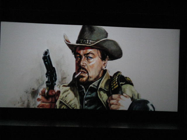 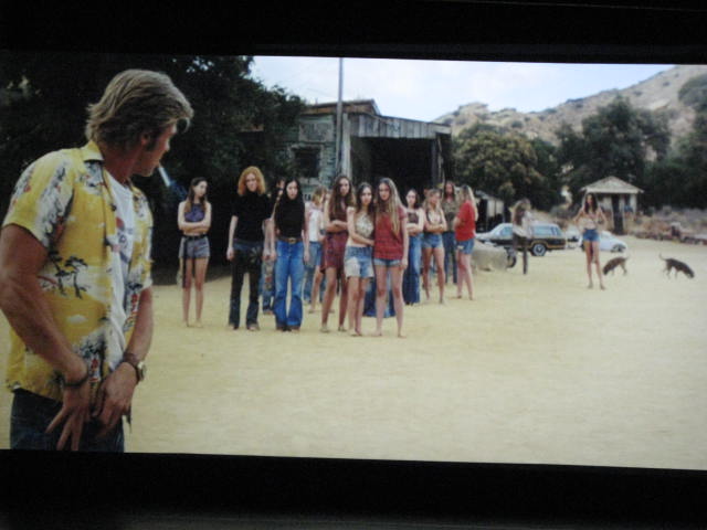
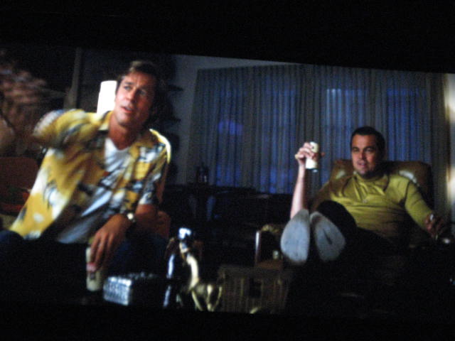 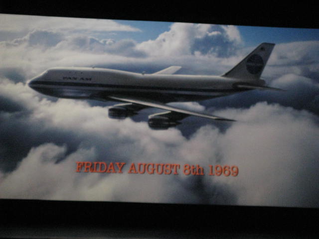
Do these look "mint green" to anyone? At all? Bueller? Come on, folks: dont be shy.
[And please note: these have not been colour corrected: I dont have PhotoShop, & wouldnt know how to work it if I did. Also please note: four weeks in, & no dirt, no lines, no sign of wear.]
Heres a suggestion, Herr Gutzeit: the next time you watch a movie, take off your sunglasses. I am going to seriously question your judgement about anything having to do with colour balance after this insane asseveration. I also question whether your viewing condition are at spec, or even competent. In fact, I'm going to question pretty much every damn thing you say.
We get it. Film images were superior decades ago. In some cases, thats somewhat debatable. In the case of 70mm, thats close to correct, although there are always exceptions [all the prints of The Master, for instance, were struck off the OCN]. Nonetheless, overall, film prints looked a little bit better in the past.
And there were reasons for that; lots & lots of reasons, which you seem incapable of acknowledging. So let me bring you up to speed:
quote: Gutzeit 2
How else could the industry and the quality of roadshow prints have been justified other than by direct copying?
YES, in 1965, 70mm release prints were struck off their OCN. Want to know why? Let us count the ways:
1. Hollywood was, at the time, seriously interested in putting out the best looking prints they could, in order to compete with the perceived threat of television.
2. There was a huge infrastructure in place that could make such an effort technically viable.
3. It followed a long-standing practice. Since the birth of film, most release prints were struck off the OCN. But not many prints were struck: they would make the number they needed & those prints would be shuttled from theatre to theatre, and from state to state, and from city to city, and the movie would break slowly over the country & would then wind its way down to some podunk movie house in gooberville (as seen in something like The Last Picture Show) before finally coming to rest. No one was sending out 2/3/4000 prints: thats not how the release patterns worked back then.
4. Also back then, Hollywood cared a lot less about preserving or archiving its back catalogue, with the exception of what were known as "evergreen" titles -- ones that could be released & make money again & again, such as The Wizard of Oz, Gone with the Wind, etc. All the others? Of no importance. Thousands of titles were lost to neglect.
5. MOST IMPORTANT: There was no good duplicating stock. Over time, reasonably good duplicating stocks were made for B&W (lavenders, for instance -- if you know what those were). But colour stock was something new & different. Eastman colour negative stock rolled out of the factory in 1947, but it didnt get used by Hollywood until around the middle 1950s. Up to that point, the 3-strip Technicolor process held sway. By 1965, the stock had only been used for about 10 years, and, following what was then standard practice, a small number of release prints were struck off the OCNs & then travelled around. When 70mm was introduced, the studios again followed standard practice. They had to: there was no good duplicating stock. Prints struck off (then) dupe negatives looked awful, so nobody used them unless they had no choice.
Got that? All clear? Good, because heres the rub: None of that applies any more, because we're living in 2019, not 1965.
1. Hollywood is no longer interested in putting out the best looking anything, as anyone with two eyes & a brain can see. DCPs look mostly wretched, & the majority of old titles transferred to DCP look worse. People are shooting movies ON THEIR PHONES. People are watching Lawrence of Arabia ON THEIR IPADS. And nobody cares. At all.
2. The huge infrastructure is GONE. No competing labs, no competing wide screen formats, nothing. We have one working 70mm lab in America, & you, Mein Herr, cant stop shitting all over it every bloody chance you get. To wit:
quote: Gutzeit 3
It's clear to me that it hasn't worked for 15 years. Why should we protect such a lab and hope for a second chance if we cannot see the slightest reason for it?
Heres a really good, solid reason: theyre processing film. Hows that? And I like that they are. So, how about you just STOP with these baseless & pointless attacks? Robert Harris says FotoKem is top-rank, & I'll take Mr Harris's word over yours any moment of any second of any day of any year. I know Mr Harris knows what hes talking about. And I wouldnt believe you if you told me rain was wet & fell from the sky.
3. Hollywood now does care about preserving its back catalogue. Unlike you, Hollywood learned a important, critical lesson: the studios learned that spending millions of dollars to resuscitate a OCN damaged from overuse or neglect is a considerable unforeseen & undesirable expenditure. How to avoid it? By not letting the irreplaceable OCN get damaged through overuse or neglect in the first place! You know what that is, Herr Gutzeit? Intelligent.
4. Because of that, the long-standing practice is of printing off OCNs is DEAD. And there are several other reasons for this: Release patterns changed, necessitating a larger volume of prints than any OCN could strike without falling to pieces. Kodak finally created a worthy duplicating stock, which, while it isnt quite as sharp & grainless as a show print, can come -- with careful lab work & exposure -- pretty damn close. [Example: Thelma & Louise. Release prints were 3rd gen. They didnt look it.]
5. So, striking several hundred 70mm prints off the 65mm OCN is now considered inconceivable. And you know what else it is, Herr Gutzeit? Irresponsible. You have an element that represents a multi-million dollar investment, & you want to take a chance that no lab technician, nor the printer, can possibly make an error or have something go mechanically wrong? And permanently screw up the master element? Just so you can sit in some theatre & watch a print off the OCN the way you did fifty years ago, when the chances are that not only will you complain about how the print isnt up to snuff anyway, but also the very likely fact that said print will be TOTALLY WRECKED within a couple of days because almost nobody alive knows how to handle the 70mm format without damaging it anymore? Do you know how misinformed & oblivious you come across when you make statements like this? Whats your point? What do you hope to achieve? Do you think the film industry revolves around the glory that is you, & by annoying everyone with your pusillanimous posts, A New World will spring into being, with thousands of high-quality film labs laying print after print at your feet to win your seal of anal-retentive, punctilious approval?
And if this is making you mad? Hey, buddy: welcome to my world......the world that isnt stuck, like a needle in a broken record, in 1965.
Lets continue.
Heres a recent example of Herr Gutzeit's typical flying trapeze act leaps of illogic:
quote: Gutzeit 4
The Nolan version of "2001" from 2018 also contains half of it‘s running time parts of the older interpositive and half of the time of the younger interpositive of 1999. The version from the year 2001 was printed from the old 65mm interpositive to new 35mm and 65mm dupe negatives, and it disappointed many connoisseurs of the film, because the color timing in the then circulating correction prints was extremely different...
Okay, so here we have Herr Gutzeit whining like a kinder because we're not striking prints from 2001's OCN, which was A) Damaged from overuse & overprinting and, B) Fading. It's all but dead. (And maybe it was used 300 times!) And the IPs & the INs we have are just so inferior; so sad, so disappointing; lets all hang our heads & have a good cry, because no prints are ever going to look like they did in 1968. Keeping that in mind, we have this pearl of wisdom:
quote: Gutzeit 5
Even after three hundred serial prints, especially off the 65mm negative, there is no need for any damage.
Got that? See what he did here? Now we have Herr Gutzeit proclaiming that we should endanger some future 2001 to some similar fate by overprinting the OCN & leaving us (once again) with some inferior IN that he will no doubt find infinite reasons to complain about decades from now ["exhausted" -- whatever that means -- "without contrasts" -- and also whatever that means]!
Isnt that sweet? Herr Gutzeit is trying to be irrefutable....by having it both ways every time.
I dont know what you do for a living, or even if youre working at all. Are you? Or are you sitting at home, studying BluRays (BluRays!!!) & reminiscing about times long past? Wandering through your yellowing memories (see what I did there?) & thinking wistfully about the days when you could see 70mm, shot high key, well printed & well projected? Well, those days are GONE. That time is PAST. That system is all but DEAD. The technology has CHANGED (as technologies tend to do). And the fact that you refuse to accept this, & stubbornly play the same boring, relentless tune over & over & over & over (this colour is a little off, this isnt the way I remember, this isnt where I think it should be, this is inferior to this other thing, this doesnt look the same as a BluRay [and give me a break on that], this isnt as sharp as it should be, &c&c&c), marks you as someone who is interested not in helping, but in hindering, not in advancing, but in retreating, not in being constructive, but in being destructive and, most especially, not in keeping the film format alive, but doing all that you can -- with your continuous nit-picking, unreasonable complaints -- to help it die.
I think film has enough enemies in the world without adding your name to the list. Maybe you should evaluate your life choices & do something helpful for a change. I think we would all welcome that.
| IP: Logged
|
|
|
|
Chris Haller
Film Handler
Posts: 68
From: Rochester, NY, USA
Registered: Dec 2015
|
posted 08-23-2019 11:08 PM
My sister still hadn't seen the movie, so I took her to see the 35mm print that's still running here at The Little in Rochester. A month later, I still found it to be a disappointing viewing experience. They fixed the sound channel dropouts and focus, but in exchange we got:
various dirt and scratches on the base side of the film; not terrible, but definitely present from a month of average quality screenings in terms of handling
Even reels of the film were plagued with TONS of emulsion side green speckling at the heads, kind of like what a lot of rep houses get with their prints and the heads and tails of reels on the base side. I've never seen the speckling at the heads of reels like this.
The left projector, which played the even reels, was projecting off center onto the curtain slightly, revealing the soft edge of the film on the right side, as well as some dead space on the screen. It wasn't a ton of space, but it was definitely noticeable.
The right projector, after awhile, seemed to have developed some sort of lens issue where everything just sort of started slanting to the left like a \. It was hard to notice in full scope shots, but closeups started to look a little odd, and the pillarboxed images definitely slanted to the left from the right side, while the left side of the image was perfectly fine. Not really sure what could cause this either, but it was obnoxious.
Not a great experience, but at least I got to hear both channels of analog sound throughout the entire movie! I wanted to stick around to chat with the projectionist about it, but no one seemed to be able to get a hold of him.....hmmmmmm.
| IP: Logged
|
|
|
|
All times are Central (GMT -6:00)
|
This topic comprises 15 pages: 1 2 3 ... 10 11 12 13 14 15
|
Powered by Infopop Corporation
UBB.classicTM
6.3.1.2
The Film-Tech Forums are designed for various members related to the cinema industry to express their opinions, viewpoints and testimonials on various products, services and events based upon speculation, personal knowledge and factual information through use, therefore all views represented here allow no liability upon the publishers of this web site and the owners of said views assume no liability for any ill will resulting from these postings. The posts made here are for educational as well as entertainment purposes and as such anyone viewing this portion of the website must accept these views as statements of the author of that opinion
and agrees to release the authors from any and all liability.
|

 Home
Home


![[Confused]](confused.gif)
![[Razz]](tongue.gif) I didn't have my hands on them, so I'm speaking from a consumer having talked to the projectionists about the issues.
I didn't have my hands on them, so I'm speaking from a consumer having talked to the projectionists about the issues. 


 Printer-friendly view of this topic