|
|
 
|
|
Author
|
Topic: Dolby's new sound system
|
|
|
|
|
|
|
|
|
|
|
Bobby Henderson
"Ask me about Trajan."

Posts: 10973
From: Lawton, OK, USA
Registered: Apr 2001
|
 posted 01-27-2014 02:36 PM


Here's a few more Atmos logo alternatives, including a couple more minimal versions. Sorry, the Double-D logo has to be present, as well as the Morgan Sans typeface. I could do something with a big "A" set in Morgan Sans, or just hand-drawn to get people to think about Atmos. Unfortunately with our country having the mindset it has many would confuse the big A for America, Ass, Scarlet Letter Adultery or just plain "fuckin-A."
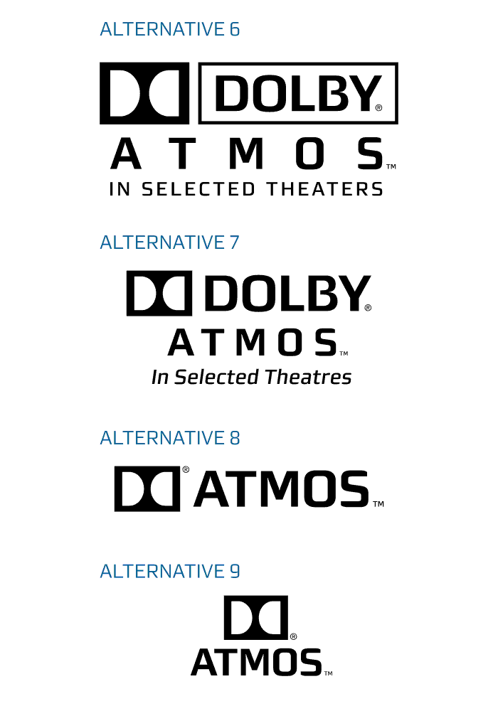
Alternative 6 is styled after the 1995 Dolby logo system, but with Morgan Sans type instead of the classic Eurostile and Helvetica arrangement. Alternative 7 mimics that Dolby Digital logo I see so often in movie end credits. Alternatives 8 and 9 are more minimal, using the Double-D to get people to think "Dolby" rather than having it spelled out for them.
quote: Joe Redifer
Jesus S Christ will I be happy when the minimalism fad ends. That can't happen soon enough.
That kind of depends. A lot of so-called "flat design," which counters the skeuomorphism trend from the previous decade, does tend to look pretty stark. However a lot of skeuomorphism-based designs are pretty freaking cheesy looking. People were going crazy with all the filter effects, trying to mimic real world materials (glass, chrome, leather, etc.). That trend was really starting to get old.
One thing I do like about "flat" logos is they make my day job a LOT easier. A logo that's entirely vector-based and able to be reproduced in a single ink color is a lot easier to turn into various types of signs. I can rout a single color, vector-based logo out of all sorts of materials. The same is not possible for logos created in pixel-based form within Photoshop, complete with all kinds of bevels, drop shadows, softened edges, etc. Any good logo should have a base version that's very simple and vector-based. Designing a logo in Photoshop and then trying to vectorize it and simplify it later is absolutely counterproductive. It ends up costing clients a bunch of money later when they need the logo produced in mediums other than the printed page or a computer screen.
Flat design is kind of a throw-back to pre-digital conventions in design -particularly the late 1950's through 70's period where the Helvetica typeface and Swiss design grew incredibly popular.
| IP: Logged
|
|
|
|
|
|
|
|
|
|
|
|
|
|
|
|
|
|
|
|
|
Powered by Infopop Corporation
UBB.classicTM
6.3.1.2
The Film-Tech Forums are designed for various members related to the cinema industry to express their opinions, viewpoints and testimonials on various products, services and events based upon speculation, personal knowledge and factual information through use, therefore all views represented here allow no liability upon the publishers of this web site and the owners of said views assume no liability for any ill will resulting from these postings. The posts made here are for educational as well as entertainment purposes and as such anyone viewing this portion of the website must accept these views as statements of the author of that opinion
and agrees to release the authors from any and all liability.
|

 Home
Home







 Printer-friendly view of this topic